10 Teal Blue and Cream Living Room Ideas for a Modern and Elegant Home
A living room painted a flat cream with no other color in sight can start to feel unfinished, and that gap is usually what sends people searching for teal blue and cream living room ideas in the first place. Teal and cream work well together because they share a similar depth. Cream stays soft and warm. Teal adds richness without tipping into cold or harsh. Picture a cream boucle sofa anchoring the room, a teal velvet chair angled beside it, and a brass floor lamp catching the light between them. That balance is what this article walks through, piece by piece.
1. Pick Your Dominant Color First
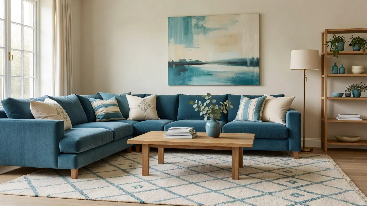
Before buying anything, decide whether cream or teal will cover more of the room. Most elegant pairings lean roughly 70 percent cream and 30 percent teal, with cream on walls and larger furniture, and teal reserved for an accent chair, pillows, or a rug. Reversing the ratio can work too, but it shifts the room toward bold rather than calm.
Why This Decision Comes First
Committing to a ratio early keeps future purchases consistent. Without it, a room can end up with too much teal competing for attention, or so little that the color feels like an afterthought rather than a design choice.
2. Choose the Right Teal Shade for the Room
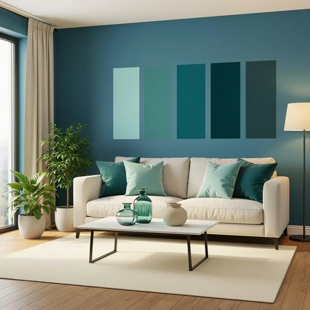
Teal ranges from a deep, almost navy blue-green to a brighter, more saturated peacock tone. A room with lots of natural light can handle a deeper, richer teal without feeling dark. A room with limited light often looks better with a lighter, slightly more muted teal so the space doesn’t feel closed in.
Testing paint or fabric swatches in the room at different times of day, morning and evening light shift color noticeably, prevents an unpleasant surprise after a big purchase.
3. Use Cream on Large Surfaces for a Calm Base
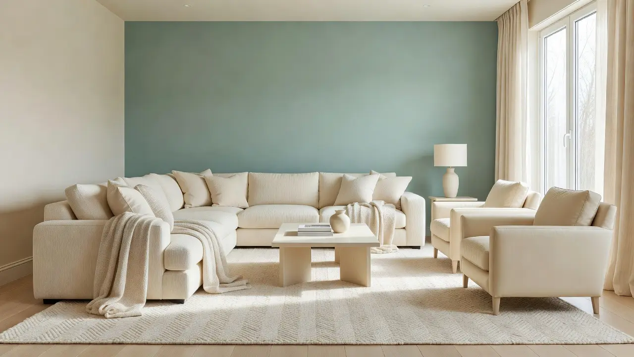
Cream walls, a cream sofa, or a cream area rug give the eye a place to rest between bolder elements. Warm cream, leaning slightly yellow or beige rather than stark white, pairs more naturally with teal’s cool undertone and keeps the room from feeling sterile.
Large cream surfaces also make the room feel more spacious, since lighter tones reflect more light than deeper, saturated colors would across the same square footage.
4. Add Texture Through Velvet and Boucle Fabrics
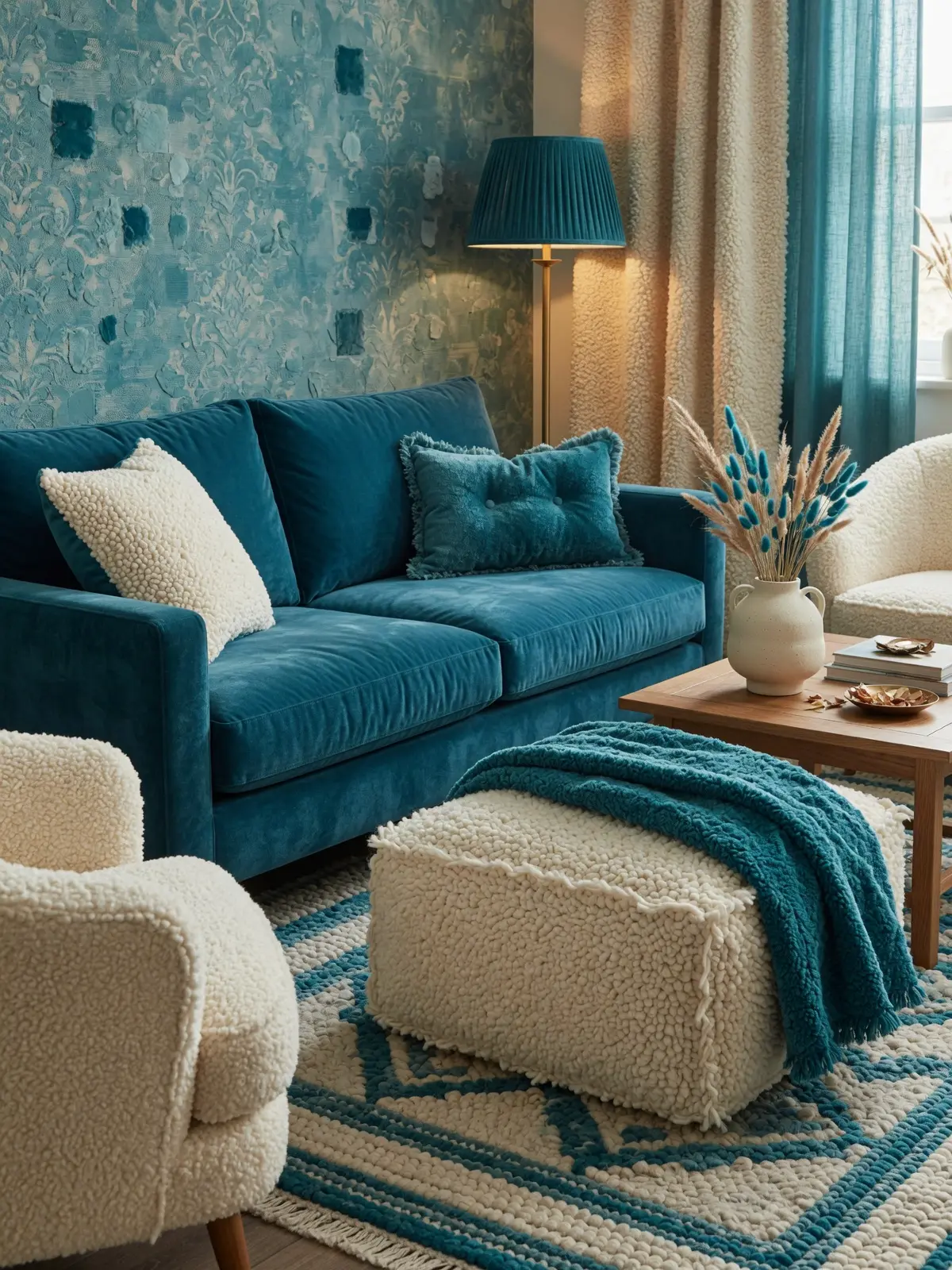
Velvet in teal reads as elegant partly because of how the fabric catches light, showing subtle shifts in shade depending on the angle. Boucle, in cream or a soft oatmeal, adds a tactile, slightly nubby texture that keeps the room from feeling too smooth or flat. A velvet teal accent chair in the $300 to $700 range is often the single piece that defines the whole room’s character.
Mixing these two textures, one plush and one nubby, adds visual depth even within a fairly limited two color palette.
5. Bring in Brass or Gold for Warmth and Contrast
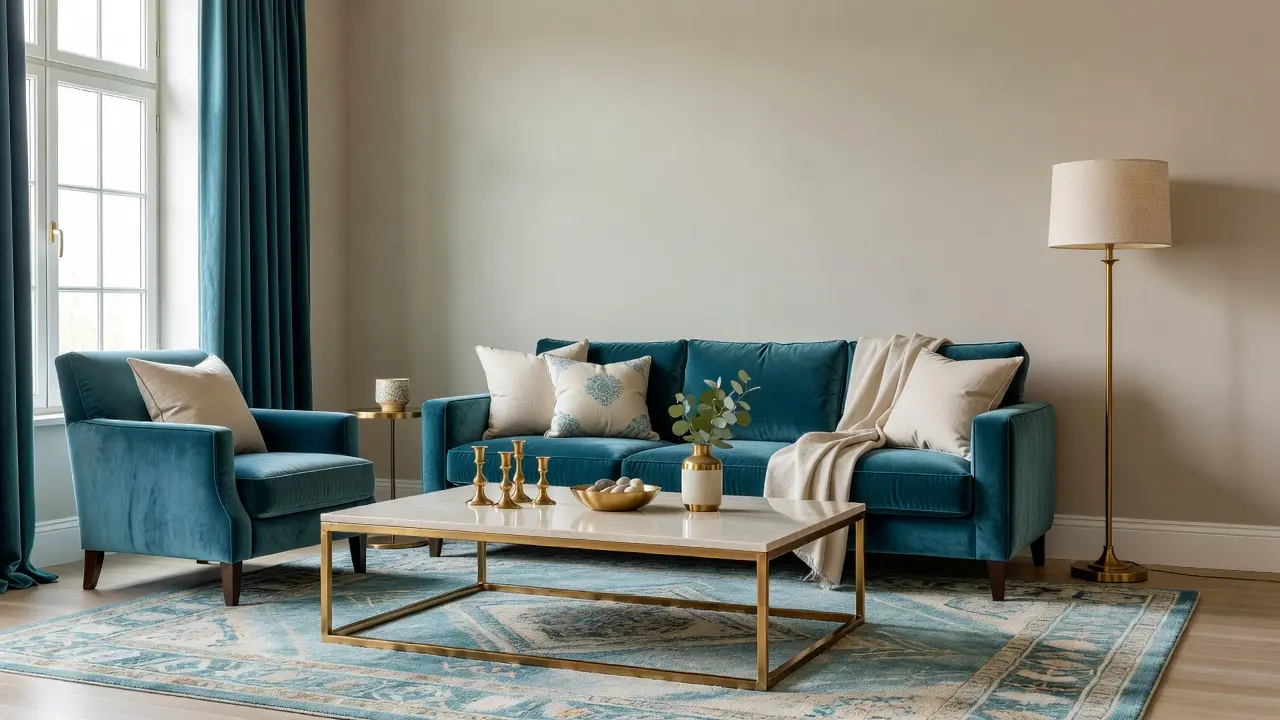
Teal and cream alone can feel a little cool without a warm metal accent to balance them. Brass or aged gold hardware, a lamp base, or picture frames add warmth and a sense of polish. A brass floor lamp in the $80 to $200 range is a common anchor piece for this reason.
Where Brass Works Best
Small, repeated touches, drawer pulls, a picture frame, a vase, work better than one single large brass piece trying to do all the visual work alone. Repetition across a few smaller items ties the room together more convincingly.
6. Layer a Patterned Rug to Tie the Palette Together

A rug that combines teal and cream in a subtle pattern, a soft geometric or a traditional inspired design, grounds the seating area and visually connects the two main colors. Sizing matters here too. A rug in the 8×10 range for a standard living room should extend under the front legs of the main seating pieces.
A rug with too many additional colors can pull focus from the teal and cream pairing, so sticking to a palette that includes mostly those two tones, plus maybe one neutral, keeps the room cohesive.
7. Use Art to Reinforce the Color Story
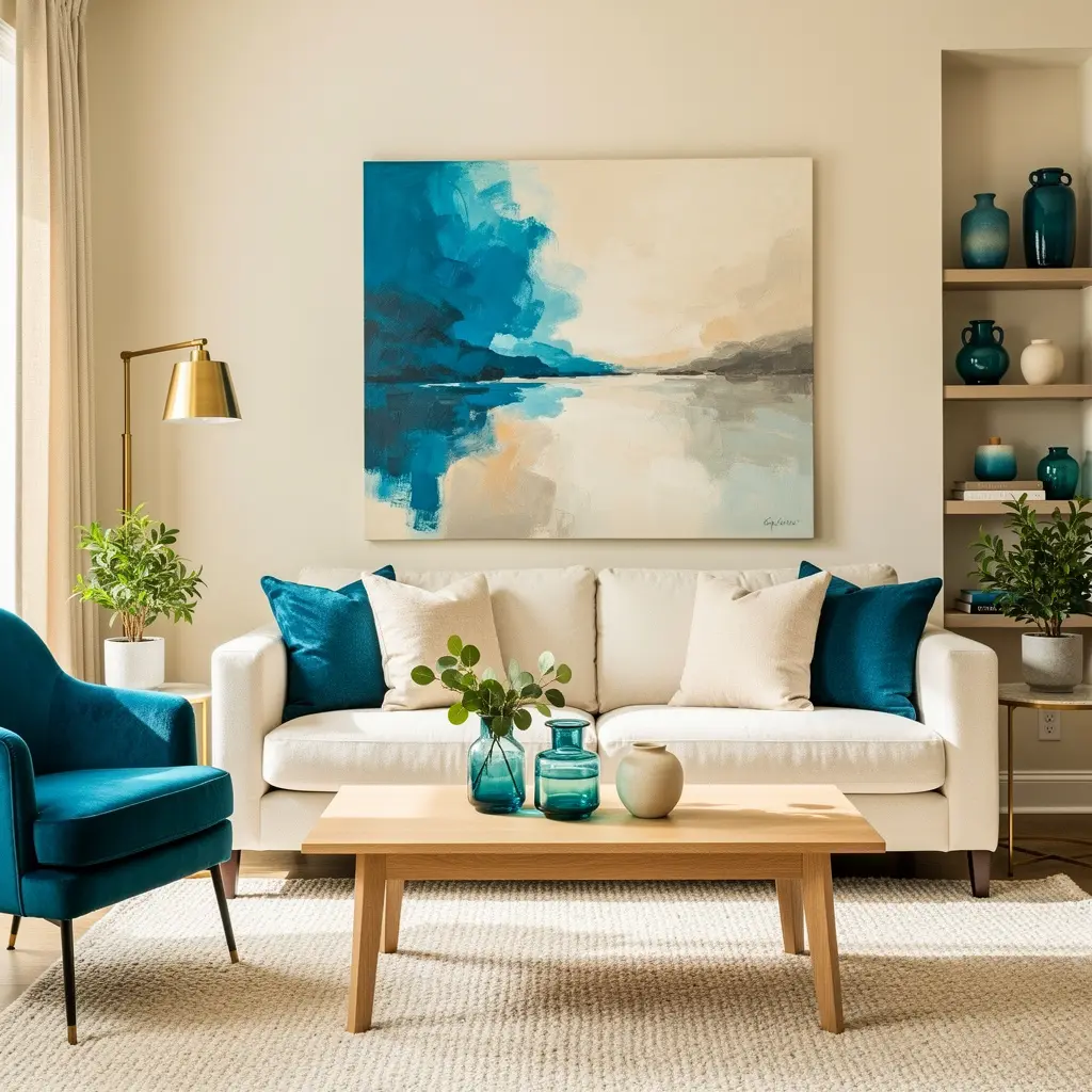
A piece of art that includes both teal and cream, even in small amounts, reinforces the palette without needing to match exactly. Abstract art works particularly well here, since it can pick up on the color story without being literal about it. Framed art in the $40 to $120 range, in a simple frame, usually fits the elegant feel better than an ornate one.
Hanging art at eye level, roughly 57 inches to the center, keeps the room feeling proportional and considered.
8. Add Greenery to Soften the Palette
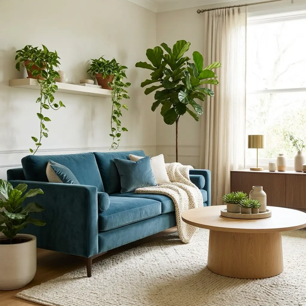
A live plant, a fiddle leaf fig or a pothos in a cream or brass toned pot, softens the room’s more structured color pairing with some organic variation. Green sits naturally alongside teal on the color wheel, so it doesn’t compete with the room’s existing palette the way an unrelated color might.
One larger plant placed in a corner or beside the sofa tends to have more visual impact than several small plants scattered throughout the room.
9. Balance Bold Furniture With Simple Window Treatments

Elegant rooms tend to avoid overly ornate curtains that compete with the furniture for attention. Simple linen curtains in cream or a very pale teal let the window treatments support the room rather than compete with the sofa or accent chair. Floor length curtains, just barely grazing the floor, add a more polished, finished look than shorter panels.
Keeping the curtain rod close to the ceiling, rather than right above the window frame, makes the room feel taller and more intentional overall.
10. Keep the Lighting Warm to Support the Elegant Feel
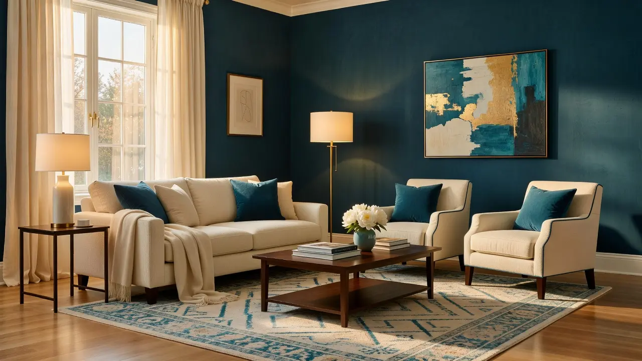
Cool white bulbs can wash out the warmth that cream and brass are meant to bring to the room. Warm bulbs, around 2700K, keep the whole palette feeling cohesive after the sun goes down. A dimmer switch, relatively inexpensive to install, gives more control over how bright or moody the room feels at different times of day.
Layering at least two light sources, an overhead fixture plus a floor or table lamp, avoids the flat, single source lighting that can undercut an otherwise well designed room.
Mistakes to Avoid
- Using too much teal without enough cream to balance it, which can feel heavy in a small room
- Choosing a stark white instead of a warm cream, which clashes with teal’s cool undertone
- Skipping a warm metal accent, leaving the palette feeling a little cold overall
- Picking a rug with too many extra colors that pull focus from the main palette
- Using only cool white lighting, which undercuts the warmth brass and cream are meant to add
- Overcrowding the room with too many small teal accessories instead of one or two strong pieces
Frequently Asked Questions
What ratio of teal to cream works best in a living room? A common approach uses roughly 70 percent cream and 30 percent teal, with cream on larger surfaces and teal reserved for accent pieces.
Does teal work in a room with limited natural light? Yes, but a lighter, more muted teal tends to work better in dimmer rooms, since deep saturated teal can feel heavy without enough light to balance it.
What metal finish pairs best with teal and cream? Brass or aged gold generally pairs best, since it adds warmth that balances teal’s cooler undertone.
Can I use teal as the wall color instead of an accent? Yes, especially in a room with strong natural light. In that case, keep furniture mostly cream to maintain balance.
How do I keep a teal and cream room from feeling cold? Add warm metal accents, warm bulb lighting, and at least one plush or textured fabric like velvet or boucle to keep the palette feeling inviting.
Conclusion
A teal blue and cream living room works because the two colors balance each other. Cream keeps things calm and spacious. Teal adds richness and depth. Start with a dominant color ratio, layer in warm brass accents, and finish with textured fabrics and a patterned rug to tie it all together. The result is a room that feels elegant and considered, not overly matched or accidentally cold.