10 Funky Color Pop Seating Room Ideas for a Bright and Aesthetic Interior
A beige sofa facing a beige wall with a beige rug underneath is safe, but it’s also forgettable, and that flatness is usually the actual complaint behind a search for funky color pop seating room ideas. The fix isn’t repainting every wall a bright color. It’s choosing a few bold, deliberate moments, one statement chair, a patterned rug, a bright lamp, and letting a mostly neutral room carry them well. Picture a mustard yellow accent chair next to a plain linen sofa, a small side table topped with a cobalt blue lamp, and a single graphic pillow tying the two together. That’s the balance this article is built around.
1. Start With One Statement Chair, Not Five
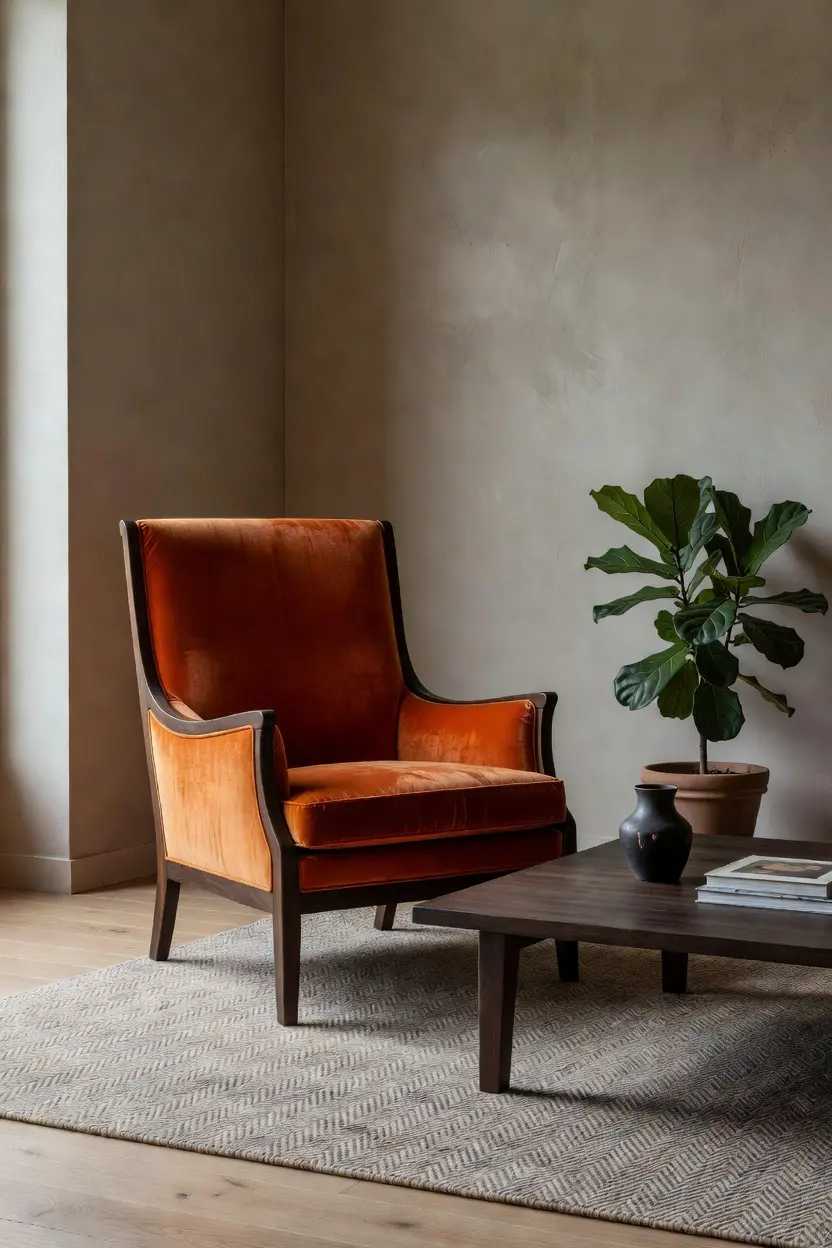
A single bold chair does more for a room than five moderately colorful pieces competing for attention. Look for a chair in a saturated color, emerald green, burnt orange, or cobalt, in the $250 to $600 range depending on materials. One strong anchor piece gives the eye somewhere to land and keeps the rest of the room from feeling scattered.
Why Restraint Actually Reads as Bolder
A room with one loud chair against a calm background reads as confident. A room with several competing bold pieces reads as chaotic. The single anchor approach almost always looks more intentional in photos and in person.
2. Keep the Walls Neutral So Color Can Pop

Bright furniture needs a quiet backdrop to actually stand out. Warm white, soft greige, or a pale putty wall color lets a bold chair or patterned rug read as the focal point instead of competing with the walls for attention. If a colored wall is genuinely wanted, choose just one wall and keep it a muted tone rather than a saturated shade.
Testing a paint sample against the planned furniture color, rather than in isolation, avoids a wall and chair that clash instead of complement.
3. Use the 60 30 10 Rule for Color Balance
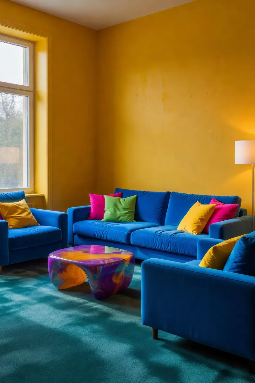
A simple ratio keeps a colorful room from tipping into overwhelming. Roughly 60 percent of the room stays neutral, walls, sofa, larger furniture, 30 percent carries a secondary color, a rug or an accent chair, and 10 percent is reserved for the boldest pops, pillows, art, or small accessories. This ratio is a guideline, not a rigid formula, but it keeps most rooms visually balanced.
Sketching this out roughly before shopping, even just jotting which pieces fall into each percentage, prevents an accidental room full of only bold colors with nothing neutral to rest the eye on.
4. Mix Patterns Without Making the Room Feel Busy
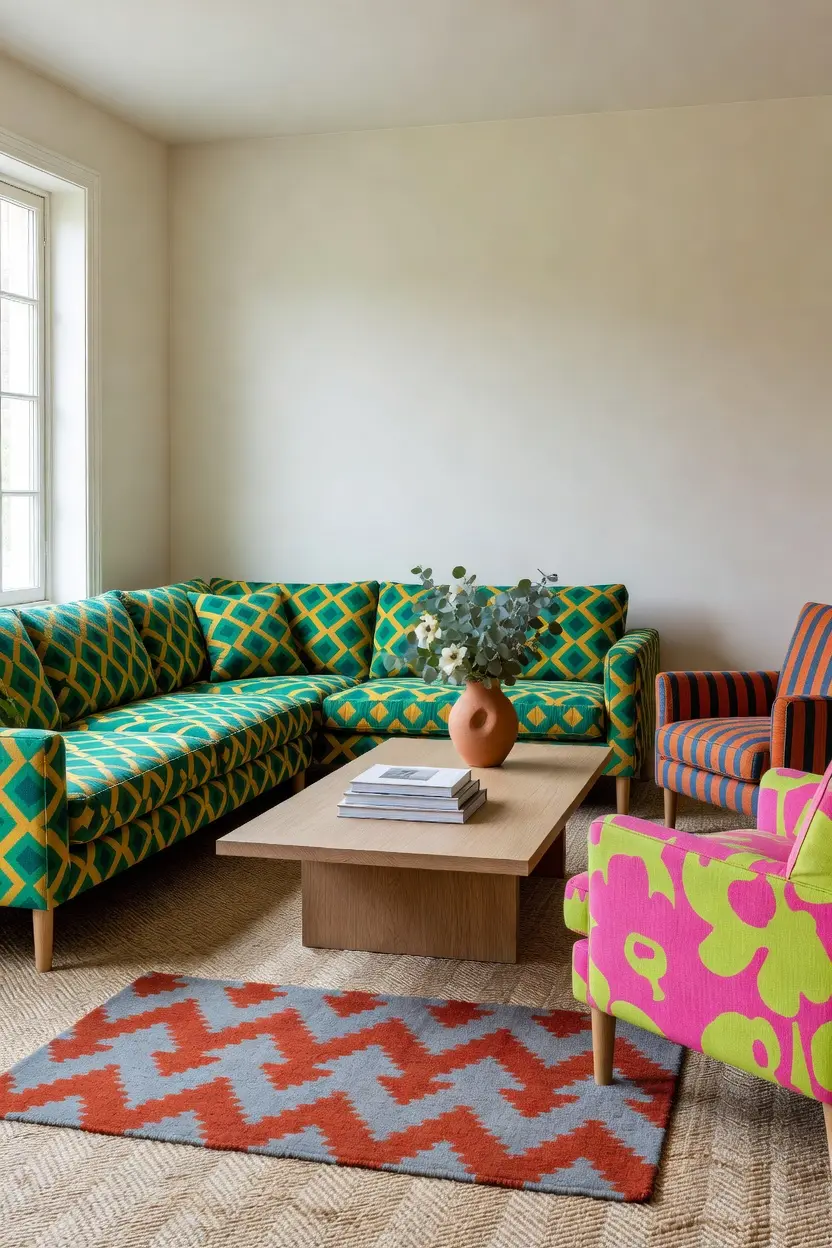
Two or three patterns can coexist if they vary in scale. Pair a large scale geometric rug with a smaller scale striped pillow and a solid colored chair. Repeating the same scale of pattern across multiple pieces is what usually makes a room feel busy rather than styled.
A shared color thread across the different patterns, even if the patterns themselves differ, ties the mix together and keeps it from feeling random.
5. Add Color Through Pillows Before Committing to Furniture
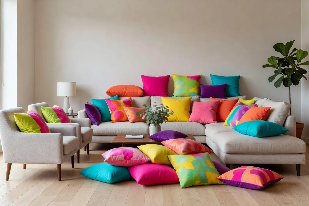
Pillows are the lowest risk way to test a bold color before buying an expensive piece of furniture in that same shade. A set of two or three pillows in the $20 to $50 range each lets a room experiment with fuchsia, chartreuse, or burnt orange without a long term commitment.
A Simple Way to Test Combinations
Lay a few pillow options on the existing sofa and live with them for a week before buying more. Colors that feel exciting in a store sometimes feel too intense once they’re actually in the room daily.
6. Choose a Rug That Grounds the Bold Palette
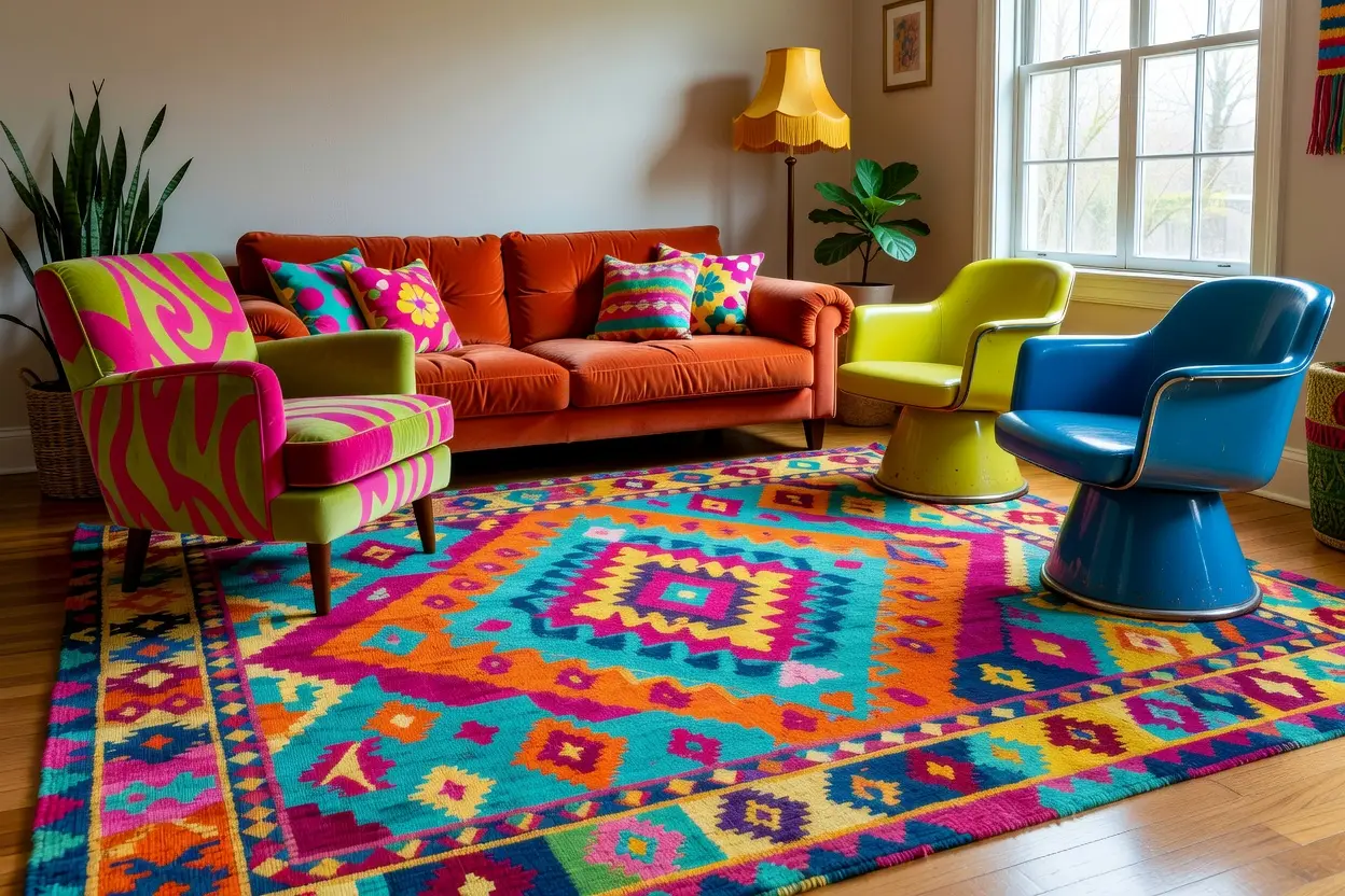
A patterned or brightly colored rug anchors a seating area and ties the furniture pieces together visually. A rug in the 5×8 to 8×10 range, depending on the room, should extend under the front legs of the seating for a grounded, intentional look rather than floating in the middle of the space.
Choosing a rug pattern that repeats a color already used in the room’s chair or pillows creates a cohesive palette instead of two competing bold elements.
7. Bring in Playful Lighting as a Secondary Color Source
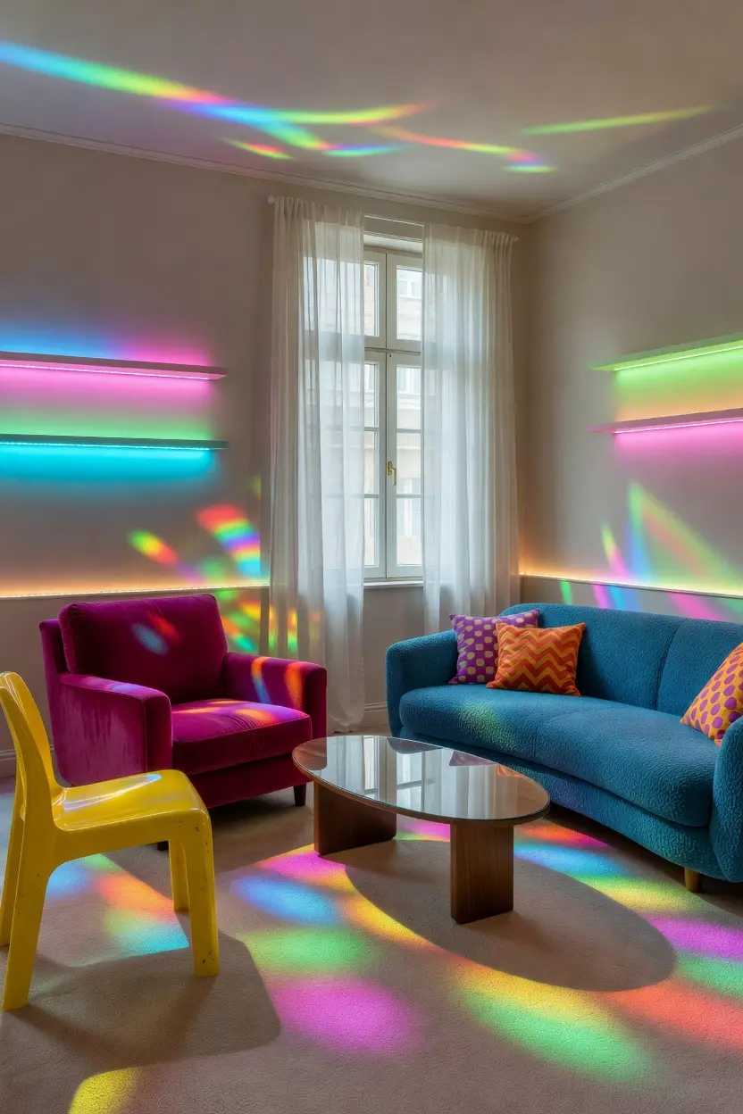
A colored glass lamp base or a bold ceramic table lamp adds another layer of color at a smaller, easier to manage scale than furniture. Lamps in the $40 to $120 range are widely available in saturated glazes and finishes that pick up on a room’s existing accent colors.
Warm bulbs, again in the 2700K to 3000K range, keep the room feeling inviting even with bold color choices elsewhere in the space.
8. Use Art and Wall Decor to Echo the Palette
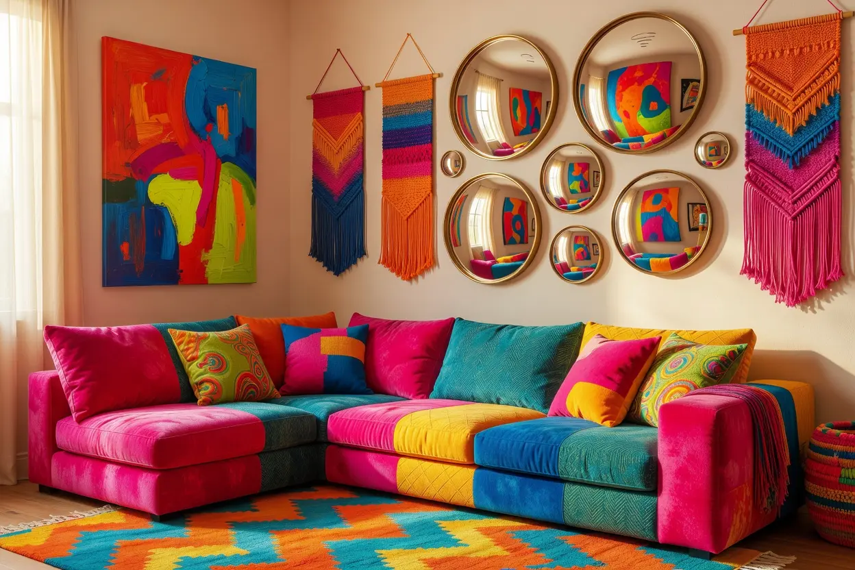
A piece of art that repeats one or two colors already present in the furniture ties the whole room together. This doesn’t need to be an expensive original piece. Printed art in the $30 to $80 range, framed simply, does the job just as well as something pricier.
Hanging art at eye level, roughly 57 inches to the center of the piece, keeps the room feeling proportional rather than off balance.
9. Balance Bold Color With Natural Textures
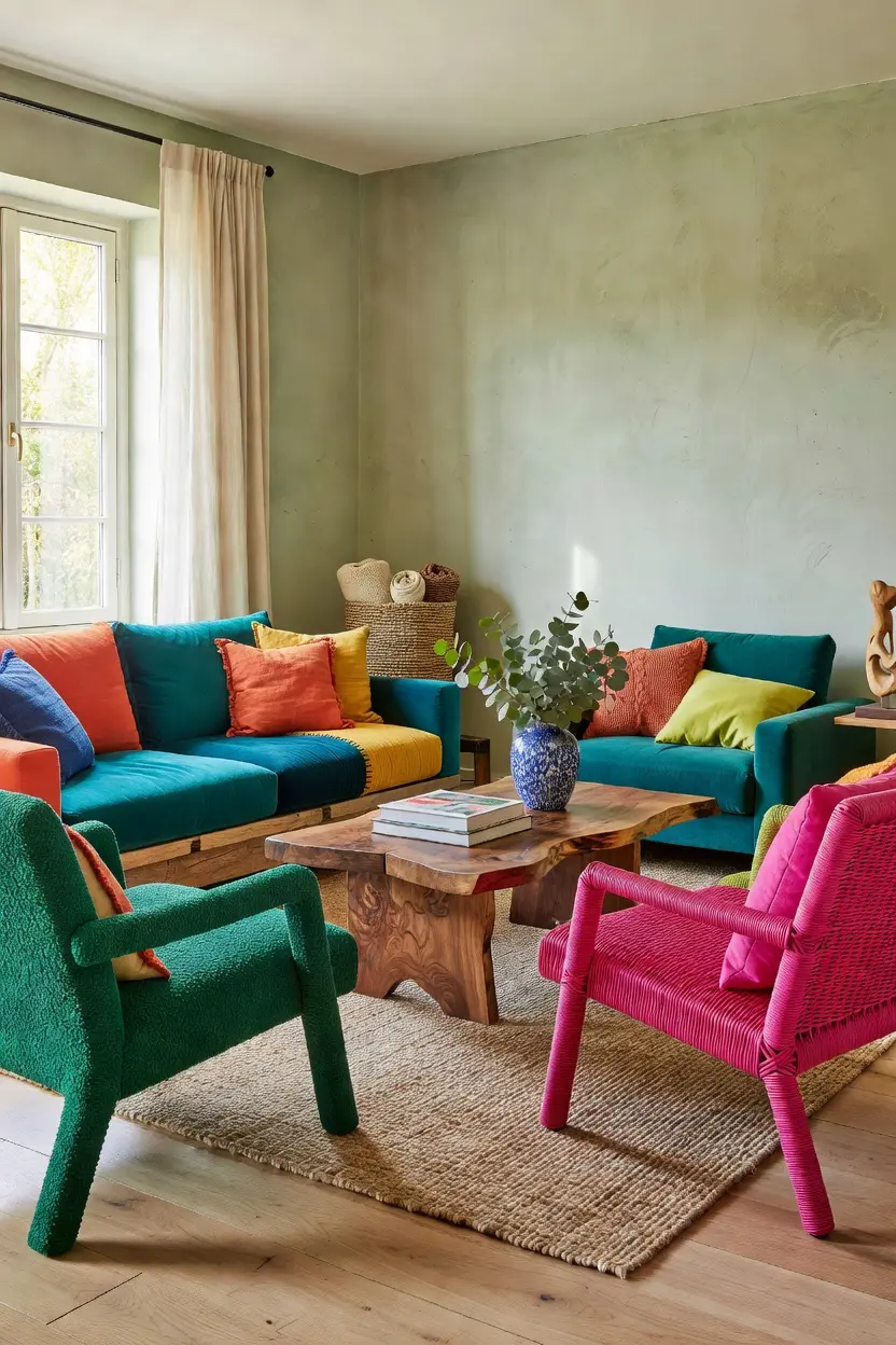
Wood, rattan, and woven textiles keep a colorful room from feeling like a showroom display. A wood coffee table or a rattan side chair next to a bold accent piece grounds the palette and adds warmth that color alone can’t provide. This mix of natural texture against saturated color is often what separates a room that feels curated from one that feels like a paint swatch come to life.
A woven basket or a jute rug underneath a bold patterned area rug adds another layer of texture without introducing a competing color.
10. Arrange Seating for Conversation, Not Just Color
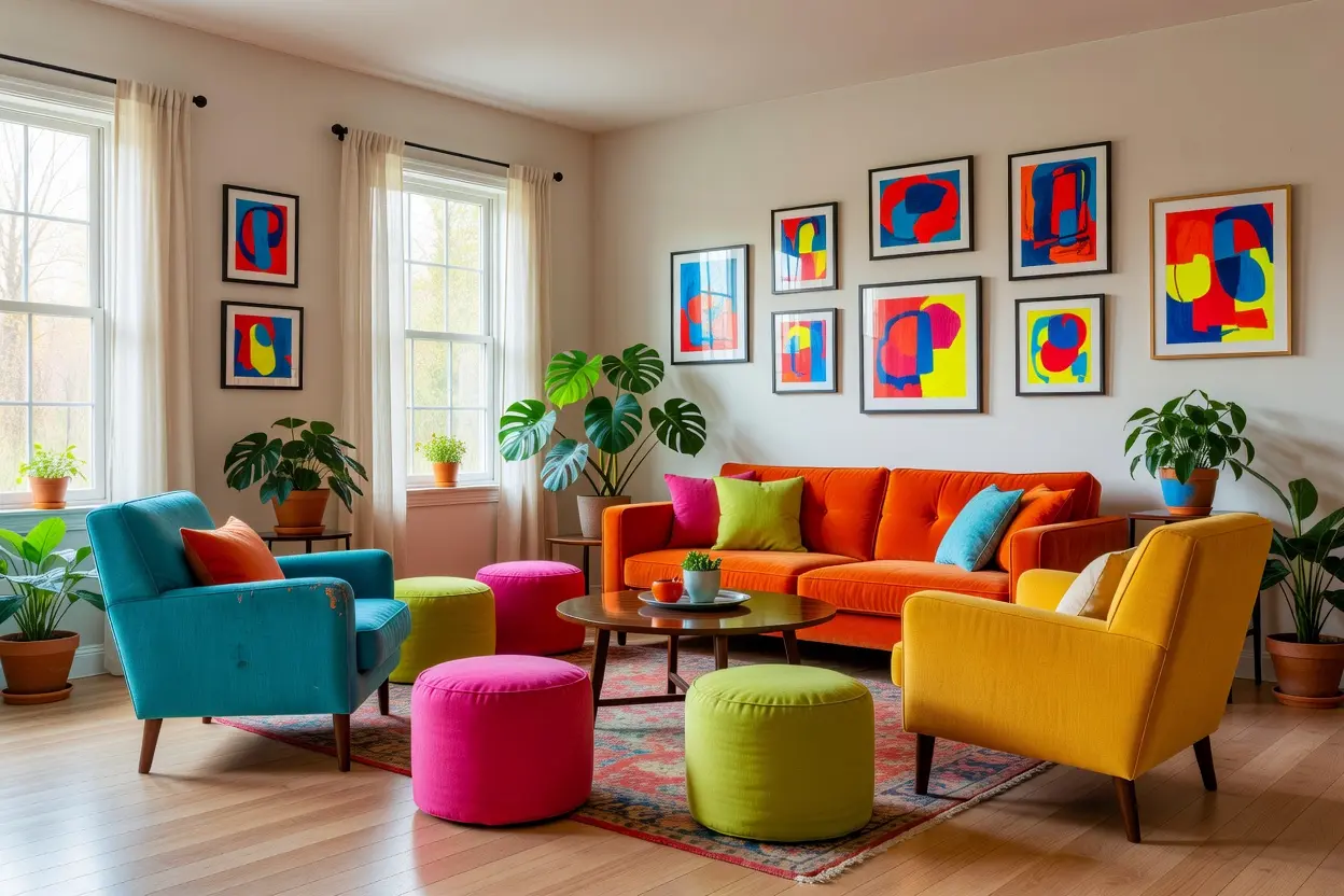
A colorful room still needs to function well. Arrange chairs and sofas to face each other or angle slightly inward, ideally within eight feet of each other for easy conversation. Color choices matter, but a beautifully colored room that’s awkward to sit and talk in still falls short of its purpose.
Leaving at least 30 inches of walking space between furniture pieces keeps the room feeling open even with bold colors and patterns layered throughout.
Mistakes to Avoid
- Buying several bold pieces at once instead of anchoring the room with one statement piece
- Painting every wall a saturated color, which competes with the furniture instead of supporting it
- Mixing patterns of the same scale, which tends to look busy rather than styled
- Skipping natural textures and relying only on color for visual interest
- Choosing a rug too small for the seating area, leaving it floating awkwardly
- Prioritizing color over the actual seating arrangement and conversation flow
Frequently Asked Questions
How do I add color without overdoing it? Start with one statement piece, a chair or a rug, keep the walls neutral, and use pillows or small decor to layer in additional color gradually.
What wall color works best behind bold furniture? A warm white, soft greige, or pale putty tone lets bold furniture and accessories stand out as the room’s focal point.
Can I mix more than one bold color in a room? Yes, as long as the colors share a common thread, like similar warmth or saturation, and one color takes the lead while others play a supporting role.
Do patterns and bold colors work together? They can, as long as the patterns vary in scale and share a repeated color, which keeps the mix feeling intentional rather than random.
What’s an affordable way to start adding color to a seating area? Pillows and a single lamp are the lowest cost entry points, both in the $20 to $120 range, before committing to a larger furniture purchase.
Conclusion
A funky, color pop seating room comes down to intentional restraint more than sheer amount of color. Anchor the space with one bold piece, keep the background neutral, and layer in pattern, texture, and lighting gradually using the 60 30 10 balance as a rough guide. The result is a room that feels bright and alive without tipping into visual chaos, and one that still works as a comfortable place to actually sit and talk.