10 Minimalist Glowing Waterfall LED Wall Art for a Dreamy Room
Picture a thin panel on the wall with light trickling down it like falling water. It sounds like something out of a high end showroom. Buy the wrong version, though, and it ends up looking like something plugged in at a novelty shop, all rainbow colors and no restraint. The panel itself rarely causes that problem. What separates a genuinely minimalist glowing waterfall piece from a gimmick comes down to brightness, color choice, and how much visual company it’s given on the wall around it.
The same physical product can end up in two completely different places depending on how it’s set up. Cranked to full brightness, cycling through rainbow colors, mounted next to a busy gallery wall, it reads as a novelty. Dimmed low, held to a single tone, given its own quiet stretch of wall, that exact same panel reads as art.
1. Why Glowing Waterfall Panels Can Tip Into Looking Gimmicky
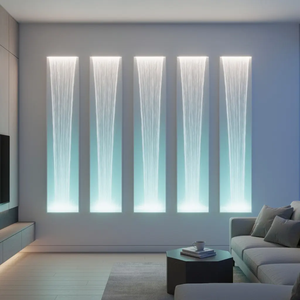
Most mass market LED waterfall panels ship set to full brightness with a rotating rainbow color mode as the default. That default setting is exactly what pushes the piece toward novelty territory the second it’s turned on. A panel running through cycling colors at max brightness competes for attention instead of quietly holding it.
Turn that same panel down to a single soft tone at maybe forty percent brightness, and the whole feel shifts. Suddenly it looks less like a toy and more like something a lighting designer chose on purpose.
It’s a strange thing about this particular product category. The hardware barely changes between the cheap and expensive versions in most cases. What changes is almost entirely how it’s used, which puts more control in your hands than the price tag might suggest.
2. Choose a Slim, Simple Frame Over an Ornate One
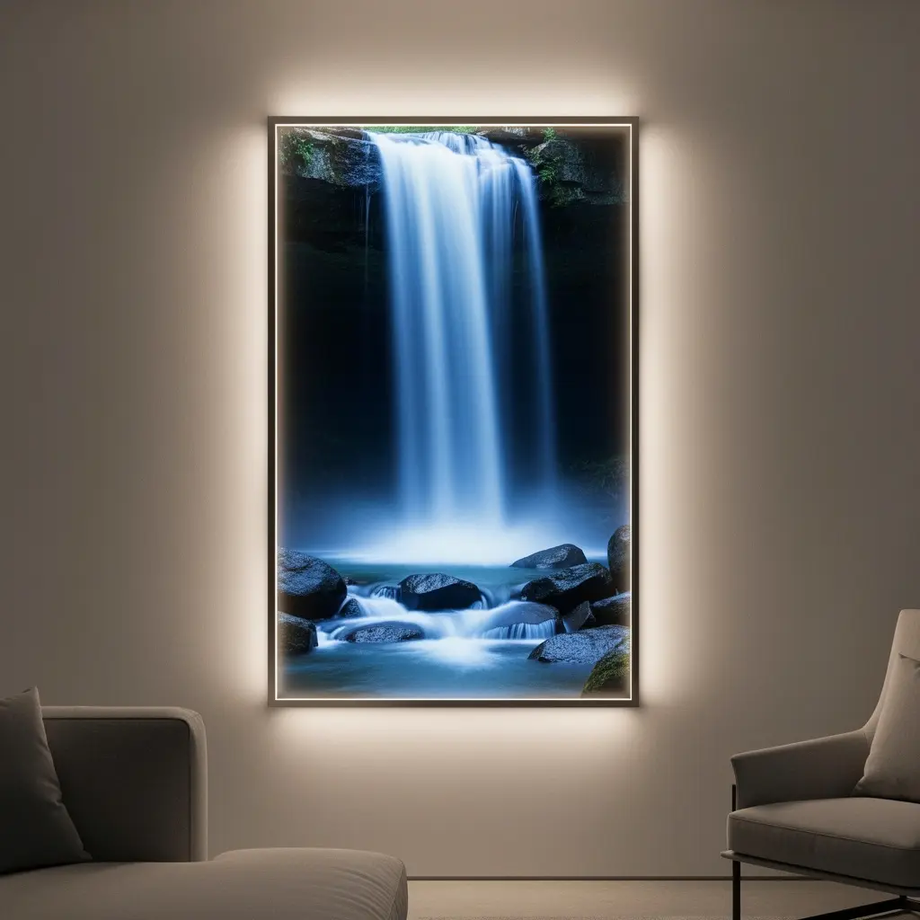
A thin black, white, or brushed metal frame keeps the visual focus on the light itself, not the housing around it. Bulkier plastic frames with visible seams or branding text tend to undercut the effect no matter how nice the light looks once it’s on.
What to Look for Before Buying
Check product photos for frame thickness and finish, not just the glowing effect shown in a dark room. A panel photographed only in pitch black conditions can hide a chunky, cheap looking frame that becomes obvious the moment daylight hits it.
3. Keep Brightness Low and Add a Dimmer if Possible
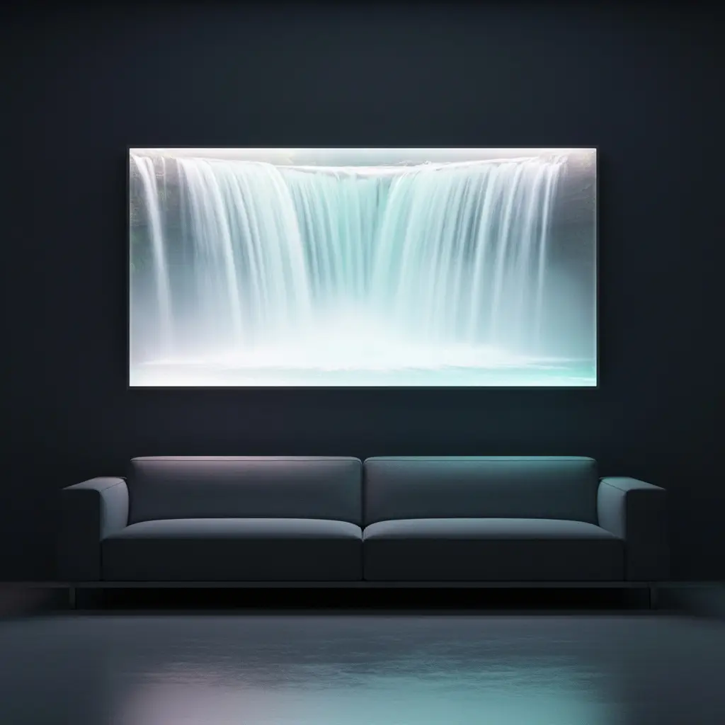
Full brightness on most LED waterfall panels is simply too much for a living room or bedroom wall. It reads as harsh, closer to a storefront sign than ambient art. Dropping brightness to around thirty to fifty percent, if the panel allows it, creates a softer glow that suits actual living spaces.
Panels with a physical dimmer knob or a smartphone app tend to give far more control than ones with a fixed remote offering only a handful of preset brightness steps. That extra control is worth checking for before purchase, since not every model includes it.
4. Pick a Single Cool or Warm Tone, Not Rainbow Modes
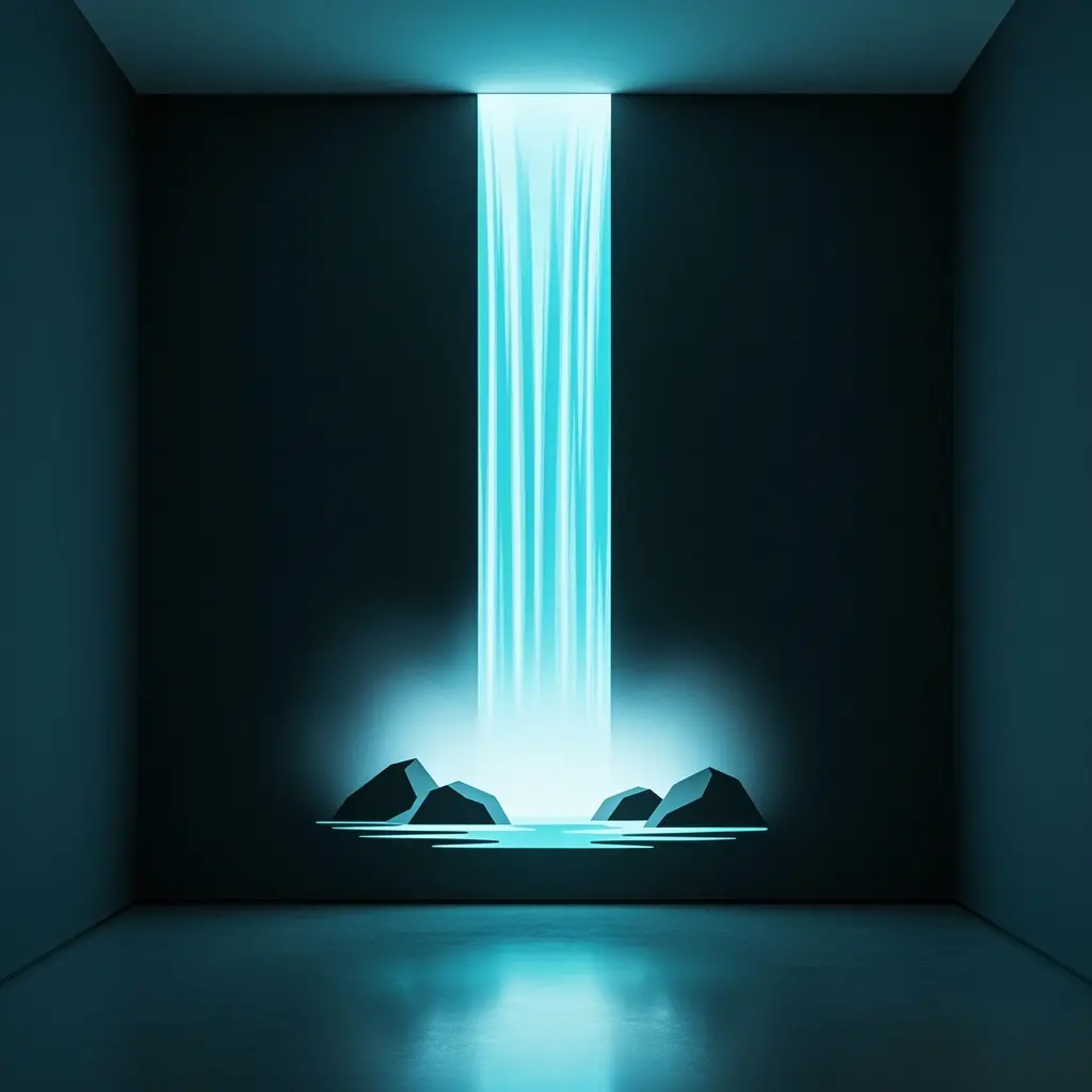
A cool blue white mimics real water more convincingly than any other color option, making it the strongest choice for a piece meant to look like flowing water and not just colored light. A warm amber tone works too, though it reads more like firelight than water.
Sticking to one consistent color, left running instead of cycling, is what separates this piece from a party gadget. Save the rainbow cycling mode, if the panel has one, for an occasional novelty moment, not everyday use.
5. Mount It as the Room’s Only Statement Piece
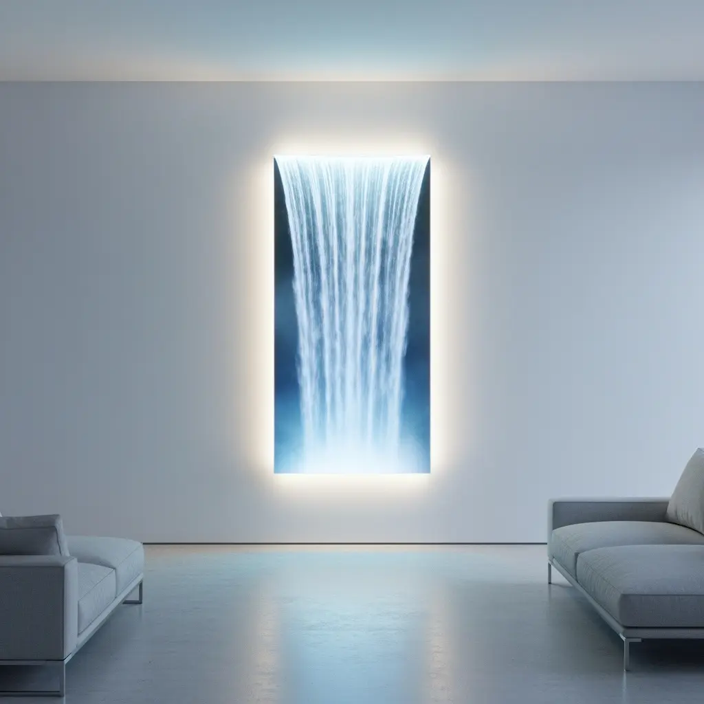
A glowing waterfall panel already draws the eye. Adding a gallery wall, patterned wallpaper, or other bold decor nearby creates visual competition that makes the whole wall look busy instead of intentional. Letting the panel stand alone gives it room to actually read as art.
This doesn’t mean the rest of the room needs to be empty. It means the panel’s own wall, specifically, benefits from staying uncluttered so nothing pulls focus away from it.
6. Pair It With a Plain Wall for Maximum Effect
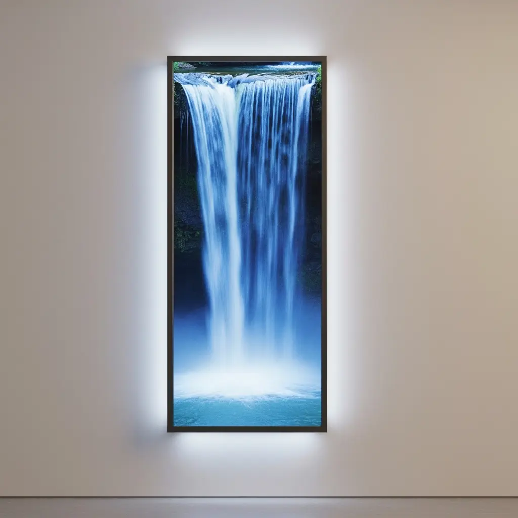
A solid, muted wall color, whether that’s charcoal, deep navy, or a soft warm gray, provides the contrast a glowing panel needs to stand out cleanly. Busy wallpaper or a heavily textured wall behind it muddies the effect, making the glow harder to appreciate against a distracting backdrop.
Darker wall colors in particular make the light itself pop more dramatically after dark, which is when this kind of piece does most of its visual work anyway.
7. Consider Placement Away From Competing Light Sources
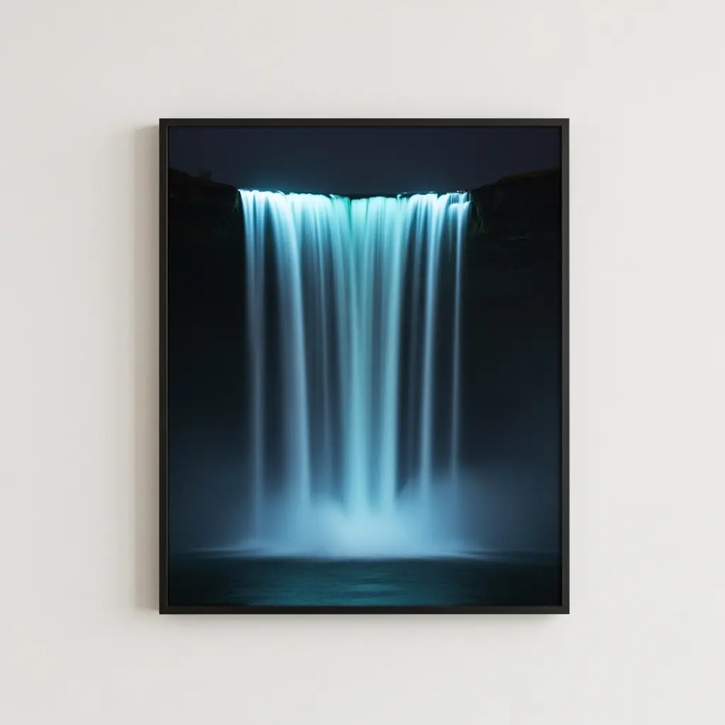
Mounting the panel directly across from a large window or under a bright overhead fixture washes out its glow during the day and dilutes the effect at night if other lights stay on nearby. A hallway corner, a reading nook, or a wall that gets moderate, not intense, light shows the piece off far better.
Evening viewing is really this piece’s strongest moment. Choosing a spot where you’ll actually be sitting or walking past after dark makes more sense than picking a spot based purely on daytime visibility.
8. Use It as Functional Night Lighting, Not Just Decor
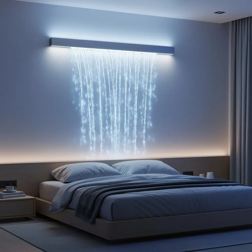
A dimmed waterfall panel doubles as gentle ambient lighting for a living room or hallway during evening hours, cutting down on the need for a harsher overhead light. This dual purpose is part of what makes the investment feel worthwhile beyond pure decoration.
Placing it somewhere you naturally pass through at night, like near a bedroom doorway or along a hallway, lets it earn its spot on the wall through actual daily use. Not just as a novelty that gets noticed once and ignored after.
9. Keep the Surrounding Decor Minimal and Quiet
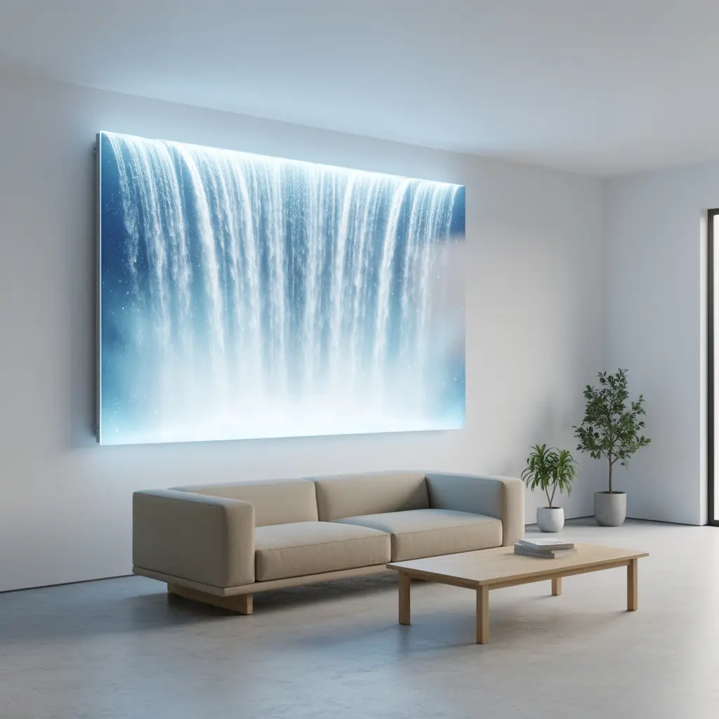
A single small shelf, one plant, or nothing at all tends to suit this piece better than a cluster of frames, mirrors, and knickknacks nearby. Minimalist decor generally works on the principle of restraint, and a glowing feature piece needs that restraint even more than a static one would.
If you do want something else on the same wall, choose one quiet object in a similar tone to the panel’s frame. Skip anything that introduces a new color or busy pattern into the mix.
10. Where to Splurge for a More Convincing Effect
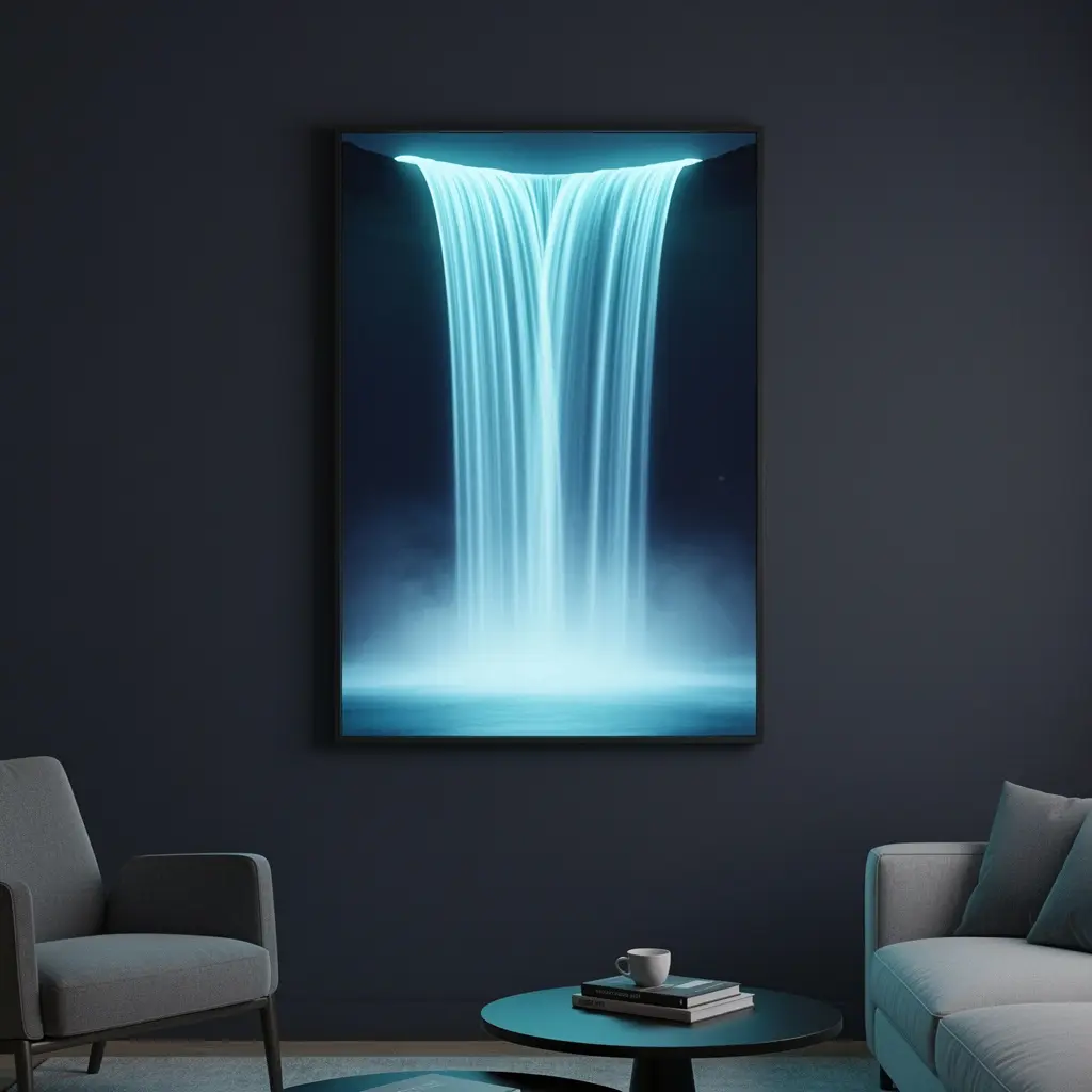
Cheaper panels often use a printed or etched acrylic pattern lit from below, which can look flat and repetitive up close. Higher end versions use a more randomized water texture pattern, sometimes layered acrylic, that reads as more organic and less like a printed graphic when you’re standing close to the wall.
Spending more on the panel’s internal texture and light diffusion technology pays off more than spending extra on a fancier frame, since the frame is easy to disguise or replace later while the internal glow pattern is baked into the piece itself.
Mistakes to Avoid
- Running the panel at full brightness in a residential room
- Leaving it set to a cycling rainbow color mode as the default
- Mounting it alongside a busy gallery wall or patterned wallpaper
- Placing it directly across from a bright window or overhead light
- Choosing a bulky, branded frame over a slim, simple one
- Ignoring internal texture quality in favor of a cheaper printed panel
Frequently Asked Questions
What brightness setting looks best for a residential wall? Somewhere around thirty to fifty percent of the panel’s maximum brightness reads as calm and considered instead of harsh or gimmicky.
Should I choose a warm or cool light for a waterfall panel? Cool blue white tones mimic real water more convincingly, while warm amber tones feel closer to firelight, so the choice comes down to which effect you’re actually going for.
Do these panels use a lot of electricity? No. Most LED waterfall panels use very little power, comparable to running a couple of standard LED bulbs, even when left on for several hours a day.
Can a glowing waterfall panel work in a small room? Yes, and it can actually help a small room feel more atmospheric in the evening, as long as it’s not competing with other bright light sources nearby.
Is it worth buying a more expensive panel? Spending more on internal texture quality and dimming control tends to make a bigger visual difference than spending more on the frame alone.
Conclusion
Minimalist glowing waterfall LED wall art comes down to restraint more than the product itself, low brightness, a single consistent tone, a quiet wall with nothing competing for attention nearby. Test the panel’s brightness and color settings before committing to a permanent mount, and give it a wall of its own instead of squeezing it into an already busy gallery setup. Handled this way, a glowing waterfall panel settles into a room as genuine ambient art, not something that feels borrowed from a novelty shop. Live with the brightness and color settings for a week or two before deciding they’re final, since a setting that looked right in the store sometimes needs a small adjustment once it’s actually on your wall at home.