10 Dreamy Pastel Bathroom Ideas That Look Straight Out of a Dream
Most bathrooms default to stark white or cold gray, safe choices that rarely feel special. Dreamy pastel bathroom ideas offer a different path, one that brings in color without tipping into something loud or overwhelming. Done with the right balance of tone and material, a pastel bathroom can feel soft, calm, and genuinely elevated rather than like a nursery grew up and moved into the wrong room.
1. What Makes a Pastel Bathroom Feel Dreamy Instead of Childish
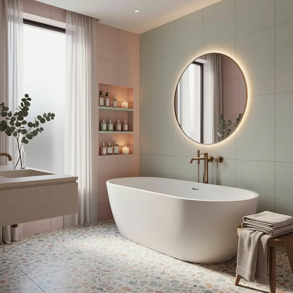
Pastel colors get a reputation for looking sweet in a way that doesn’t always suit an adult space. The difference usually comes down to saturation and pairing, not the pastel itself.
A dusty, slightly muted pastel, think sage rather than mint, or dusty rose rather than bubblegum pink, reads as sophisticated in a way a brighter, more saturated pastel doesn’t. Pairing that muted tone with warm neutrals and natural materials keeps the palette grounded instead of tipping into something that feels more like a costume than a color scheme.
2. Choosing a Pastel Color That Suits Your Light and Layout
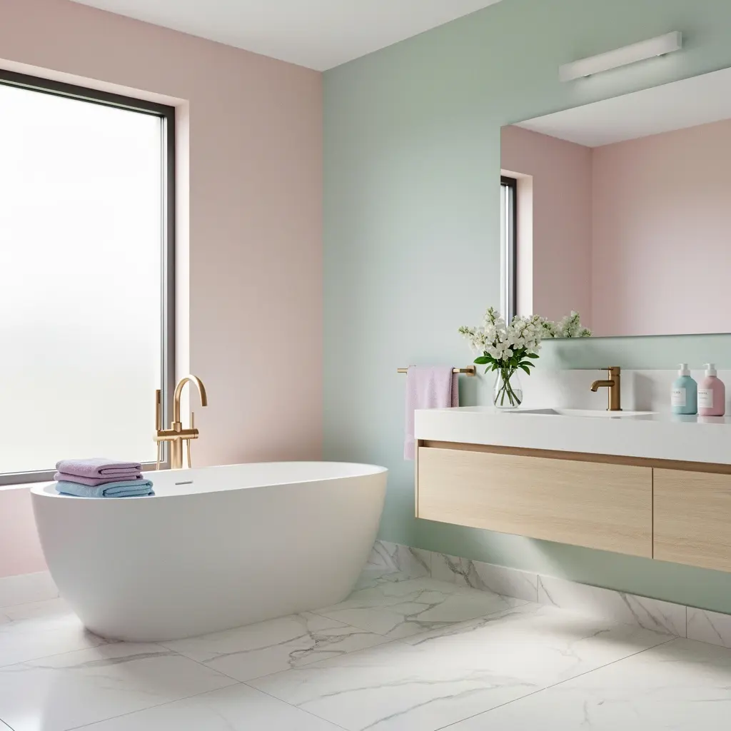
North facing bathrooms, which tend to get cooler, indirect light, often suit warmer pastels better, like a soft blush or a warm sage, since cooler pastels can read as flat or gray under that lighting. South facing rooms with more direct sun can handle cooler pastels, like a pale lavender or a soft periwinkle, without the room feeling washed out.
Layout matters too. A small powder room can handle a bolder pastel on all four walls, since the space is limited enough that the color reads as a design choice rather than an overwhelming amount of one tone. A larger primary bathroom often benefits from using the pastel more selectively, on tile or a vanity, with white or a light neutral carrying the rest of the walls.
Testing Color Before Committing
Bathroom lighting shifts a lot between daytime and evening, so it’s worth looking at a paint or tile sample under both before finalizing. A color that looks perfect at noon can shift entirely under warm evening bulbs.
3. Tile Options That Bring Pastel Tones to Life
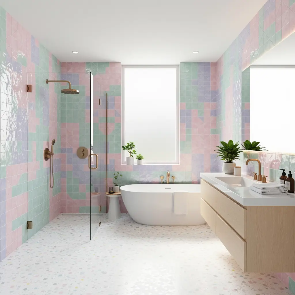
Tile carries more visual weight in a bathroom than paint does, simply because it covers more surface area and holds up to moisture better over time. Small format tile, like a scalloped or fish scale shape in a soft pastel, adds texture and pattern without needing a second color to compete with it.
Larger format pastel tile, especially in a matte finish rather than glossy, tends to look more current and less like a dated 1980s pastel bathroom. Matte finishes also hide water spots better than glossy tile, which matters in a room that deals with daily moisture.
Grout color matters more than people expect. A grout that closely matches the tile keeps the look soft and seamless, while a contrasting grout, even in a neutral tone, adds a grid pattern that can visually break up a pastel color in a way that either works beautifully or feels busy, depending on the tile shape.
4. Pairing Pastels With the Right Neutral Base
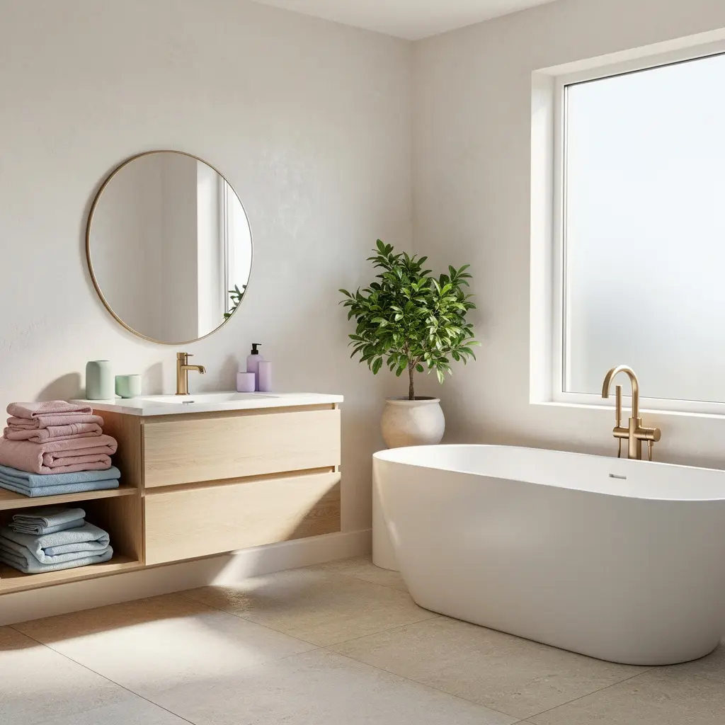
Pastels need a neutral to lean against, or the whole room can start to feel one note. Warm white, cream, and light oak tend to soften a pastel and keep it from feeling too sweet, while a crisp white or a cooler gray gives the same pastel a more modern, slightly sharper edge.
A quick rule that helps: aim for roughly 60 to 70 percent neutral and 30 to 40 percent pastel across the room, whether that split comes from tile placement, painted walls versus white trim, or a pastel vanity against a neutral wall.
Avoiding an Overly Matched Look
Using the exact same pastel shade across every surface, walls, tile, and towels, tends to look flat rather than intentional. Varying the shade slightly, a dustier version on tile and a slightly softer tone on textiles, adds depth without breaking the overall palette.
5. Fixture Finishes That Complement Soft Color Palettes
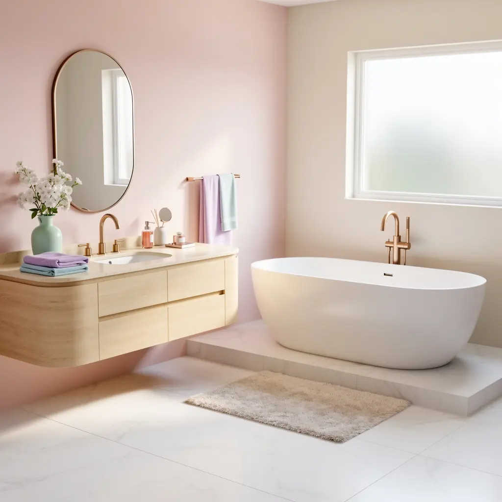
Brushed brass and unlacquered brass fixtures pair especially well with warmer pastels like blush or peach, adding a bit of warmth that chrome doesn’t offer. Matte black fixtures create more contrast against a pastel palette, which works well in a bathroom aiming for a slightly more modern, less exclusively soft look.
Polished chrome and nickel suit cooler pastels, like sage or pale blue, and tend to read as more classic than trend driven. Whatever finish gets chosen, keeping it consistent across the faucet, showerhead, and any hardware avoids a mismatched look that can undercut an otherwise well planned palette.
6. Textiles and Accessories That Reinforce the Look
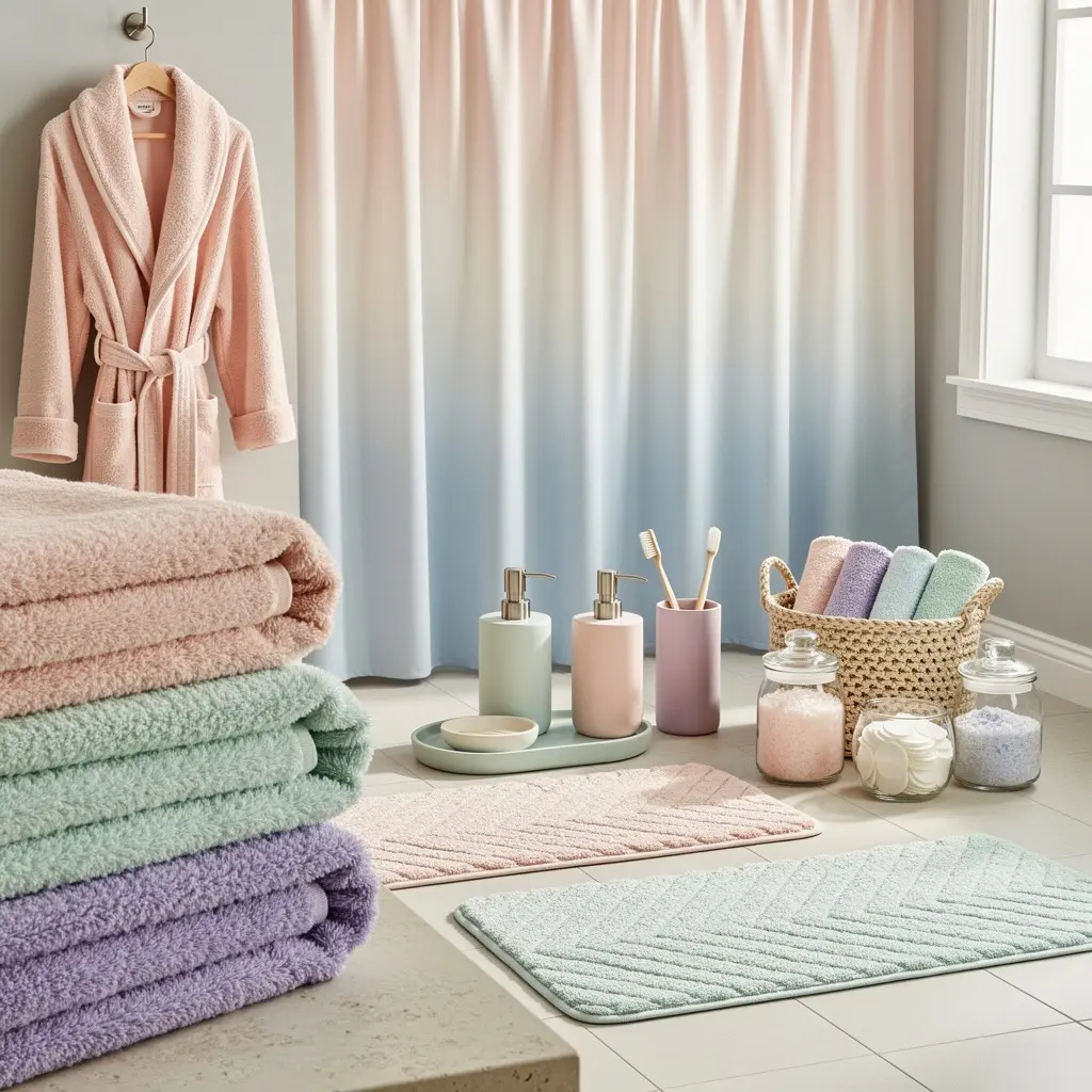
Towels in a slightly deeper or slightly lighter shade of the wall’s pastel tone add dimension without introducing a whole new color. A woven bath mat in a natural fiber, rather than a plain cotton mat, brings texture that keeps the soft palette from feeling flat.
Small accessories, a soap dish, a tumbler, a small tray, work best in a natural material like ceramic, marble, or wood rather than plastic, since plastic tends to look cheaper against a carefully chosen pastel backdrop. One or two accent pieces in a deeper, more saturated version of the pastel can ground the room without overwhelming the softer base tone.
7. Lighting Choices That Flatter Pastel Tones
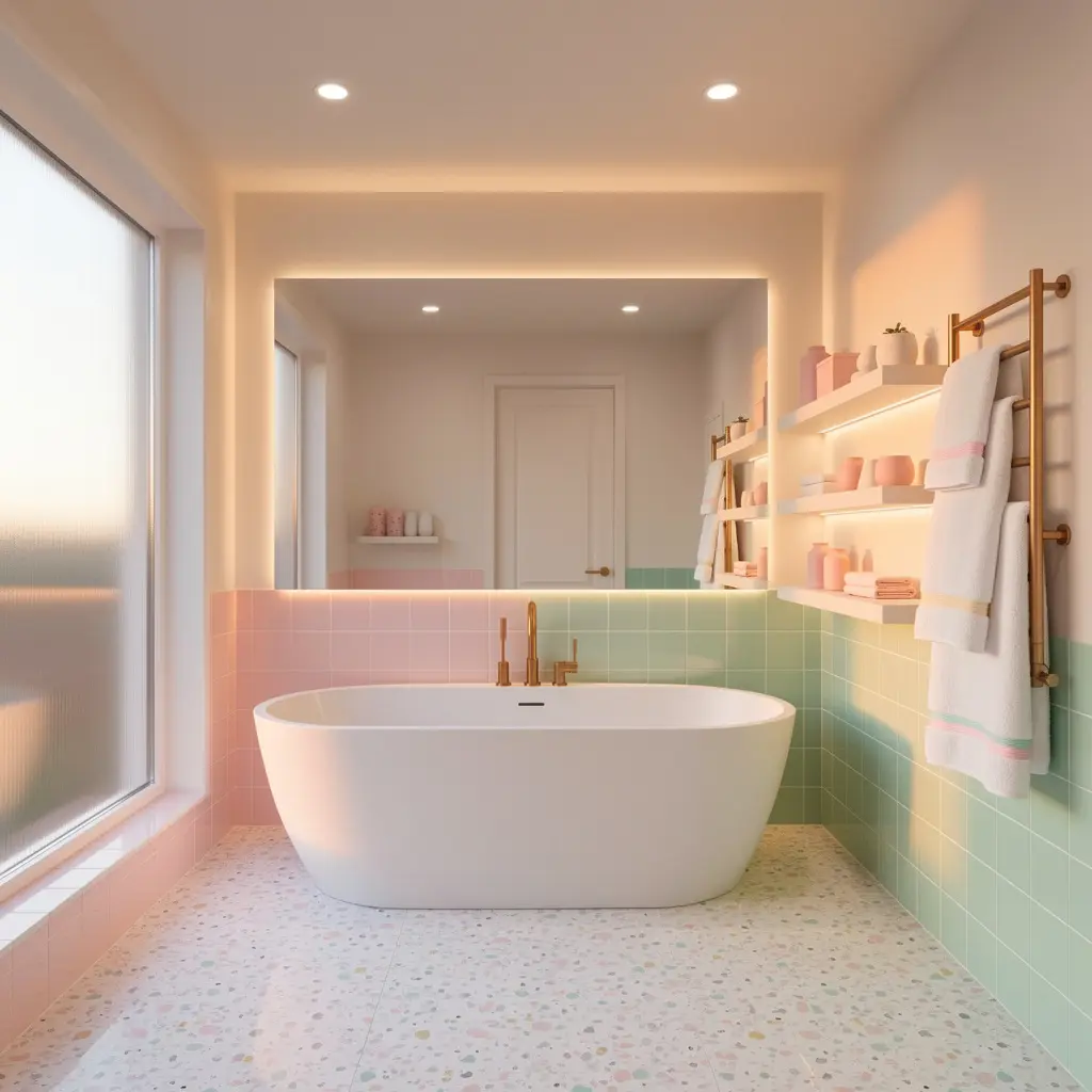
Warm white lighting, generally 2700K to 3000K, flatters most pastel tones better than cool or daylight bulbs, which can wash out a soft color and make it look grayer than intended. This matters especially around a mirror, where lighting affects both the room’s color and how flattering it feels to actually get ready in.
Layering in a small wall sconce or pendant beyond the standard vanity light adds warmth and shadow that makes the space feel more considered. A dimmer switch, where wiring allows for one, lets the room shift from bright and functional in the morning to soft and calming in the evening.
8. Small Bathroom Adjustments for a Big Pastel Impact
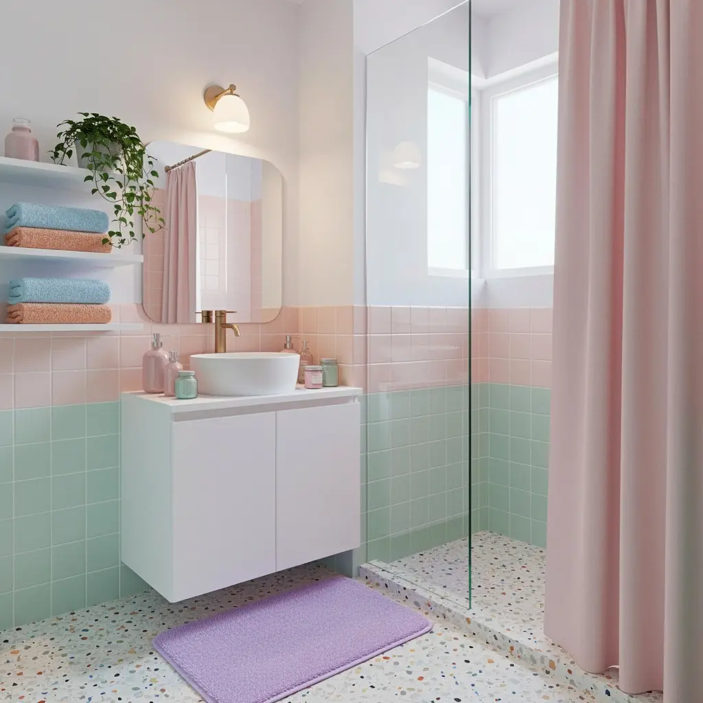
Not every pastel bathroom refresh requires new tile or a full renovation. Repainting just the vanity in a muted pastel, while keeping the walls neutral, brings in color at a much lower cost and effort than retiling.
Swapping out a shower curtain, hand towels, and a bath mat for pieces in a coordinated pastel tone changes the room’s whole feel for a relatively small amount of money. Even something as simple as a pastel tray on the counter, holding a few curated bottles, adds color without any permanent changes at all.
Key takeaway: the biggest visual impact often comes from the smallest, most flexible items in the room, not the fixed surfaces.
9. Budget Ranges for a Full or Partial Pastel Refresh
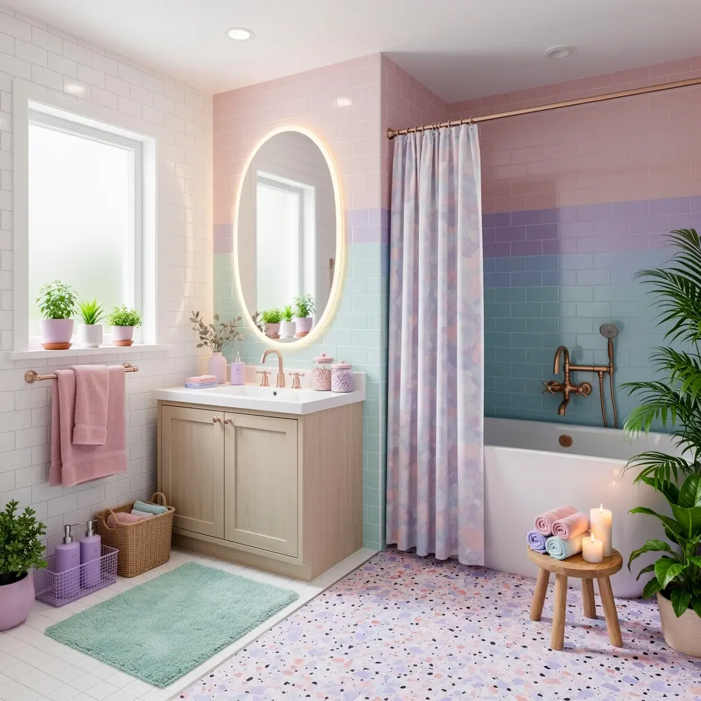
A full retile of a small bathroom, tile and labor included, often runs 2,000 to 5,000 dollars depending on tile choice and region, with pastel specialty tile generally costing more than a standard white subway tile. Repainting a vanity and walls, done as a DIY project, typically costs 60 to 150 dollars in paint and supplies.
New fixtures in a brushed brass or matte black finish generally run 80 to 250 dollars per piece, depending on whether it’s a faucet, showerhead, or full set. A textile and accessory refresh, towels, a bath mat, and a few small accessories, often lands somewhere between 80 and 200 dollars total, making it one of the more affordable ways to test a pastel palette before committing to anything permanent.
10. Keeping a Pastel Bathroom Looking Fresh Over Time
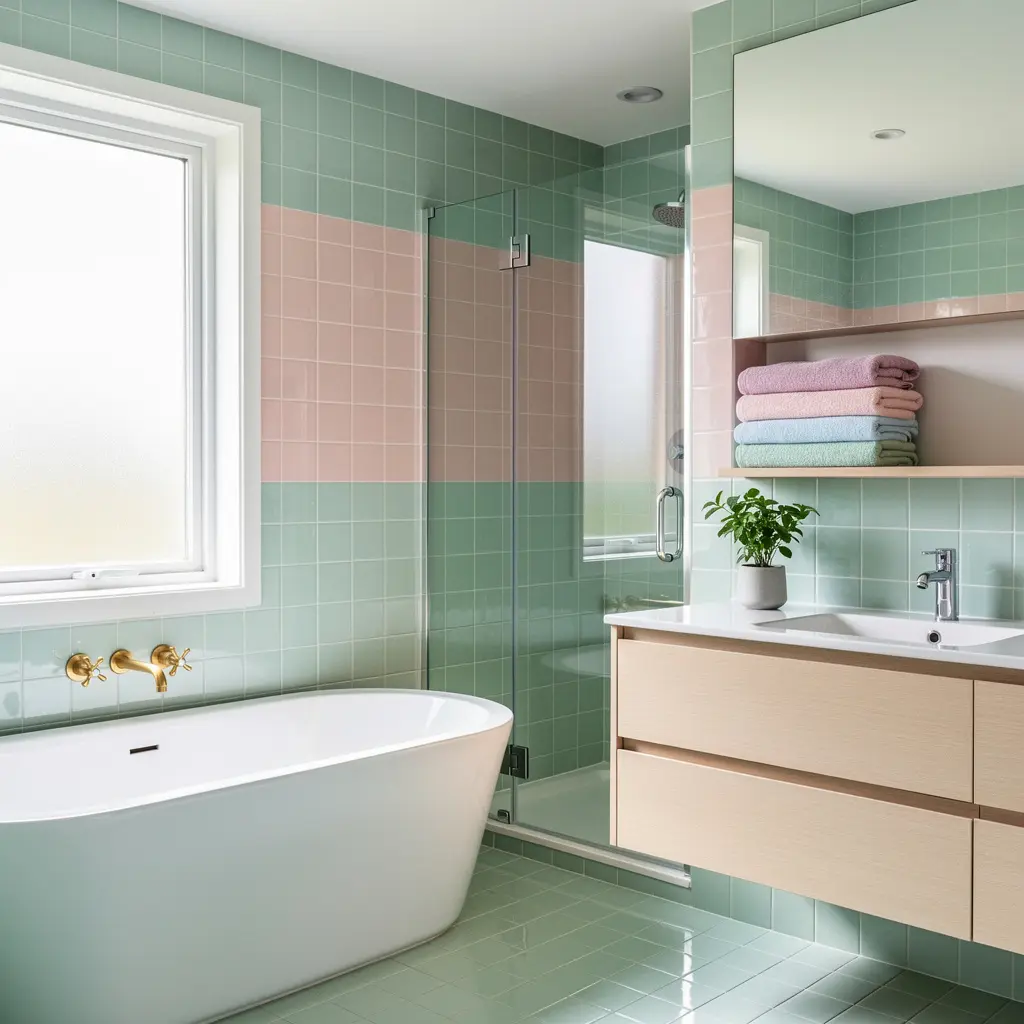
Pastel tile and paint show water spots and soap scum more visibly than a busier pattern would, so a quick wipe down after showers, particularly on tile, helps the color stay looking clean rather than dull. A gentle, non abrasive cleaner matters more here than in a neutral bathroom, since harsh chemicals can dull a pastel finish faster than a neutral one.
Textiles fade with repeated washing and sun exposure, so rotating in a fresh towel set every so often keeps the palette looking intentional instead of worn. If a pastel wall color starts to feel dated after a few years, it’s usually an easier refresh than retiling, since paint can be updated without touching any of the fixed surfaces in the room.
Mistakes to Avoid
- Choosing a highly saturated pastel that reads as childish rather than soft
- Matching every surface to the exact same pastel shade, which flattens the look
- Skipping a neutral base, leaving the whole room feeling one note
- Using glossy tile in a color that shows water spots more visibly
- Pairing warm pastels with cool toned fixtures, creating an unintentional clash
- Overlooking lighting temperature, which can wash out a carefully chosen color
Frequently Asked Questions
Will a pastel bathroom look dated in a few years? It depends on the shade and how it’s used. Muted, dusty pastels paired with neutral materials tend to hold up better over time than bright, highly saturated pastels, which trend in and out more quickly.
What’s the easiest way to try a pastel bathroom without a full renovation? Start with textiles and a painted vanity rather than retiling. Towels, a bath mat, and a repainted vanity bring in color at a fraction of the cost and can be changed again easily if the look doesn’t work out.
Do pastel bathrooms work in small spaces? Yes, and often better than in larger rooms. A small powder room can handle a bolder pastel across all the walls without it becoming overwhelming, since the space itself is limited.
What fixture finish works best with pastel tile? It depends on the pastel’s undertone. Warmer pastels like blush or peach pair well with brushed brass, while cooler pastels like sage or pale blue tend to suit chrome, nickel, or matte black better.
How do I keep a pastel bathroom from looking too sweet or juvenile? Lean toward muted, dusty versions of pastel colors rather than bright ones, and balance the palette with warm neutrals, natural materials, and consistent fixture finishes throughout the space.
Conclusion
A dreamy pastel bathroom comes down to restraint as much as color choice. Pick a muted shade that suits your room’s light, pair it with a solid neutral base, and keep fixture finishes consistent throughout. Whether it’s a full retile or just a few swapped textiles, the goal is a bathroom that feels soft and considered, not like color for the sake of color.