10 Modern Off White, Charcoal Blue, and Light Grey Dining Room Ideas for a Luxury Look
You went with a neutral palette for your dining room because you wanted something that felt calm and expensive. Instead the room ended up looking flat, like a hotel lobby nobody bothered to finish styling. That’s the risk with an all neutral scheme. Off white, charcoal blue, and light grey are a genuinely strong combination for a modern dining room, but only when each tone is doing a specific job in the space.
These ten ideas walk through exactly how to divide the work between the three colors, plus where to add texture and warmth so the room reads luxury instead of empty. By the end, you’ll have a clear plan for walls, furniture, lighting, and the small details that make a neutral dining room feel finished.
1. Understand How These Three Tones Work Together
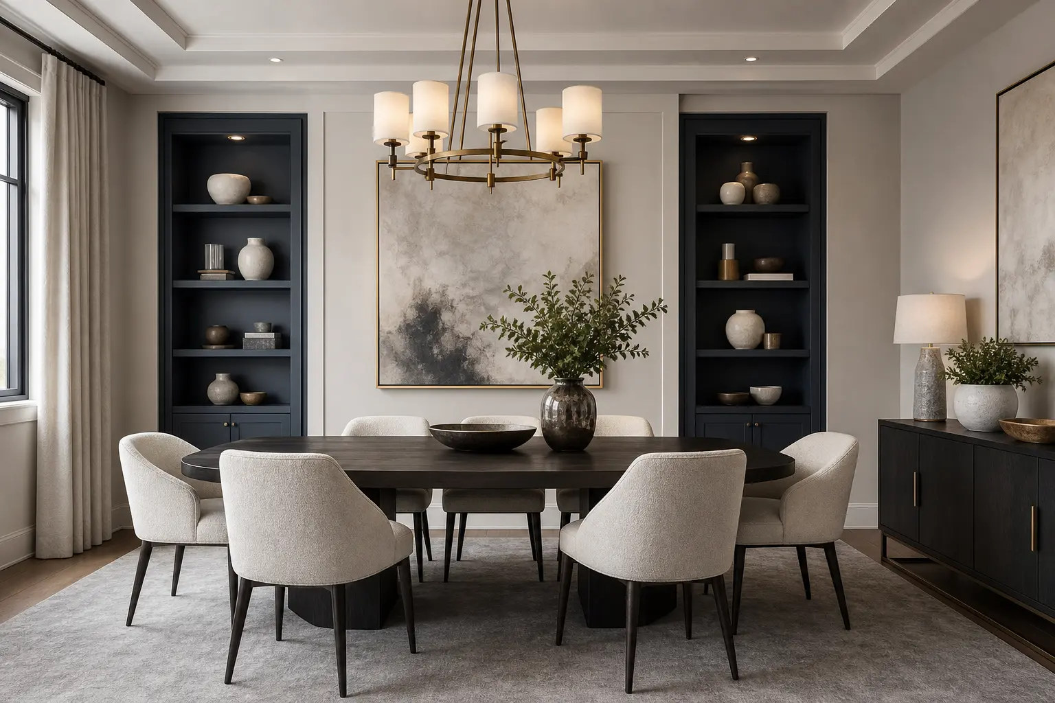
Off white, charcoal blue, and light grey sit at three different points on the value scale, from very light to very dark. That range is what makes the combination work. If all three tones were closer in lightness, the room would look muddy and hard to read. Instead, think of off white as your lightest surface, light grey as your middle tone, and charcoal blue as your darkest, most grounding color.
A simple starting ratio is roughly 60 percent off white, 30 percent light grey, and 10 percent charcoal blue. That keeps the room feeling open and bright while still giving it the depth and moodiness that charcoal blue brings. You can shift this ratio once you know the look you want, but it’s a solid place to start.
2. Use Off White as Your Wall and Ceiling Base
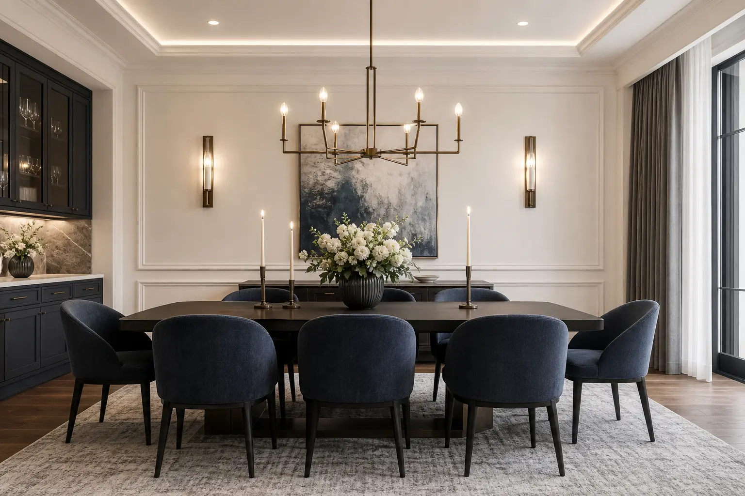
Off white on the walls and ceiling gives the room a soft, warm backdrop rather than the starker look of pure white. Look for an off white with a hint of warmth in it, since a cooler, blue leaning white can start to feel sterile next to charcoal blue furniture. Most paint brands offer a warm off white in their neutral collection, often described as a “linen” or “cream” white on the swatch.
Why the Ceiling Matters Too
Painting the ceiling the same off white as the walls, rather than leaving it stark white, removes a harsh line where wall meets ceiling. This makes the room feel taller and more cohesive. It’s a small detail that a lot of dining rooms skip, and it’s one of the easiest ways to make the space feel more considered.
3. Bring in Charcoal Blue Through Furniture, Not Just Accents
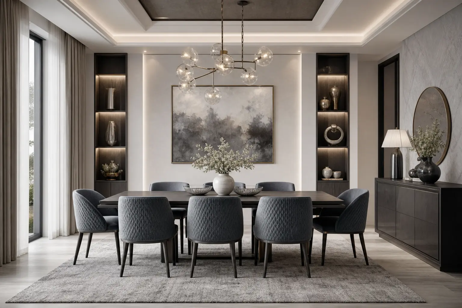
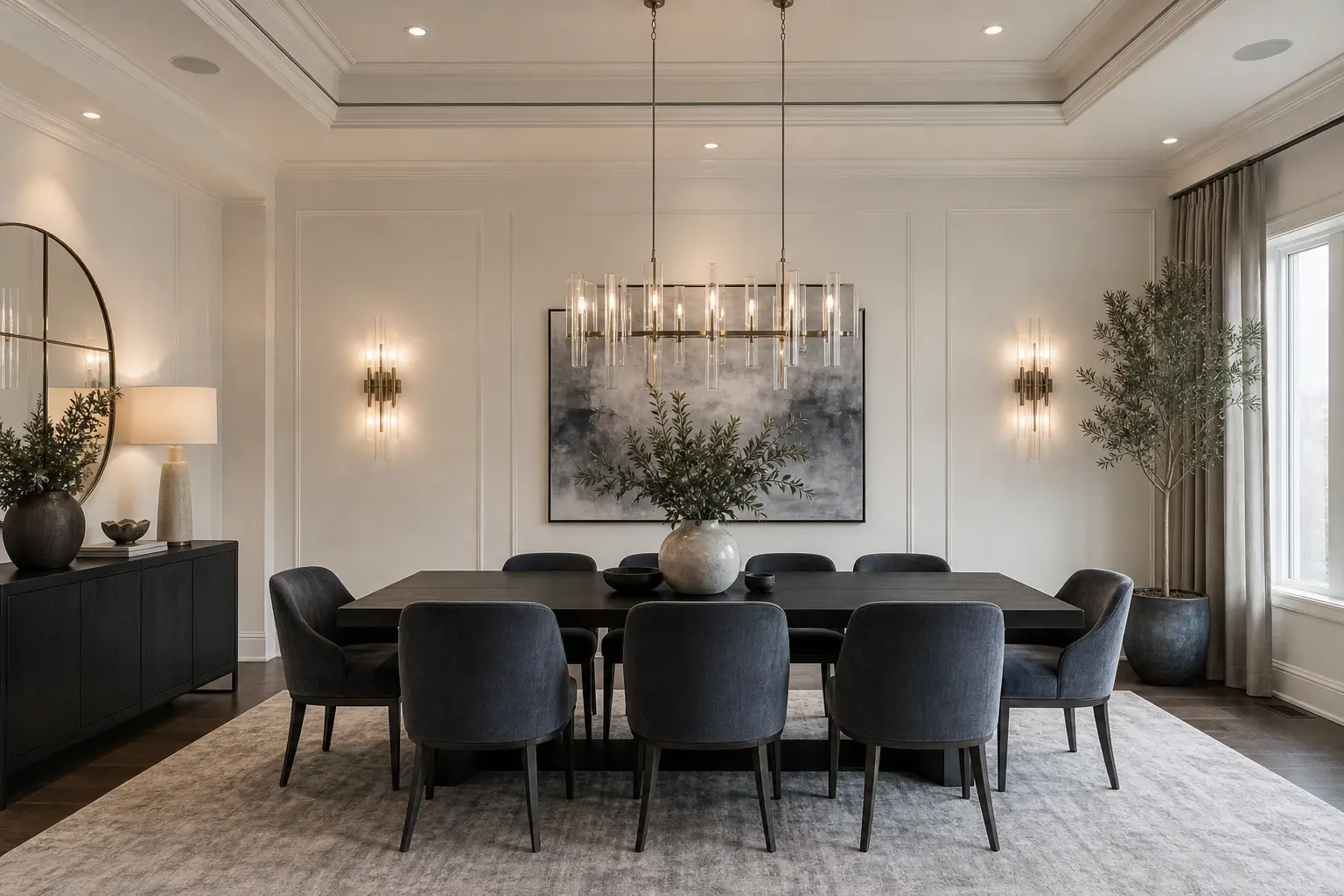
Charcoal blue is the anchor color in this palette, so give it a real job rather than tucking it into a single throw pillow. A charcoal blue buffet or sideboard, a set of dining chairs in a charcoal blue fabric, or even charcoal blue lower cabinets in a built in hutch all give the color enough presence to matter.
Using charcoal blue on a large piece of furniture, rather than the walls, also keeps your options open. Furniture is easier and cheaper to change than a full room repaint if your taste shifts later. It also gives the room a clear focal point, since the eye naturally goes to the darkest object in a mostly light space.
4. Add Light Grey Through Textiles and Flooring
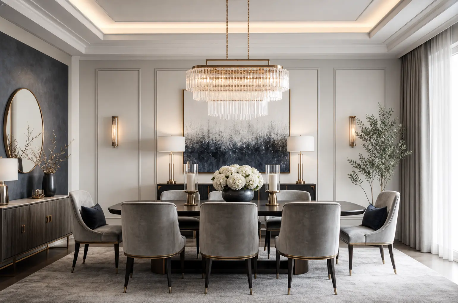
Light grey works best as the connective tissue between off white walls and charcoal blue furniture. A light grey area rug, curtains, or dining chair cushions bridge the gap between the two more extreme tones. Without this middle step, the jump from very light walls to very dark furniture can feel abrupt.
If your flooring is already a light grey toned wood or tile, you’re most of the way there already. If not, a light grey rug is the fastest way to introduce this middle tone, and it also helps define the dining area if it’s part of an open floor plan.
5. Choose Metal Finishes That Read Luxury, Not Cold
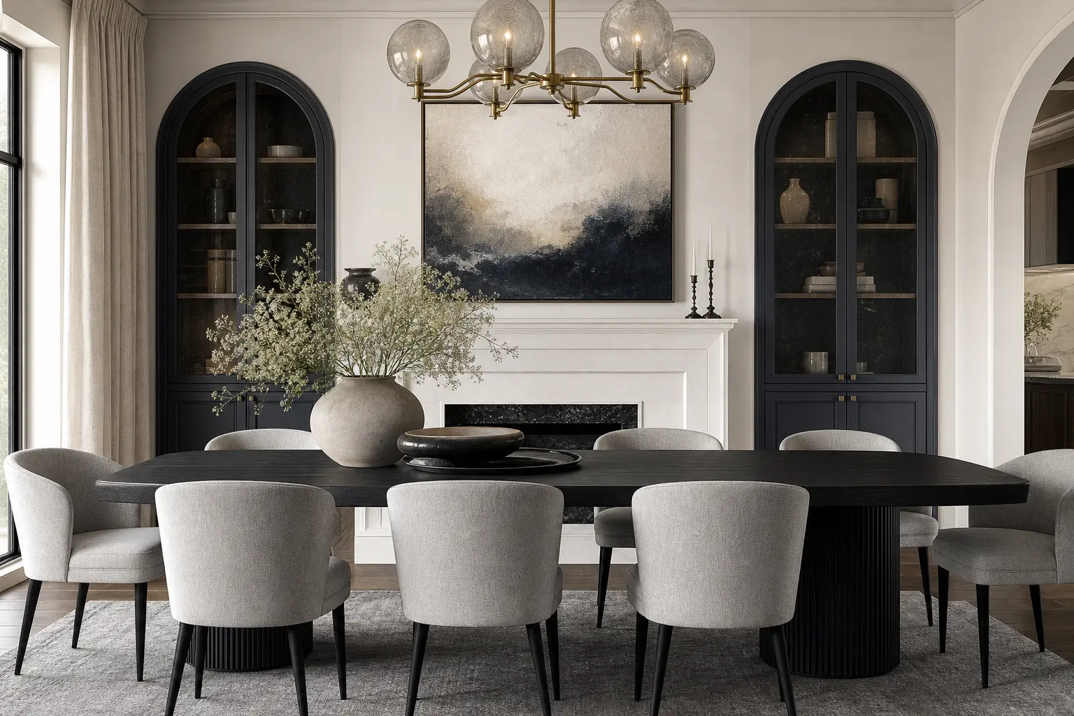
Metal finish has a bigger effect on this palette than most people expect. Brushed nickel and chrome, paired with a lot of grey and blue, can tip the whole room toward cold and corporate. Warm metals like brass, aged brass, or matte black instead push the same palette toward luxury and intention.
Pick one metal finish and repeat it across the room, on the light fixture, drawer pulls, and any picture frames. A single consistent metal finish reads far more expensive than several different finishes scattered around, even if the individual pieces cost the same amount.
6. Layer Textures So Three Neutrals Don’t Feel Flat
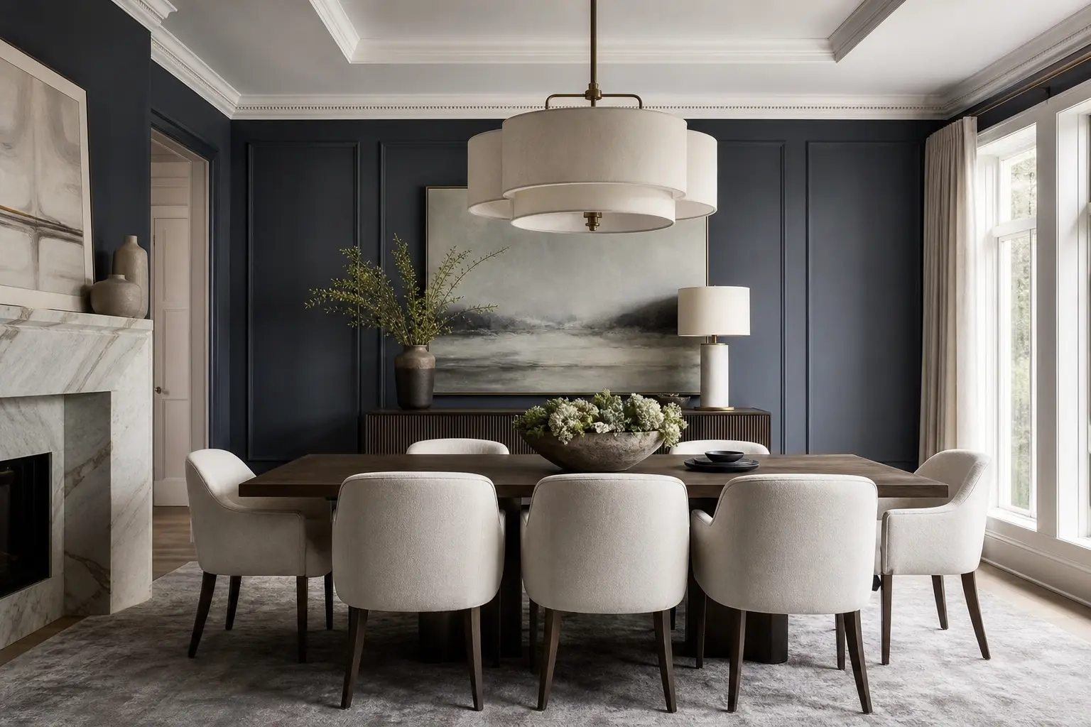
With no bright colors doing the visual work, texture has to carry more of the room. A smooth painted wall next to a woven grass cloth accent, a matte ceramic vase next to a glossy charcoal blue lacquered buffet, all of these contrasts keep a neutral room from reading as boring.
Aim for at least three different textures in the room. That might be a woven rug, a linen tablecloth, and a lacquered or high gloss piece of furniture. Mixing matte and shine this way is often what separates a room that feels expensive from one that just feels empty.
7. Pick a Lighting Fixture That Feels Substantial
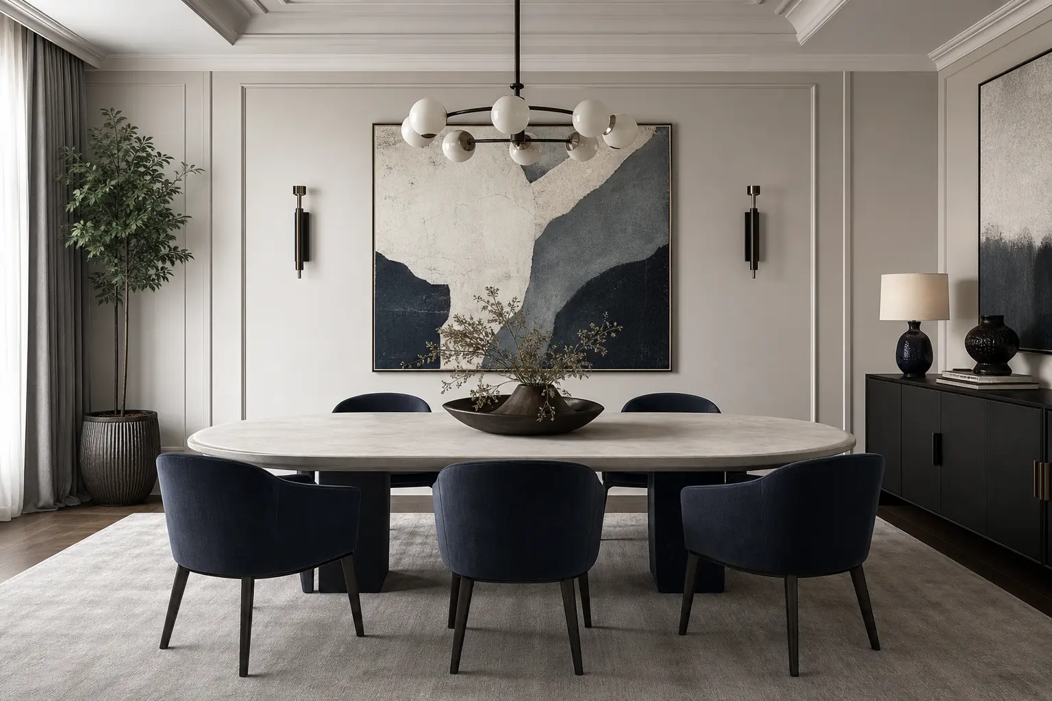
A neutral palette can absorb a lot of visual weight, so don’t be afraid of a lighting fixture with real presence. A large linear chandelier, a cluster of glass pendants, or a fixture in a matte black or aged brass finish all work well against off white walls and give the room a clear focal point above the table.
As a general sizing guide, hang the fixture about 30 to 34 inches above the tabletop for standard ceiling heights, and choose a fixture roughly half to two thirds the width of the table itself. In a room this pared back on color, a fixture that’s too small will look lost rather than intentional.
8. Use Art to Introduce Depth Without New Colors
Black and white photography, abstract charcoal or grey toned paintings, and simple line art all add visual interest without breaking the neutral palette. A large piece over the buffet, or a gallery wall of smaller pieces in matching frames, gives the eye somewhere to land besides the furniture.
Keep frame finishes consistent with your other metal choices in the room. If you’ve gone with brass hardware elsewhere, brass or wood frames will feel more unified than a mix of black, silver, and gold all on the same wall.
9. Add One Warm Material to Keep the Room From Feeling Sterile
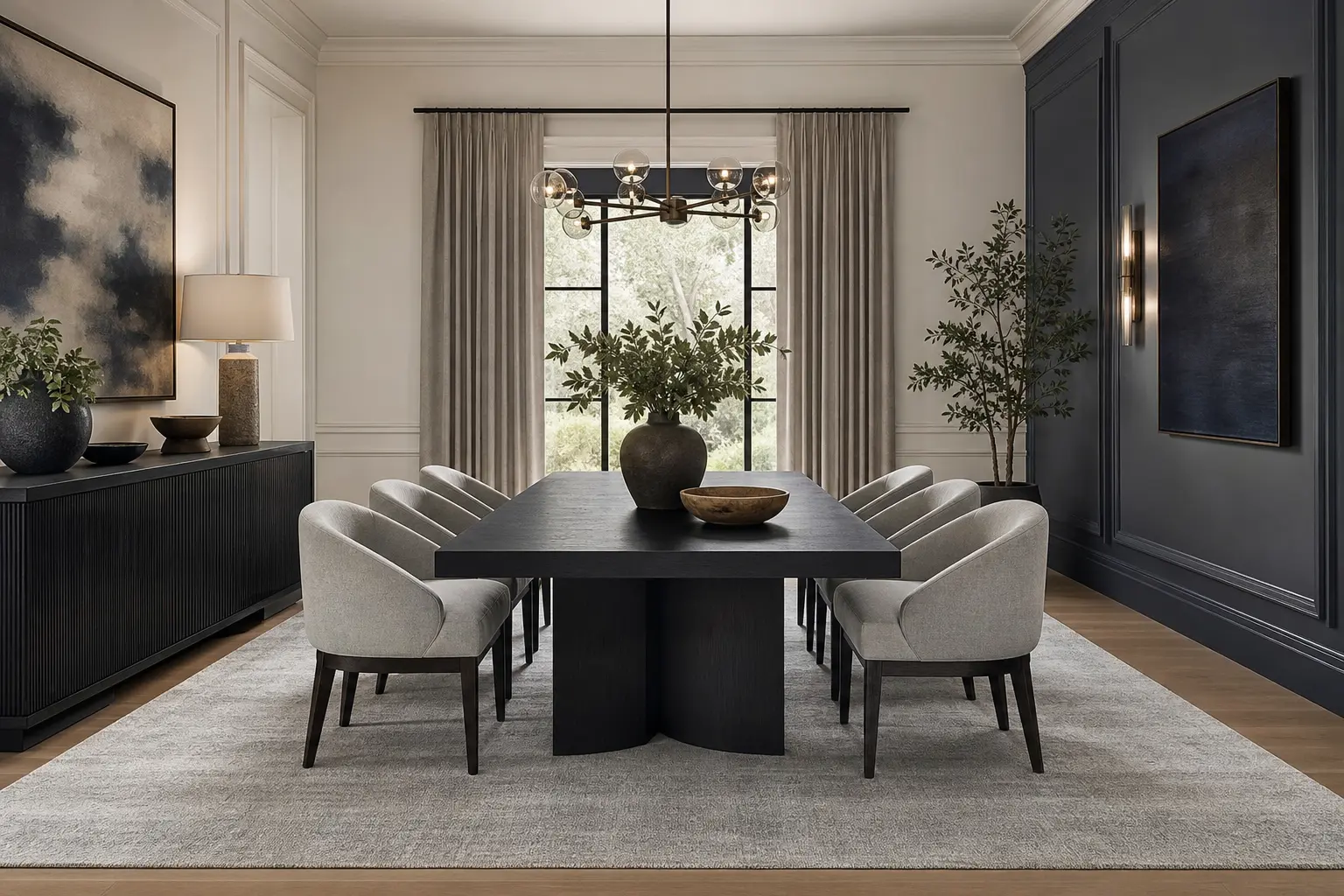
A palette built entirely from off white, charcoal blue, and grey can tip cold if there’s nothing warm to balance it. A wood dining table, rattan chair backs, or a leather seat cushion all bring a natural, warm material into the mix without adding a new color to manage.
Walnut or a warm oak both work well here, since their reddish and golden undertones contrast nicely against the cooler blue and grey. Even one warm wood piece, like the dining table itself, can be enough to keep the whole room from feeling like a showroom rather than somewhere you’d actually want to eat dinner.
10. Style the Table for an Elevated, Everyday Look
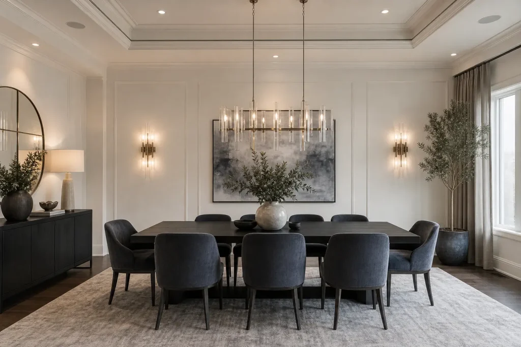
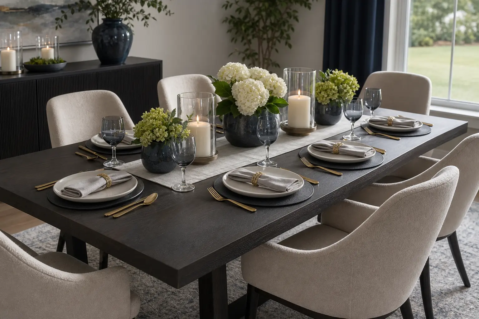
For everyday use, keep the table setting simple. White or cream stoneware, a linen runner in off white or light grey, and a low ceramic vase with a few stems keep the look clean without much daily effort. Save charcoal blue linens or dinnerware for dinner parties and holidays, where a bolder moment feels intentional rather than everyday clutter.
Candles in a warm metal holder, matching whatever finish you’ve used elsewhere in the room, add a quick layer of luxury for evening meals. This is a low cost way to make the space feel considered without buying anything new for the room itself.
Mistakes to Avoid
- Using cool, blue leaning white paired with silver or chrome, which pushes the whole room cold
- Keeping charcoal blue confined to a single small accessory, so it never reads as a real design choice
- Skipping texture entirely, which leaves an all neutral room looking flat under most lighting
- Mixing three or more different metal finishes in the same room
- Choosing a lighting fixture that’s too small for a room built around bold color contrast
- Leaving out any warm material, which can make the whole space feel more like an office than a home
Frequently Asked Questions
Will an all neutral dining room feel boring? Not if each tone has a clear job and the room includes real texture and at least one warm material. A neutral palette only feels boring when every surface is smooth, flat, and close to the same value.
What wood tone works best with charcoal blue and grey? Warm woods like walnut and oak generally work better than very pale, blonde woods, since the warmth contrasts nicely against the cooler blue and grey tones in the room.
Is charcoal blue too dark for a small dining room? Using charcoal blue on furniture rather than all four walls keeps a small room from feeling closed in. A single charcoal blue piece against off white walls can actually make a small room feel more defined rather than smaller.
How do I keep this palette from looking cold? Stick to warm metal finishes like brass over chrome or nickel, add at least one warm wood or leather piece, and use warm bulb lighting in the 2700 to 3000 Kelvin range rather than a cooler, bluer light temperature.
Do I need to repaint the whole room to get this look? No. If your walls are already a neutral off white or light grey, you can build most of this palette through furniture, a rug, and lighting alone, without repainting anything.
Conclusion
This palette works when off white, charcoal blue, and light grey each get a specific role instead of getting blended together evenly. Let off white handle the walls, light grey bridge the gap through textiles, and charcoal blue anchor the room through furniture. Add real texture and one warm material, and a scheme that could easily look flat instead reads as genuinely luxury and considered.