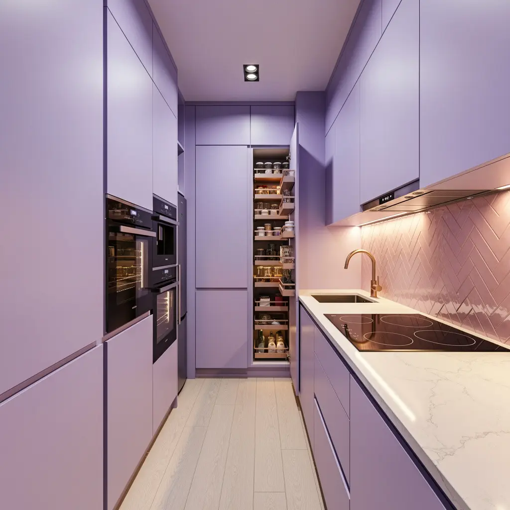
10 Luxury Lavender and Pastel Kitchen Ideas That Feel Elevated
Pastel kitchens carry baggage. Say lavender cabinets out loud and a lot of people picture something closer to a candy shop than a place they’d actually want to cook dinner. That old association is exactly what this year’s version of pastel kitchens is working against. Lavender, sage, and soft blue are back, but chalky and architectural now, not sugary. Paired with the right materials, a pastel palette comes across as genuinely upscale rather than playful.
1. Choose a Muted, Chalky Version of Lavender
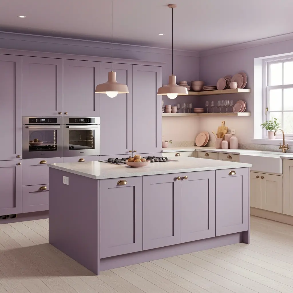
Skip anything close to bright violet or Easter egg purple. The lavender working in kitchens right now sits closer to a soft, dusty gray-lavender, near weightless, closer to fog than flower. Sherwin-Williams named a shade like this Modern Lavender for their 2026 forecast, and it keeps turning up in cabinetry mock-ups precisely because it lands as sophisticated rather than sweet.
A chalky lavender behaves almost like a neutral. It shifts depending on the light in the room and the materials around it, which is part of why it pairs so easily with almost anything else on this list.
2. Pair Pastel Cabinetry With Natural Stone Countertops
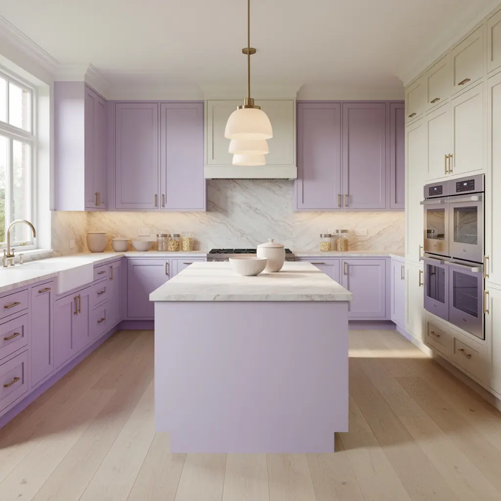
Quartzite remains the material to reach for in a high end kitchen, prized for veining that looks genuinely organic and durability that holds up to daily cooking. Set against a soft lavender or sage cabinet, a natural stone countertop keeps the whole kitchen grounded, so the pastel color becomes one layer in the room instead of carrying the entire look on its own.
Why Stone Balances a Soft Color So Well
Stone has weight and unpredictability built into its natural veining, and that visual complexity offsets a flat, single toned cabinet color. Without it, a pastel kitchen can start to feel one dimensional no matter how nice the paint color is on its own.
3. Use Matte Brass or Warm Metal Hardware
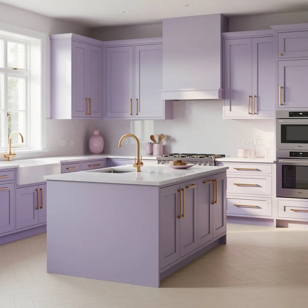
Cool chrome against lavender or pale blue can tip a kitchen back toward that sweeter, more retro feeling. Matte brass or a warm, slightly aged gold finish does the opposite. It grounds the softness and adds a bit of quiet luxury without shouting about it. This pairing shows up constantly in current kitchen mock-ups for exactly that reason.
4. Bring in Warm Wood for Contrast
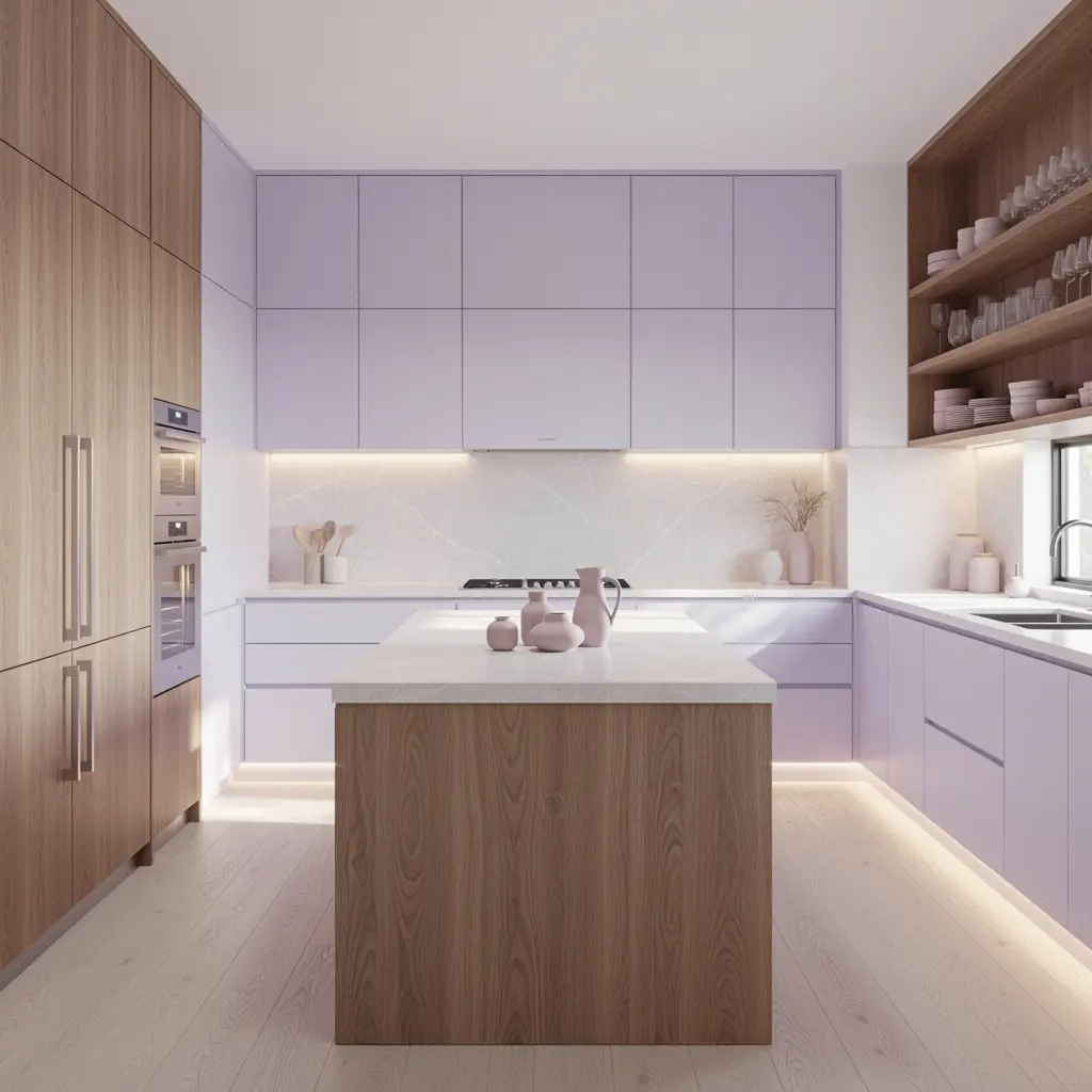
A pastel cabinet next to warm oak open shelving, a butcher block island, or simply a wood cutting board leaned against the backsplash keeps the palette from feeling too cool or too precious. Wood adds the same kind of visual weight that stone does, and it’s often the cheaper way to bring that balance into a kitchen that isn’t getting a full countertop replacement.
5. Keep the Layout Tight and Functional
This year’s kitchens are leaning into layouts that tighten around actual workflow instead of decorative flourish, with cooktops disappearing flush into countertops and storage kept ready but out of sight. A pastel palette works especially well with this kind of restraint, since a soft color holds up better in a clean, uncluttered layout than in a busy one packed with visible small appliances and open counters.
6. Choose One Pastel as the Lead, Not Several at Once
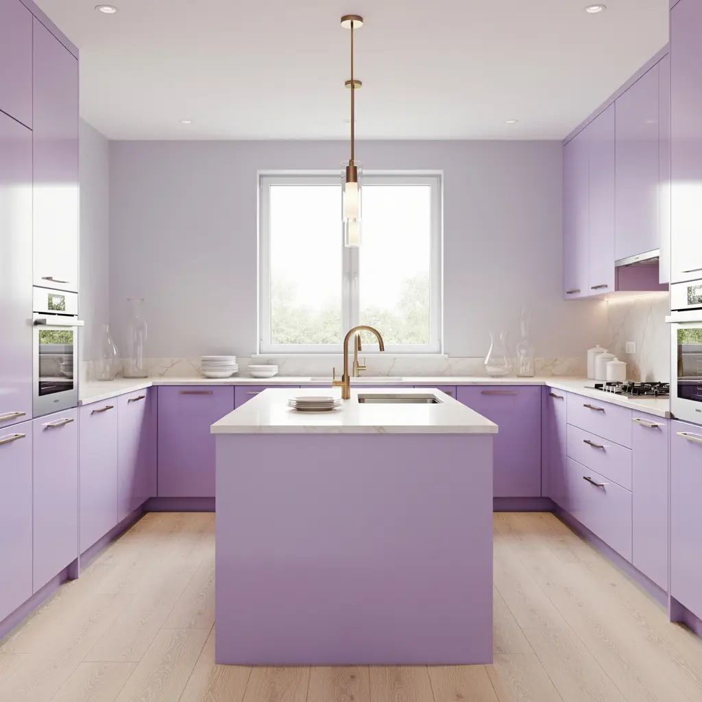
Lavender as the main cabinet color, with maybe a single accent like sage green on an island or blush on a small run of open shelving, looks deliberate rather than accidental. Mixing three or four different pastels across the same kitchen usually tips into busy instead. One color leads. Everything else supports it.
Where a Second Pastel Works Best
An island, a pantry interior, or a single wall of open shelving are the safest spots to introduce a second pastel tone, since they’re contained enough not to compete with the main cabinetry.
7. Add Floral or Botanical Touches With Restraint
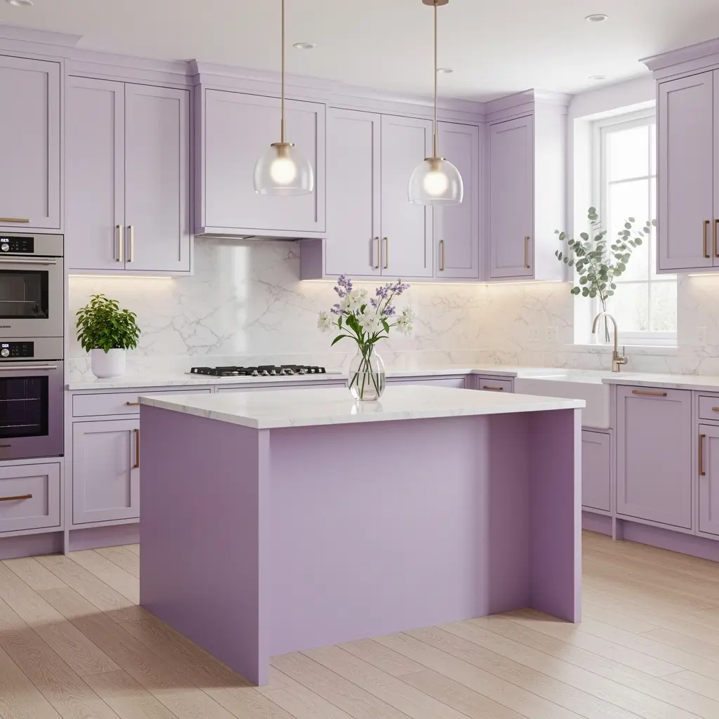
A few dried flowers in a stoneware vase, or a single piece of floral patterned dishware displayed on open shelving, nods to the romantic side of a pastel kitchen without tipping the whole room into overtly themed territory. The goal is a hint of softness, not a full countryside cottage recreation.
8. Use Single Color Blocking for a Modern Edge
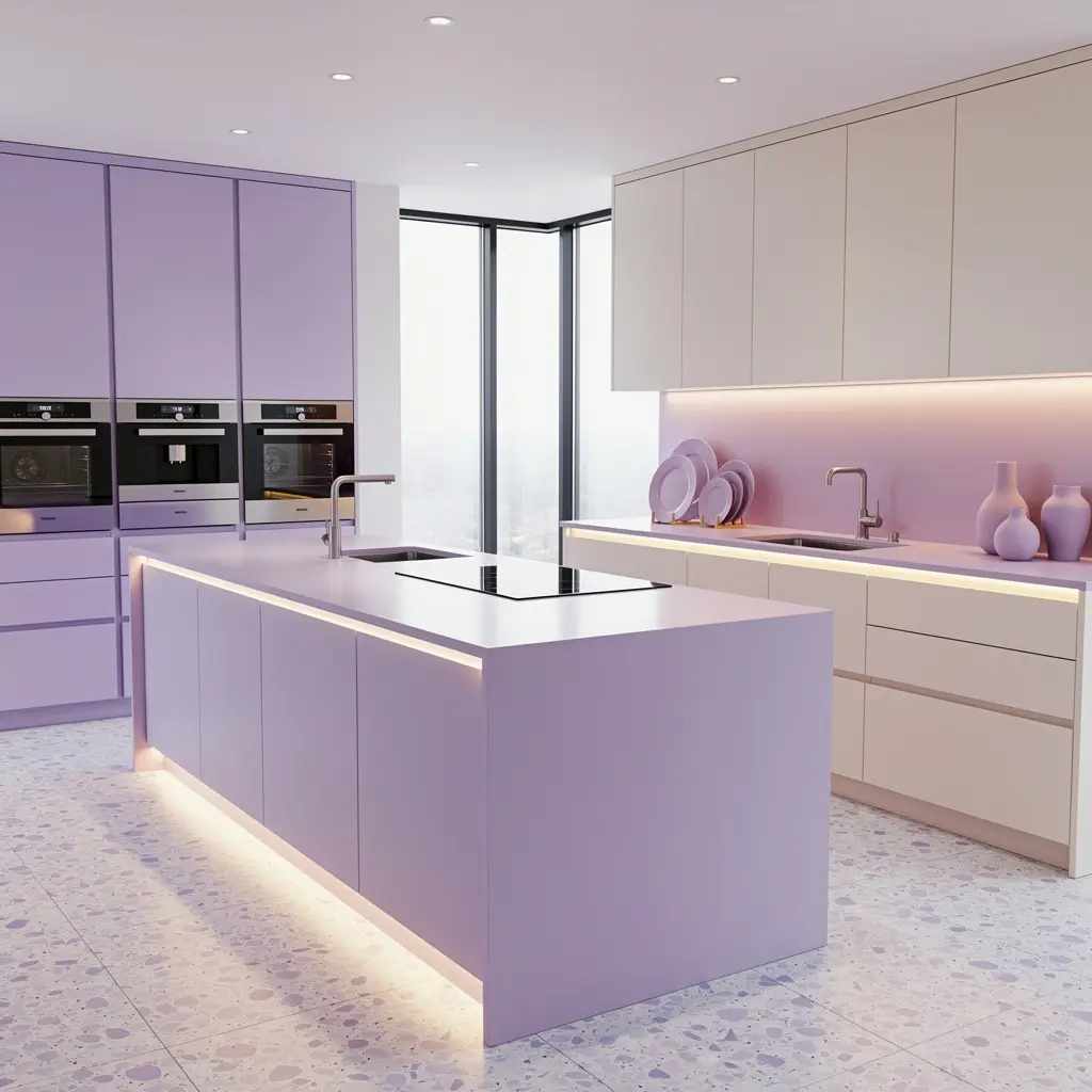
Rather than mixing lavender with several other colors, some 2026 kitchens are leaning into single color blocks, painting cabinetry, walls, and even ceilings in variations of the same muted pastel. This monochromatic approach feels considerably more architectural and current than a scattered, multicolor pastel kitchen from a decade ago.
9. Let Natural Light Shape Which Pastel You Choose
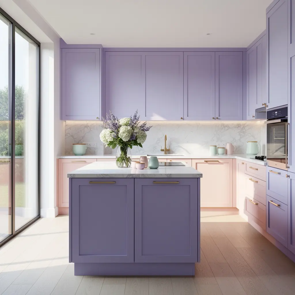
A north facing kitchen with cooler, indirect light tends to suit a warmer pastel, like a blush or soft peach, better than a cool lavender, which can look flat without warm sunlight hitting it. A kitchen that gets strong afternoon sun has more room to work with a cooler lavender or pale blue, since the light itself supplies warmth the color doesn’t have on its own.
10. Pair the Palette With Textural, Tactile Materials
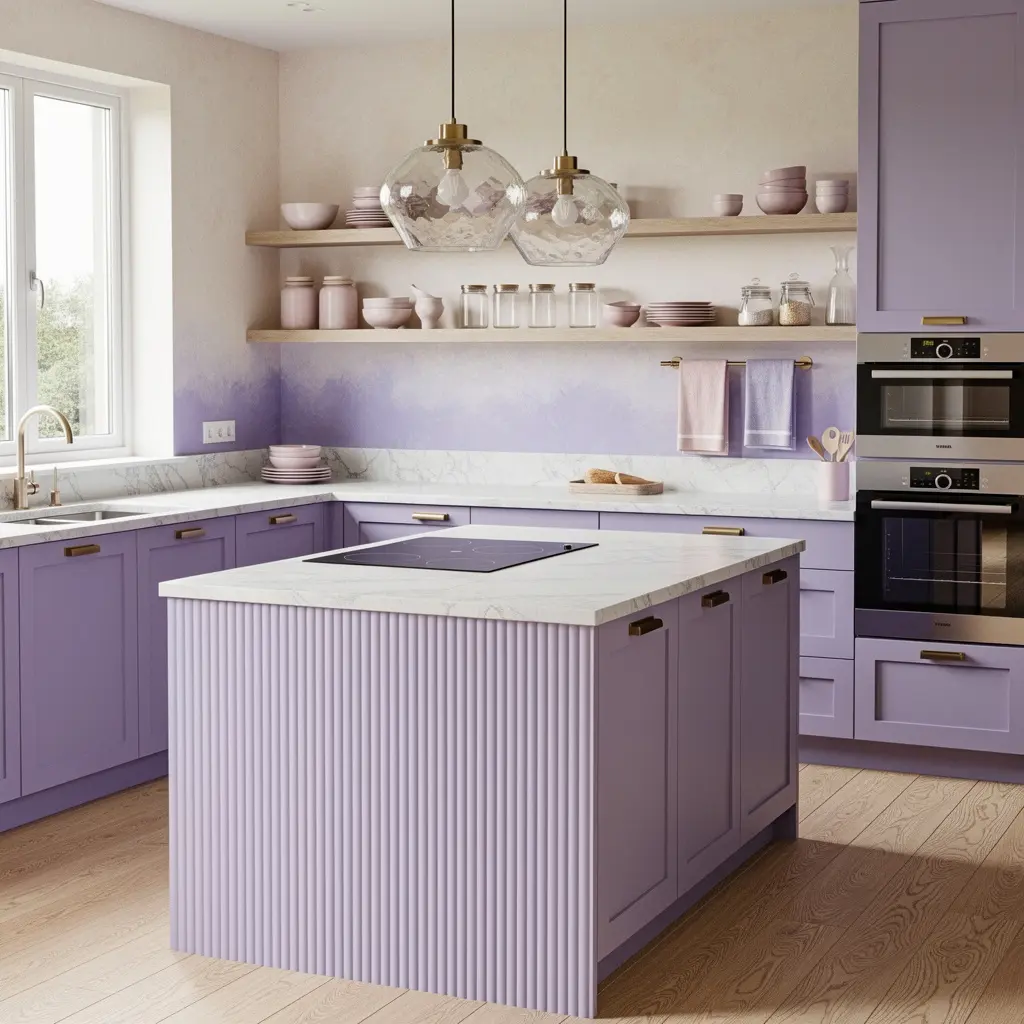
Woven baskets, linen tea towels, a textured backsplash tile. These small material choices keep a pastel kitchen from feeling flat or overly polished. The interior design trend toward richer, more expressive kitchens this year isn’t really about color alone. It’s about texture and material working together, and a soft cabinet color needs that texture around it just as much as a bolder one would.
Mistakes to Avoid
- Choosing a bright, saturated lavender instead of a muted, chalky version that reads as sophisticated
- Pairing pastel cabinets with cool chrome hardware instead of warm brass or aged gold tones
- Mixing too many different pastel colors in one kitchen instead of choosing one lead color
- Skipping natural stone or wood, which leaves a pastel kitchen feeling flat and one dimensional
- Overcrowding the kitchen with visible small appliances, which undercuts the clean, tight layouts pastel palettes pair best with
- Ignoring the room’s natural light when choosing between a warmer or cooler pastel shade
Frequently Asked Questions
Will a lavender kitchen feel dated in a few years? A muted, chalky lavender is being positioned as a longer term neutral rather than a fleeting trend, especially when paired with natural materials like stone and wood instead of an all pastel, fully matched scheme.
What countertop works best with a lavender or pastel kitchen? Natural quartzite is a common high end pairing, since its organic veining adds visual complexity that balances out a soft, flat cabinet color. Engineered quartz with marble like veining is a lower maintenance alternative that achieves a similar effect.
Is lavender a good choice for a small kitchen? Yes. Light pastel shades like lavender or soft blue tend to add a sense of calm in a smaller kitchen without darkening the space the way a deeper color might.
Do pastel kitchens work in modern homes, or only traditional ones? Both. Single color blocking and pairing pastels with matte brass and natural stone gives the palette a more architectural, current feel that fits modern kitchens, while classic detailing and floral touches lean the same color toward a more traditional look.
How do I keep a pastel kitchen from feeling too sweet? Limit the palette to one lead pastel color, pair it with natural stone or wood, and choose warm metal hardware over anything too shiny or cool toned.
Conclusion
A luxury lavender or pastel kitchen comes down to restraint. One muted, well chosen shade, paired with natural stone, warm wood, and metal finishes that ground the softness instead of amplifying it. Start with the cabinet color and countertop pairing, since those two choices set the tone for everything else, and build the rest of the kitchen’s texture and detail from there. Done this way, pastel reads as considered, not cluttered.