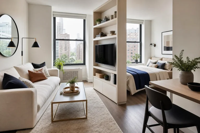
10 Cozy Brown and Cream Living Room Decor Ideas for a Warm, Elegant Look
Trend driven color palettes come and go fast, and a living room built entirely around one can start to feel dated within a couple of years. Brown and cream sidestep that problem. The pairing has shown up in interior design for decades because it works, not because it’s currently trending. These cozy brown and cream living room decor ideas focus on getting that warm, elegant look right without it feeling like a passing moment.
1. Why Brown and Cream Holds Up Better Than Trend Driven Palettes
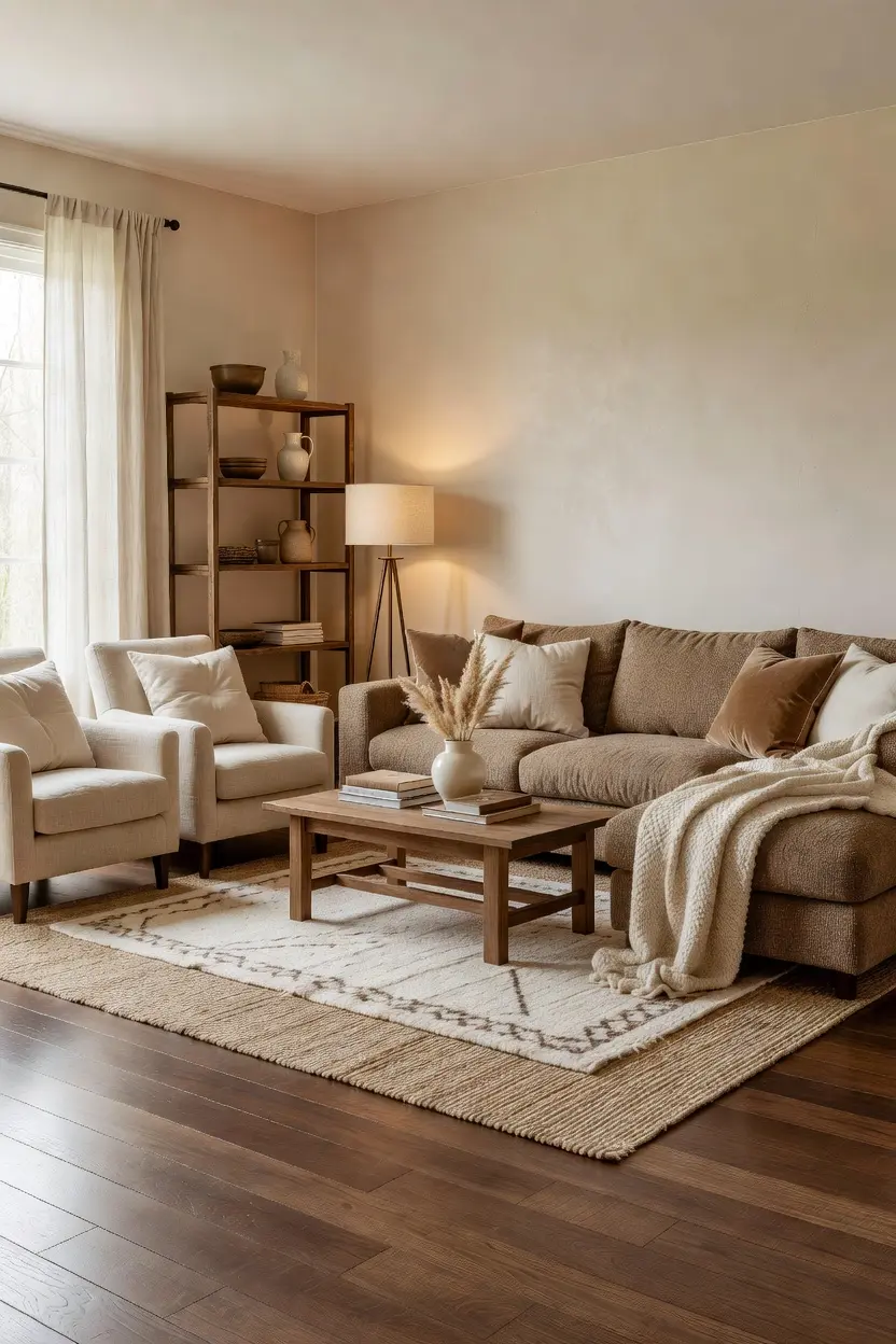
Brown and cream both function closer to neutrals than true colors, which is exactly why the pairing doesn’t date the way a bold, saturated palette does. Neither tone competes for attention, so the room reads as sophisticated rather than like it’s chasing a specific decade or aesthetic.
There’s also a flexibility argument. Furniture, art, and accent pieces in almost any other color slot easily into a brown and cream base, which makes the palette easier to live with and update over time compared to a room built around a more specific, trend driven color.
2. Choosing the Right Brown Tone for Your Room
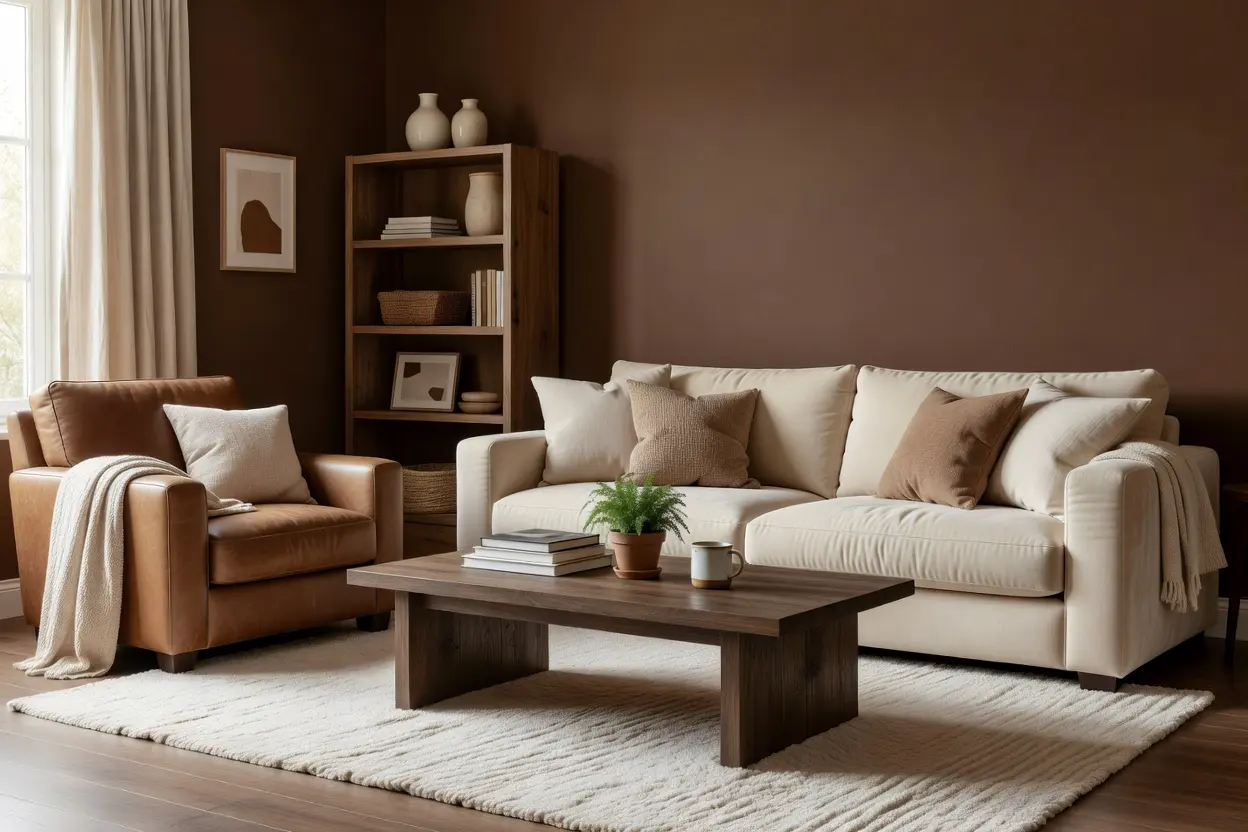
Not every brown reads the same way. A warm, reddish brown, closer to a cognac or chestnut, feels rich and inviting, while a cooler, more muted brown, closer to a taupe or mushroom tone, feels a bit more modern and understated.
North facing rooms, with cooler indirect light, generally suit a warmer brown better, since cooler light can pull a muted brown toward gray. South facing rooms with more direct sun have a bit more flexibility and can handle either direction well.
A quick tip that helps: bring home a fabric or paint sample and look at it beside your existing cream pieces, rather than assuming any brown will pair fine with any cream. Undertones matter more than people expect once the two are side by side.
3. Balancing the Ratio of Brown to Cream
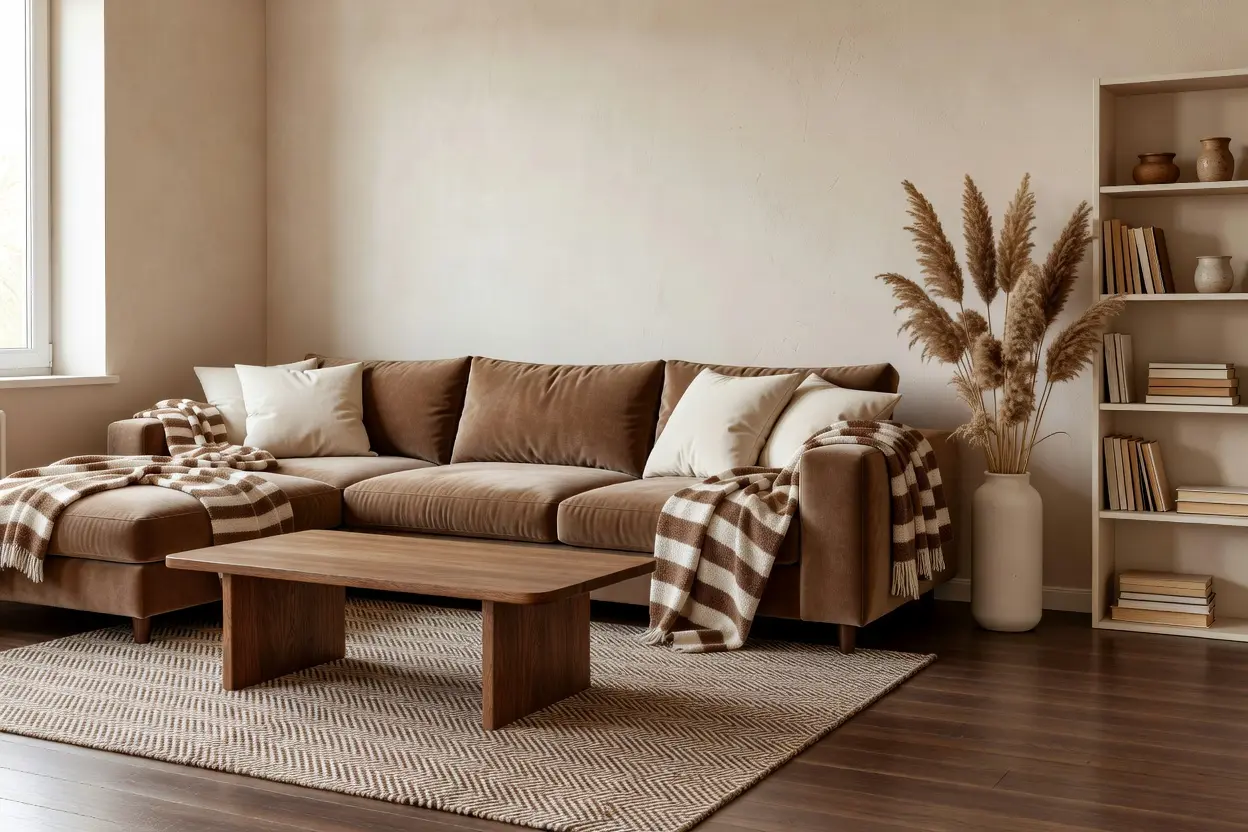
A room that’s too heavily brown can feel dark and closed in, while one that’s too heavily cream can feel flat and lack grounding. A rough 60 to 40 split, cream as the dominant tone with brown as a strong supporting layer, tends to work well in most living rooms.
Cream typically covers the larger surfaces, walls, a sofa, or a large area rug, while brown shows up in furniture, leather accents, and smaller textiles. This ratio isn’t a fixed rule, though. A room with a lot of natural light can handle a heavier brown presence without feeling dark, while a room with limited light generally benefits from leaning more cream.
4. Leather and Textile Choices That Reinforce the Look
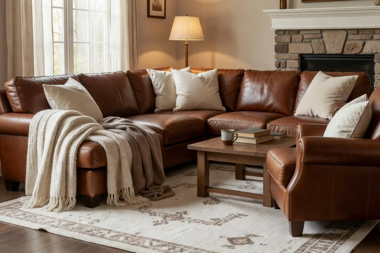
A leather sofa or armchair, in a warm cognac or chestnut tone, adds richness and a bit of structure to a brown and cream room, and it tends to age well compared to fabric upholstery that shows wear faster. Leather also photographs beautifully against cream walls or a cream rug, adding contrast without needing another color.
Boucle or linen upholstery in a cream tone softens a room that’s otherwise heavy on leather and wood, keeping the space from feeling too masculine or formal. Throw pillows in a mix of textures, a velvet in a deeper brown, a woven cream cover, add depth without introducing a whole new color scheme.
5. Wood Furniture That Grounds the Palette
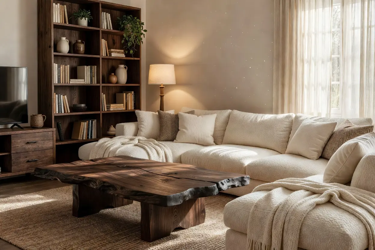
Warm wood tones, oak, walnut, or a mid tone mahogany, tie into the brown side of the palette naturally, since both share a similar warm base. A wood coffee table or media console adds another textural layer beyond just fabric and leather.
Key takeaway: matching the wood tone to the room’s dominant brown, rather than treating them as separate decisions, keeps the whole palette feeling intentional instead of like several different browns competing with each other.
Mixing Wood and Leather Tones
A slightly darker wood paired with a lighter cognac leather, or the reverse, adds contrast without clashing, as long as both stay on the warm side of the color spectrum rather than mixing warm and cool tones together.
6. Layering Texture So the Room Doesn’t Feel Flat
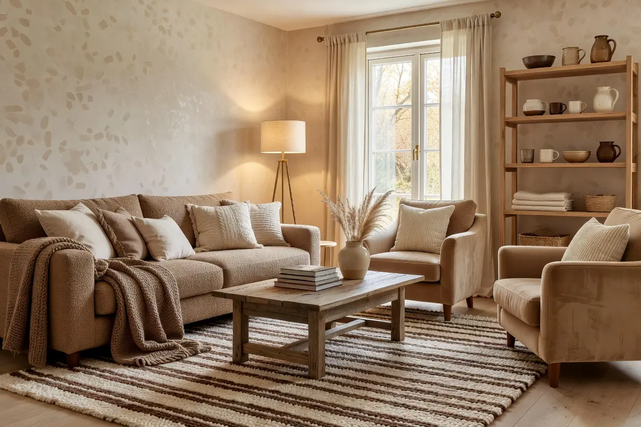
A room built entirely around two neutral tones needs texture to avoid feeling one dimensional. A chunky knit throw, a woven jute rug, and linen curtains all add different tactile layers without introducing a third color to manage.
Mixing matte and glossy finishes, a matte ceramic vase next to a glossy wood coffee table, adds visual interest that flat, uniform materials can’t replicate. Layering a smaller patterned rug over a larger cream base rug adds subtle texture and pattern without overwhelming the room’s calm, neutral foundation.
7. Lighting That Keeps Brown from Feeling Heavy
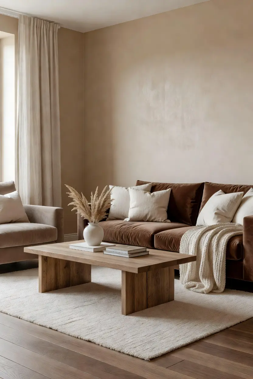
Cool toned lighting can make brown feel muddy or heavy, undercutting the warmth the pairing is going for. Warm bulbs, generally 2700K to 3000K, keep both the brown and cream tones looking rich rather than flat or gray.
A floor lamp or table lamp positioned near darker furniture pieces highlights their warmth and texture, especially in the evening once natural light fades. Natural light does a lot of the work during the day, so positioning key furniture pieces where they catch some daylight helps the whole palette read at its best.
8. Metal and Accent Choices That Add Polish
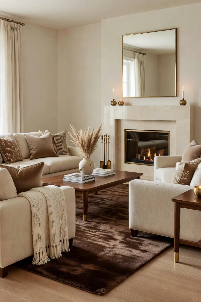
Brass or aged gold accents continue the room’s warm tone and add a bit of shine that keeps an all brown and cream space from feeling flat. A brass floor lamp, picture frames, or drawer pulls on a media console all work well here.
Black metal offers a different route, adding sharper contrast for anyone wanting the palette to feel a bit more modern rather than entirely traditional. Whatever finish gets chosen, keeping it consistent across visible hardware and lighting avoids a mismatched look that can undercut an otherwise elegant room.
9. Budget Ranges for a Full or Partial Refresh
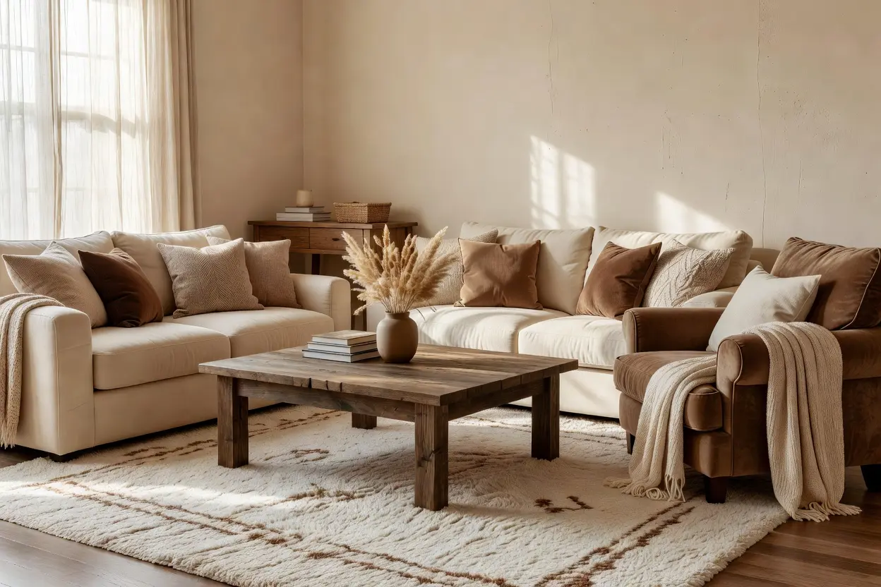
A cream sofa, mid range quality, typically runs 800 to 2,000 dollars depending on size and material, while a leather armchair in a warm brown tone generally runs 400 to 1,200 dollars. New throw pillows and a throw blanket, mixing textures and tones, typically cost 80 to 200 dollars total.
A jute or wool rug in a cream or warm neutral tone generally runs 150 to 400 dollars depending on size. For a lower cost refresh, swapping just textiles, pillows, a throw, and a smaller accent rug, over existing furniture typically costs 150 to 350 dollars total, a much smaller investment than replacing major furniture pieces.
10. Keeping the Look Elegant Over Time
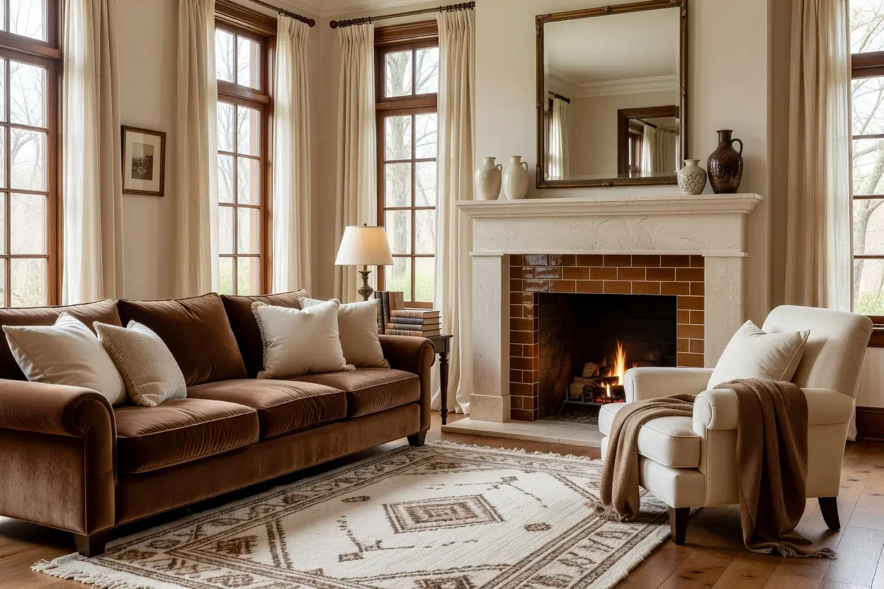
Leather furniture benefits from a conditioner applied every few months, which keeps the material supple and prevents cracking, especially in pieces that get regular use. Cream upholstery and rugs show stains more visibly than a darker color, so a fabric protector treatment and prompt spot cleaning matter more here than in a busier pattern.
Rotating throw pillow covers or a smaller accent rug seasonally is a low cost way to keep the room feeling refreshed without touching the major furniture pieces. Since brown and cream function closer to neutrals, the palette itself rarely needs updating, which is part of why it holds up so much longer than a trend driven color scheme.
Mistakes to Avoid
- Choosing a brown and cream ratio that’s too heavily skewed one direction without considering the room’s natural light
- Mixing warm and cool undertones within the brown and cream palette
- Skipping texture and relying on the two tones alone to make the room feel finished
- Using only cool toned lighting, which can make brown look muddy or flat
- Leaving cream upholstery untreated, which shows stains and wear faster than expected
- Choosing wood and leather tones that clash rather than complement each other
Frequently Asked Questions
What’s the ideal ratio of brown to cream in a living room? A rough 60 to 40 split, cream as the dominant tone with brown as a strong supporting layer, tends to work well in most rooms, though a room with more natural light can handle a heavier brown presence.
Does brown and cream work in a room with limited natural light? Yes, though leaning more heavily cream and choosing a warmer brown tone tends to work better in low light rooms than a very dark, cool toned brown, which can feel heavy without enough light to balance it.
Is brown and cream a dated color combination? Not in the way trend driven palettes tend to date. Since both tones function closer to neutrals, the pairing has remained a consistent choice in interior design for decades rather than tied to one specific era.
What furniture material works best for the brown side of the palette? Leather, particularly a warm cognac or chestnut tone, adds richness and structure, while wood furniture in a similar warm tone reinforces the palette without introducing a clashing shade.
How do I keep cream furniture looking clean in a brown and cream living room? A fabric protector treatment applied when the furniture is new, along with prompt spot cleaning of any spills, helps cream upholstery hold up against the staining and visible wear it’s more prone to than darker fabrics.
Conclusion
A cozy brown and cream living room works because the palette leans on texture, ratio, and material choice rather than trying to chase a passing trend. Choose a brown tone that suits your room’s light, balance it thoughtfully against cream, and layer in leather, wood, and texture to keep the space from feeling flat. Done well, brown and cream offers a warm, elegant look that holds up years longer than most color driven design choices.