10 Pink Girly Room Wall Decor Ideas | Cute Aesthetic Wall Posters for a Cozy Bedroom
You painted the walls a soft blush pink or hung a few pink accents, and the room still feels a little unfinished, like something is missing above the bed or on that one empty stretch of wall. A pink color scheme alone doesn’t automatically create the cozy, aesthetic bedroom feel you’re going for. It needs wall decor that actually works with the color, not just around it. These 10 pink girly room wall decor ideas focus on posters, prints, and small styling details that turn a plain pink wall into a genuinely cozy, put together bedroom space.
1. Why Pink Wall Decor Works for a Cozy, Personal Bedroom
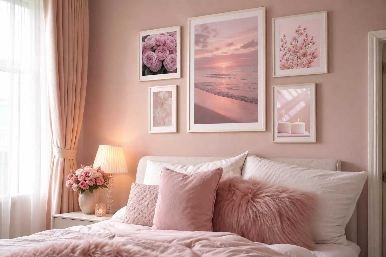
Pink carries a naturally soft, warm quality that tends to make a room feel more personal and inviting than a stark white or gray wall would. But pink alone, without any layered decor on top of it, can still end up feeling a bit plain or unfinished.
Wall decor gives that pink backdrop something to work with. A few well chosen posters, prints, or hanging pieces add depth and personality, turning a simple color choice into an actual styled room rather than just a paint job.
A pink wall sets the mood, but the decor on top of it is what makes the room feel finished.
2. Pastel Poster Gallery Walls for a Layered Aesthetic Look
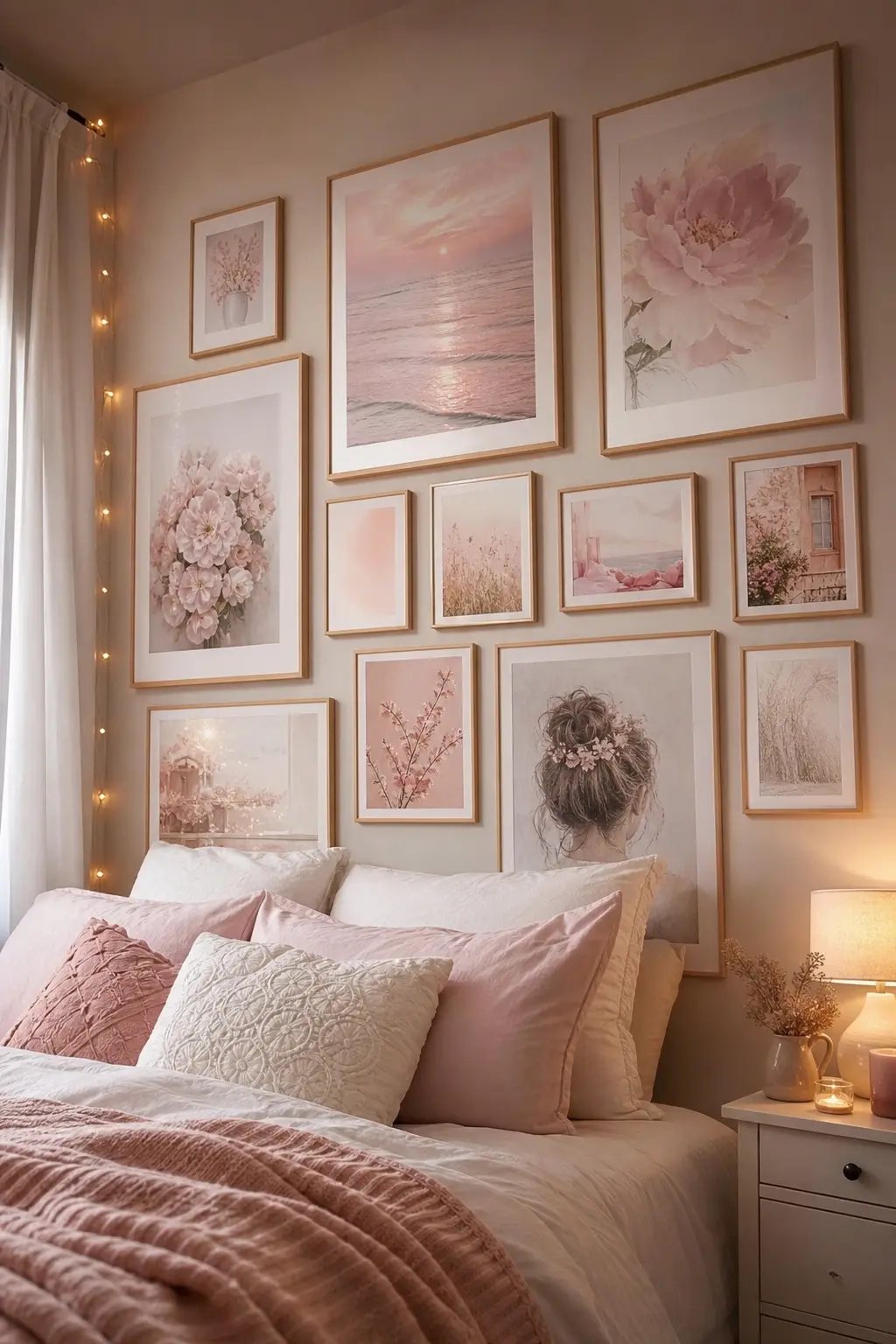
A cluster of small to medium pastel posters, mixing pink with soft lavender, cream, or light blue, creates a layered gallery wall that feels curated rather than random. This works especially well above a desk, a dresser, or one side of the bed where a single large piece might feel too heavy.
Arranging the Gallery
Mix frame sizes slightly, and space the posters unevenly rather than in a perfectly even grid. A common approach is grouping five to eight smaller posters in a loose cluster, leaving small gaps of two to three inches between most pieces.
3. Soft Pink Neon Style Signs for a Fun Focal Point
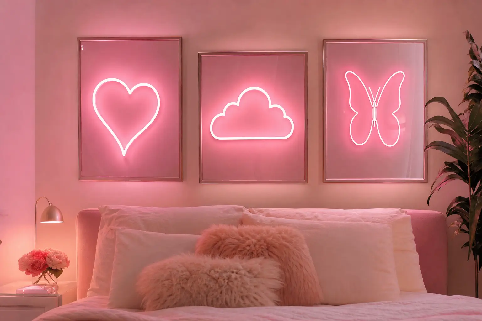
A soft pink LED sign, whether it’s a simple word or a small shape, adds a playful, glowing focal point to a bedroom wall, especially once it gets dark outside. These work well as a single statement piece rather than layered with a lot of other art nearby, since the glow already draws plenty of attention on its own.
Choosing a smaller, simpler sign over an oversized one tends to keep the look feeling more like tasteful decor and less like a storefront display.
4. Framed Botanical and Floral Prints in Blush Tones

Simple framed prints featuring botanical illustrations or soft floral patterns in blush and dusty rose tones bring a more grown up, elegant take on pink wall decor. This style suits a bedroom meant to feel calm and put together rather than bold or bright.
Quick tip: choosing prints with a matching thin frame color, like a light wood or matte white, across multiple pieces keeps a grouping of floral prints looking cohesive even if the individual images vary.
5. String Lights Paired With Wall Art for Soft Ambiance
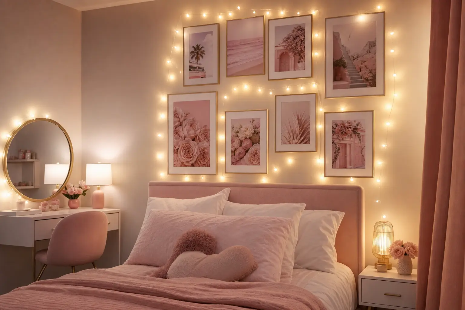
A single strand of warm white string lights, draped loosely around or behind a poster or photo grouping, adds a soft glow that makes the whole wall feel warmer once the main lights go off. This pairing works particularly well behind a headboard or above a desk area.
Keep the string lights secondary to the actual wall art rather than the main feature, using small removable adhesive hooks or clips so the light strand follows the shape of the art grouping instead of hanging as a separate, unrelated line.
6. Woven Wall Hangings in Blush and Cream Tones
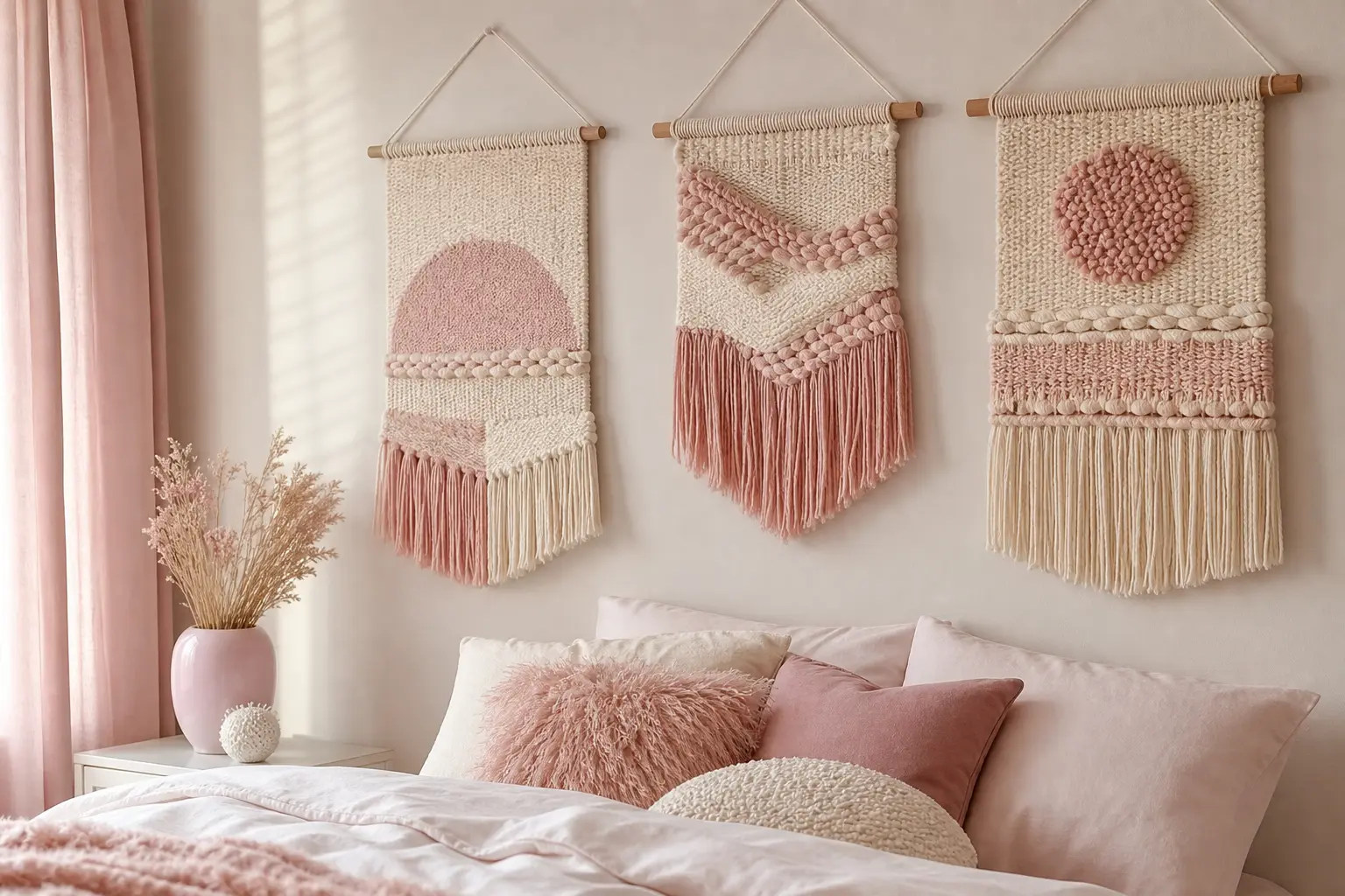
A macrame or woven wall hanging in soft blush, cream, or dusty rose tones adds texture to a pink bedroom wall without relying purely on flat prints or posters. The natural fiber material also softens a room that might otherwise feel a bit too polished or flat.
This style works especially well as a single centered piece above a bed, paired with simpler, smaller decor on either side rather than another busy grouping competing for the same wall space.
7. Photo Collage Walls for a Personal, Lived In Feel

Mixing personal photos with a few pink toned decorative prints creates a wall that feels genuinely personal rather than purely decorative. This approach works well for anyone who wants their room to reflect actual memories and relationships, not just an aesthetic.
Keeping It Cohesive
Print photos in a similar tone, like warm or slightly faded color grading, and mix them with just one or two pink accent prints, so the collage still feels intentional rather than like a cluttered pinboard.
8. Mixing Pink Shades So the Room Doesn’t Feel Flat
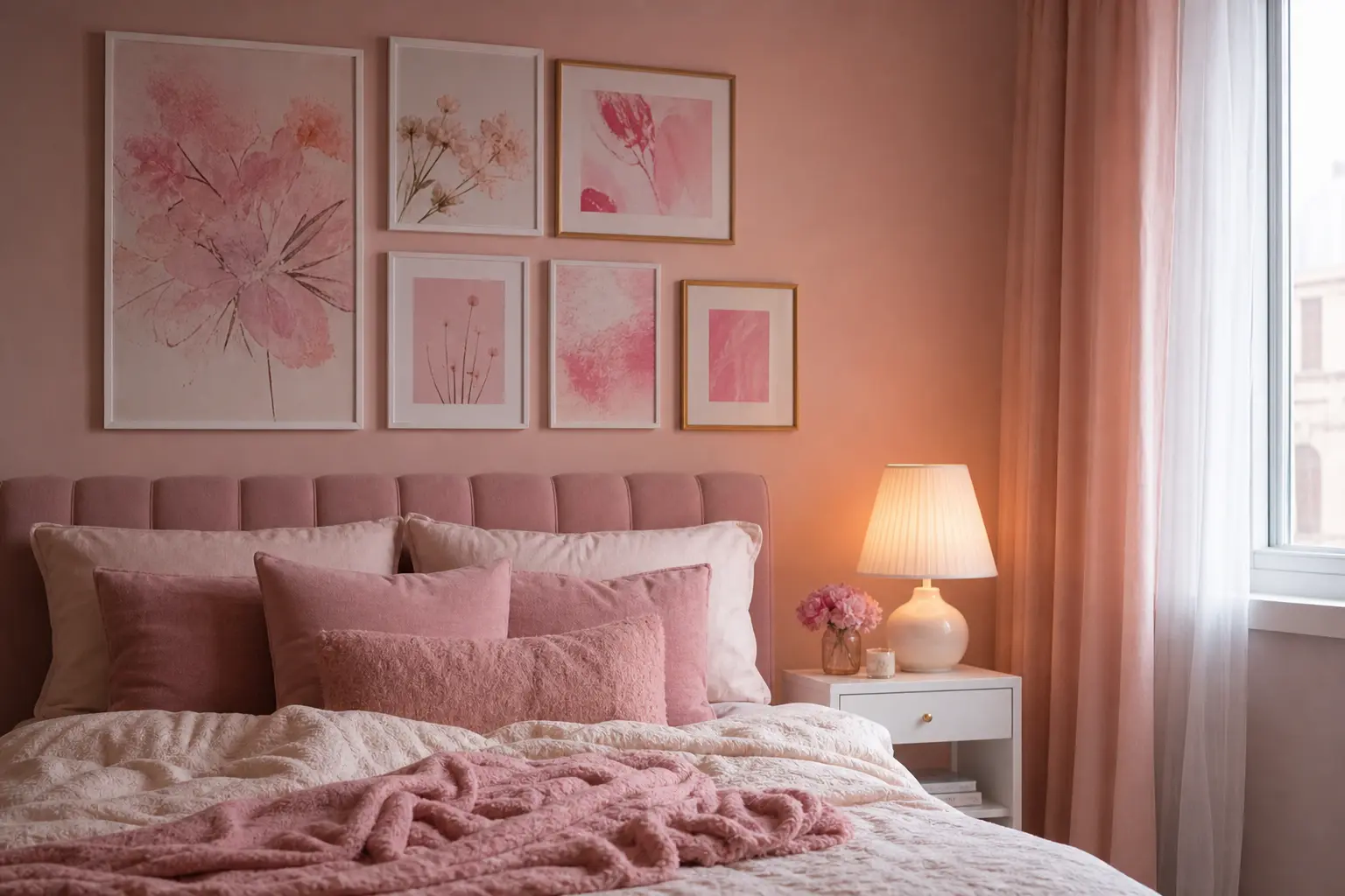
Using only one exact shade of pink across every piece of wall decor can actually make a room feel flatter, not more cohesive. Mixing a few different shades, like a pale blush, a warmer dusty rose, and one slightly bolder pink accent, adds depth in the same way that mixing textures does in a neutral room.
Bold takeaway: variety within the same color family generally looks more intentional than perfect, matching uniformity across every single piece.
9. Balancing Pink Decor With Neutral Furniture Pieces
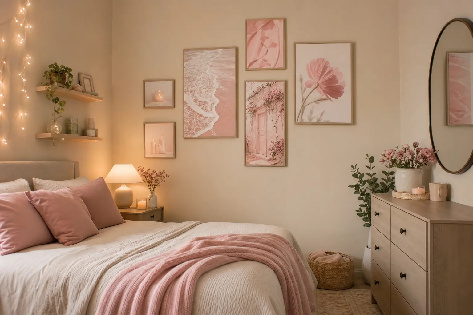
A wall full of pink decor tends to look best when the furniture underneath it, like the bed frame, dresser, or desk, stays in a more neutral tone, such as white, light wood, or cream. This keeps the pink wall decor as the clear focal point instead of competing with equally bold furniture choices.
If your furniture already leans neutral, you have more freedom to go bolder with the wall decor itself, since the rest of the room provides a calm backdrop for it.
10. Arranging Wall Decor Around a Bed for Visual Balance
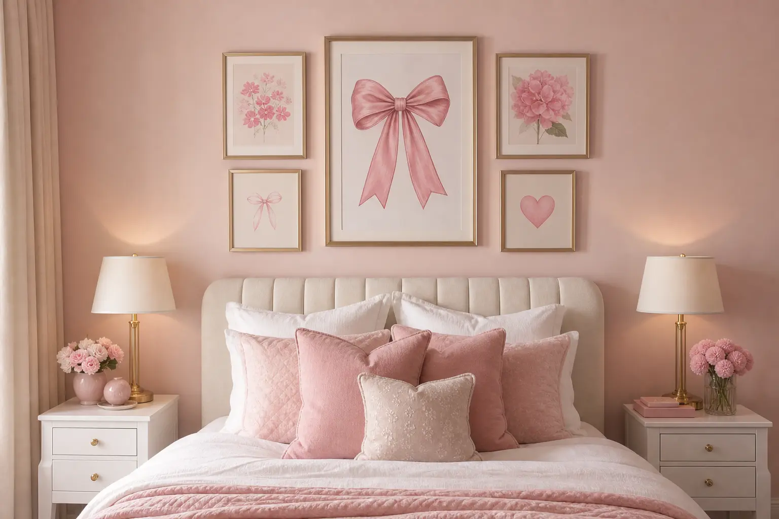
Above a bed specifically, aim for the wall decor grouping to span roughly the same width as the bed frame itself, rather than a narrow cluster that looks too small for the space. Centering the grouping horizontally above the bed, while allowing slight vertical variation in height, tends to look more balanced than a strict, symmetrical grid.
Leave at least 6 to 8 inches of space between the top of the headboard and the bottom of the wall decor, so the arrangement doesn’t feel cramped against the bed itself.
Mistakes to Avoid
- Choosing a wall decor grouping that’s too small for the wall space, especially above a bed
- Using only one exact shade of pink throughout, which can flatten the overall look
- Overcrowding a gallery wall with too many pieces and no breathing room between them
- Pairing bold, busy wall decor with equally bold or patterned furniture, creating visual competition
- Hanging string lights as the main feature instead of a soft accent to existing wall art
- Skipping personal photos entirely, resulting in a room that feels aesthetic but not personal
Frequently Asked Questions
How many posters should I use in a pink gallery wall? Five to eight smaller posters in a loosely arranged cluster generally works well for a gallery wall above a desk or dresser. Larger walls, like the space above a bed, can handle a few more.
What other colors pair well with pink wall decor? Cream, soft lavender, light blue, and warm white all pair naturally with pink tones and help keep a gallery wall from feeling one note.
Should string lights be the main decor piece or just an accent? They work best as a soft accent layered behind or around existing wall art, rather than serving as the main focal point on their own.
How much space should I leave between wall decor and my headboard? Aim for at least 6 to 8 inches of clearance between the top of the headboard and the bottom of your wall decor grouping, so the arrangement doesn’t feel cramped.
Can pink wall decor work in a room with neutral furniture? Yes, and it often works especially well. Neutral furniture keeps the room from feeling too busy, letting the pink wall decor stand out as the clear focal point.
Conclusion
Pink wall decor turns a soft, warm color scheme into an actual finished bedroom, but it works best with a bit of intentional variety and balance. Mix a few different pink shades, keep the furniture underneath more neutral, and size your wall decor grouping to fit the space it’s filling. Get those basics right, and a pink bedroom wall goes from looking unfinished to genuinely cozy and personal.