10 Modern Living Room Decor Ideas With Royal Blue and Terracotta
You found a photo of a living room in royal blue and terracotta and instantly loved it, but now you’re staring at paint swatches wondering if it’ll actually work in your space or just look like a mistake. Two bold colors together can go wrong fast if the ratios are off. These modern living room decor ideas break down exactly how to use royal blue and terracotta together so the room feels intentional and current, not chaotic. The short version is that it comes down to ratio, surface choice, and a few neutral buffers. None of it requires repainting your whole house just to test it out.
1. Understand Why Royal Blue and Terracotta Work Together
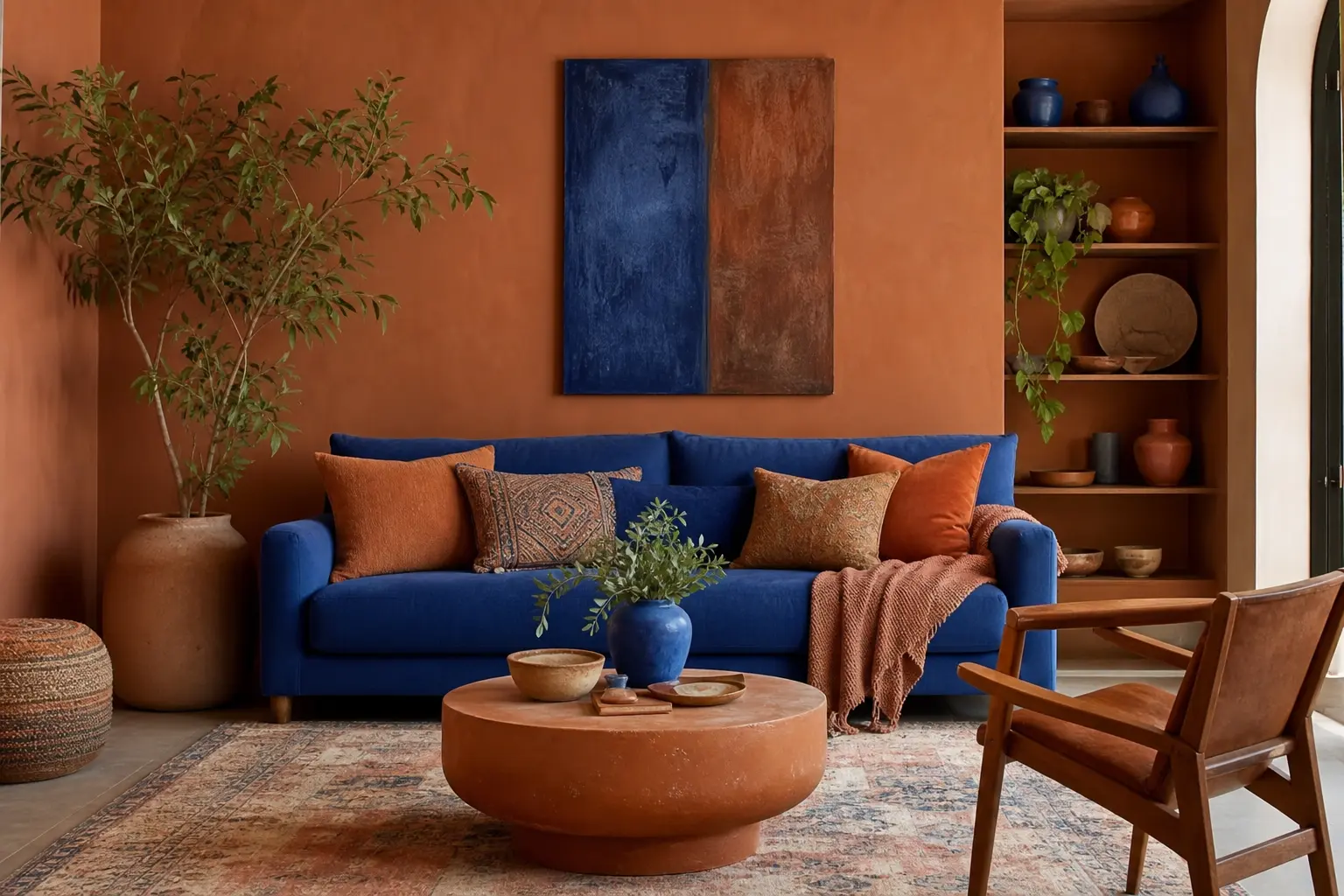
Royal blue is a cool, saturated color. Terracotta is warm and earthy, closer to a muted clay orange than a bright orange. Pairing a cool color with a warm one creates natural contrast, which is part of why this combination reads as bold but not jarring once it’s balanced correctly. Terracotta also has enough brown and red undertone that it behaves more like a neutral than people expect, which is why it pairs so well with a strong color like royal blue instead of fighting it. Designers often describe this kind of pairing as a complementary contrast, since blue and orange sit roughly opposite each other on the color wheel.
2. Pick Your Dominant Color Before You Buy Anything
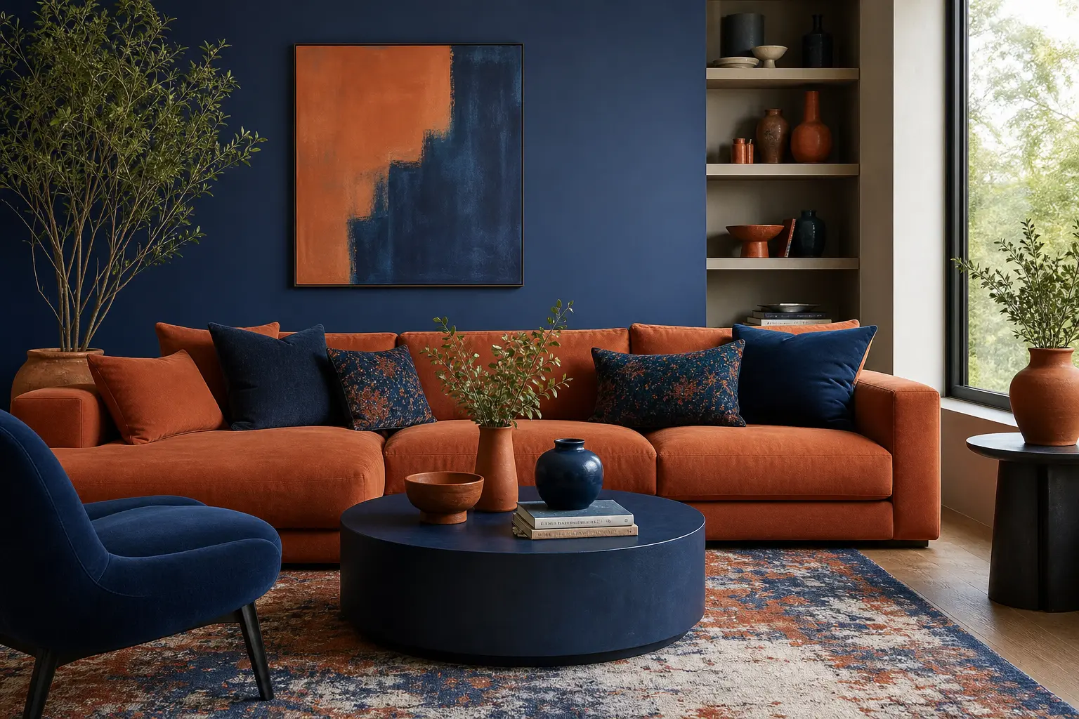
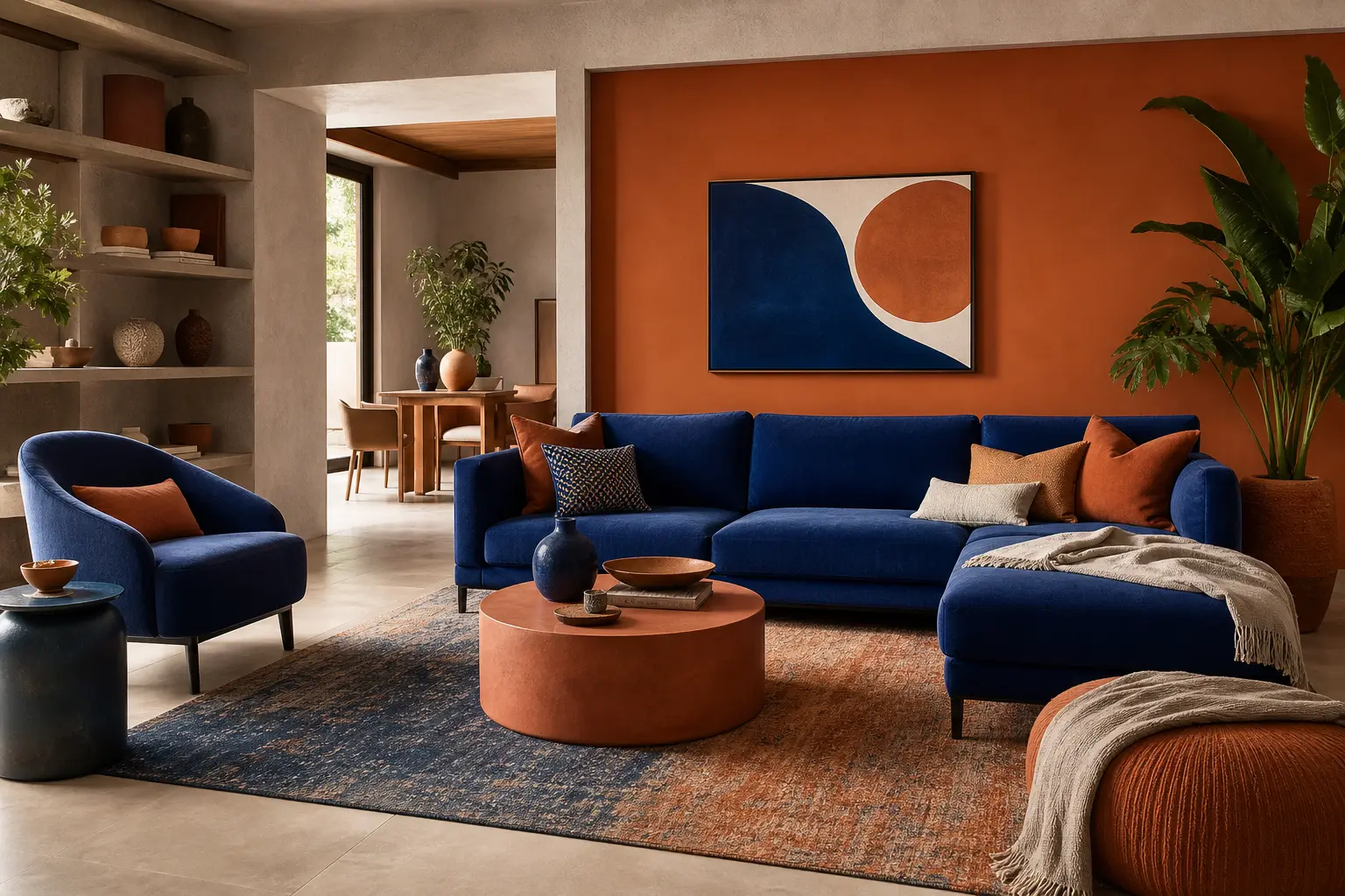
One of the biggest mistakes with a royal blue and terracotta living room is treating both colors as equally dominant. Pick one as the lead color, usually around 60 percent of the room, and let the other act as an accent closer to 20 to 30 percent. Most modern living room decor ideas built around this palette use blue as the dominant tone, on a sofa or an accent wall, with terracotta showing up in pillows, art, and smaller accessories. You can flip that ratio if you want a warmer feeling room, with terracotta walls and blue as the accent instead.
3. Use Terracotta on Warm Surfaces, Blue on Cool Ones
Where Terracotta Works Best
Terracotta tends to look most natural on textiles, ceramics, and warm materials like wood or woven baskets. A terracotta colored vase, a set of ceramic planters, or a woven pouf all lean into the material’s earthy, handmade feel.
Where Royal Blue Works Best
Royal blue reads as more modern on smoother, cooler surfaces. Think a velvet sofa, glossy ceramic lamps, or a lacquered accent table. This contrast in material finish, not just color, is part of what makes a royal blue and terracotta living room feel deliberate instead of random.
4. Bring in Warm Wood Tones to Bridge the Two Colors
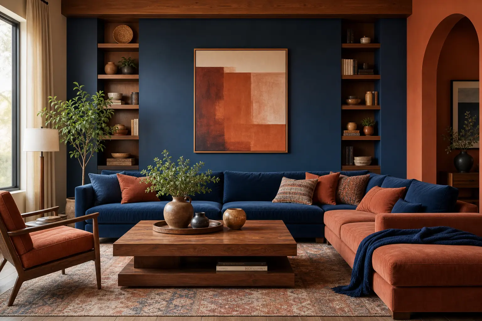
Wood furniture in a medium warm tone, like walnut or warm oak, acts as a visual bridge between royal blue and terracotta. Without it, the two colors can feel like they’re competing for attention. A wood coffee table, media console, or dining chairs in the same space soften the contrast and tie the palette together. Avoid very cool toned or gray washed wood here, since it won’t connect with the warmth of the terracotta the way a richer wood tone will.
5. Add Brass or Warm Gold Hardware for a Modern Finish
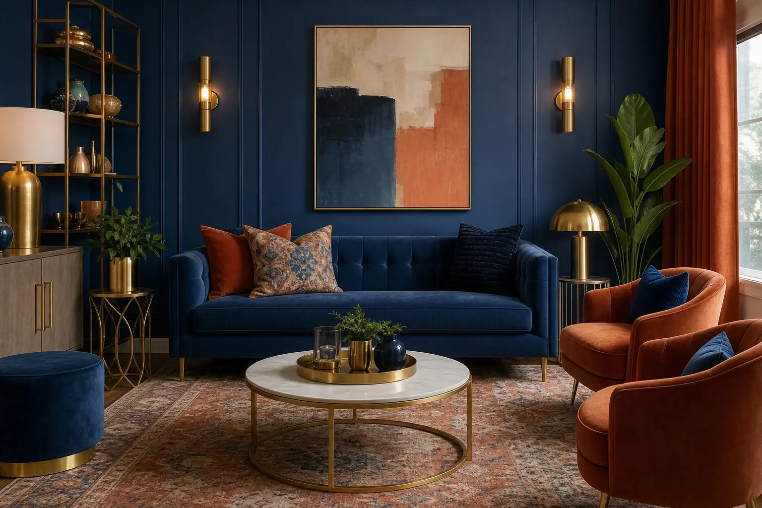
Chrome and silver finishes tend to read as cold next to terracotta, which works against the warmth you’re building into the room. Brass, aged gold, or warm bronze hardware on lamps, drawer pulls, and light fixtures pulls the whole palette together and keeps the space feeling current rather than dated. This is a small, inexpensive swap that makes a noticeable difference in a royal blue and terracotta living room.
6. Balance Bold Color With Plenty of Neutral Space
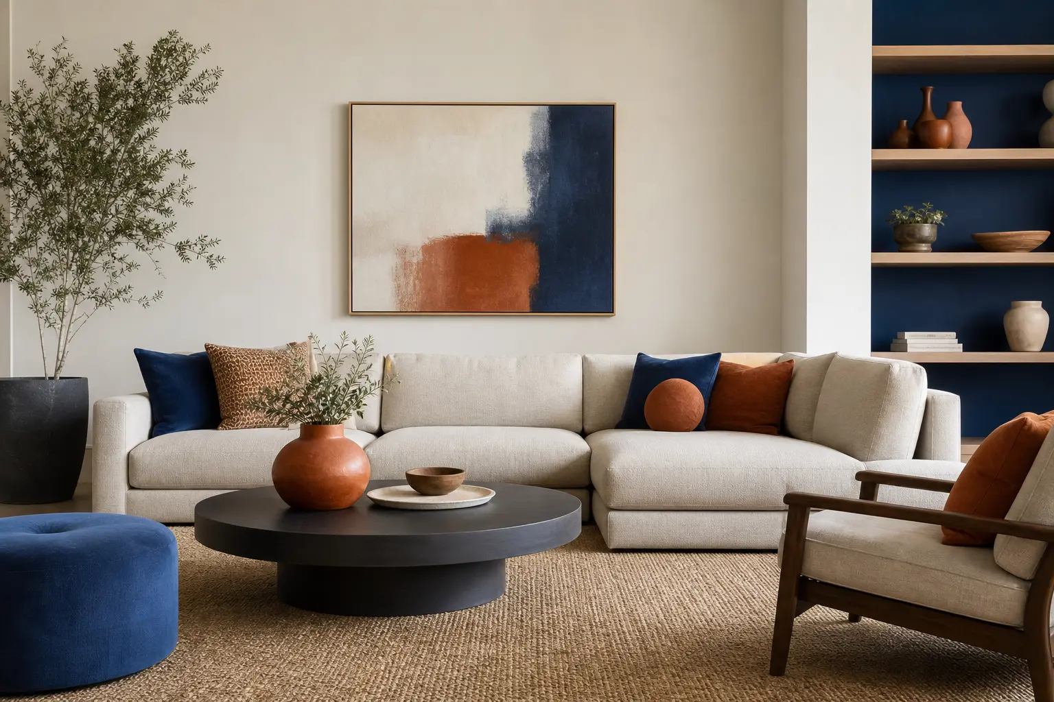
Two strong colors need breathing room. Walls, ceilings, and larger furniture pieces in warm white, soft beige, or light oat tones give the eye somewhere to rest between the blue and terracotta elements. Without enough neutral space, the room can start to feel busy or overwhelming, even if the color pairing itself is well balanced. A good rule of thumb is that neutral tones should make up close to half of what you see in the room at a glance.
7. Layer in Pattern Through Textiles, Not Paint
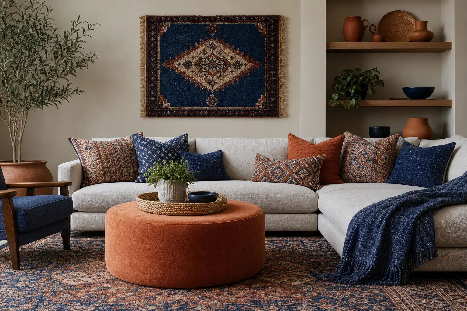
Instead of trying to blend royal blue and terracotta directly on a wall, most modern living room decor ideas keep paint choices simple and add pattern through textiles instead. A patterned rug that pulls in both colors, striped or block printed throw pillows, or a patterned curtain fabric all let the two colors interact without the commitment of a painted design. This also makes it much easier to update the look later, since swapping a rug or pillows is far simpler than repainting a wall.
8. Use Terracotta Toned Art to Soften a Blue Accent Wall
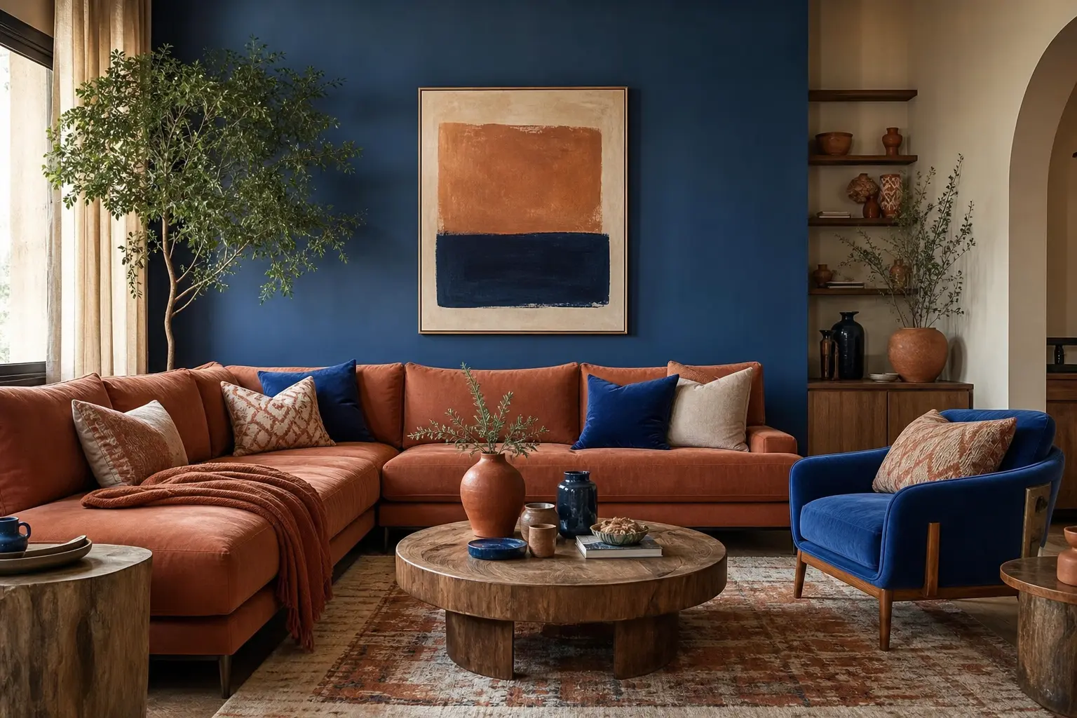
A deep royal blue accent wall can feel heavy on its own, especially in a room with limited natural light. Hanging art with terracotta, rust, or warm clay tones on that wall breaks up the color and adds warmth right where the room needs it most. Abstract art or a large scale botanical print in warm earth tones both work well here, since they add color without competing with the wall itself.
9. Add Greenery to Keep the Palette From Feeling Heavy
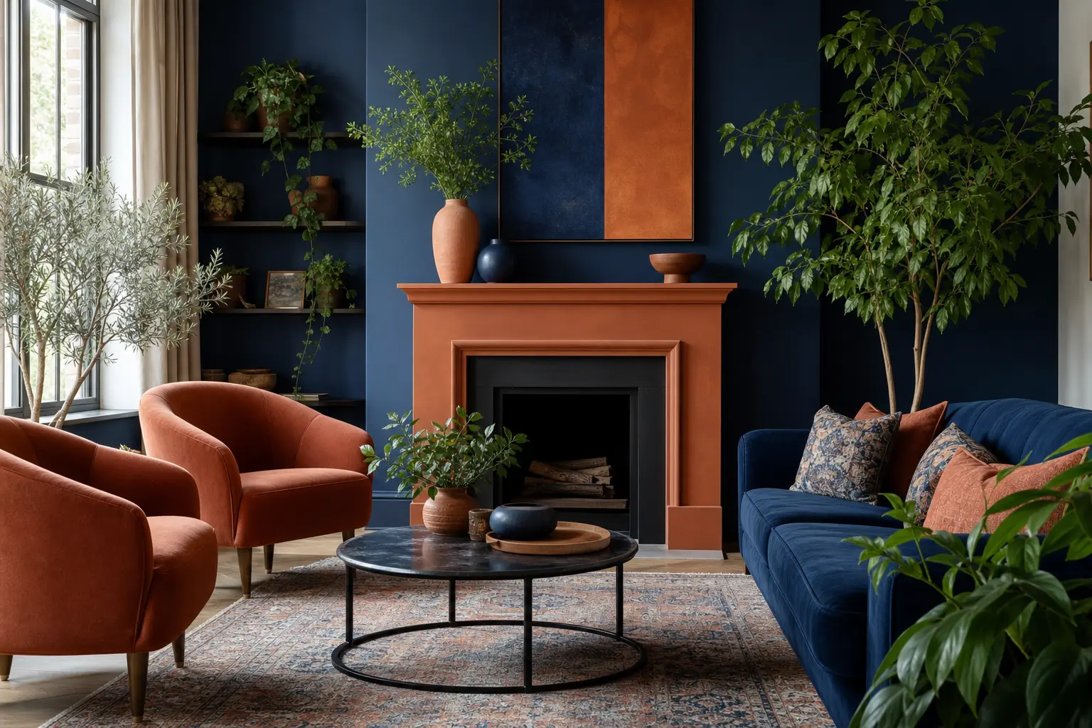
Both royal blue and terracotta are saturated, grounded colors, and a room built entirely around them can start to feel dense without a lighter, organic element to break it up. Live plants or high quality faux greenery in a terracotta colored pot do double duty, adding both a natural texture and a visual break from all that color intensity. A few plants of varying heights, rather than one large statement plant, tends to look more natural.
10. Test the Palette in Small Doses Before Committing Fully
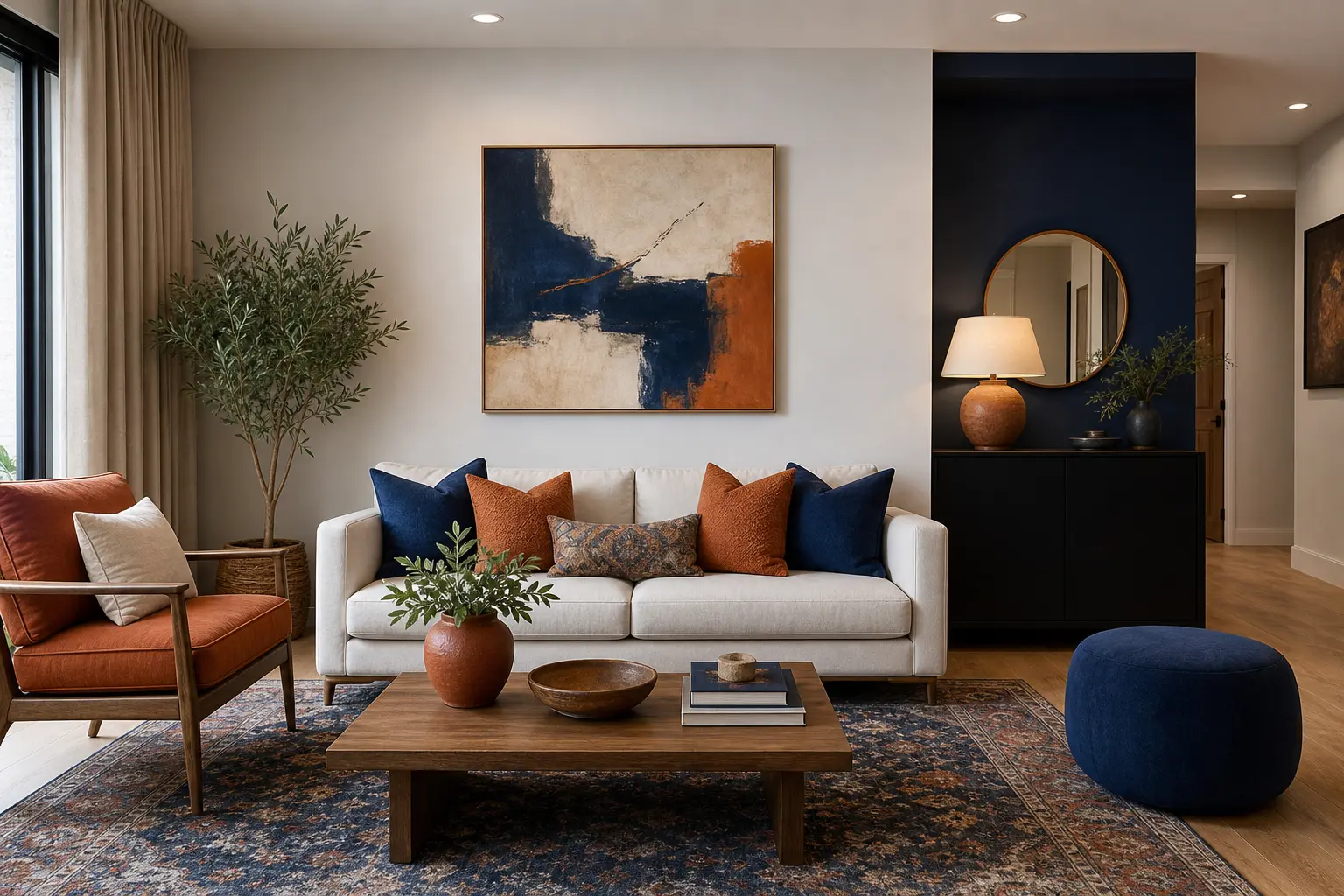
If you’re not fully sure about a royal blue and terracotta living room, start small. A few terracotta throw pillows on a neutral sofa, paired with one royal blue accent piece like a lamp or a vase, let you live with the combination before repainting a wall or buying a large piece of furniture. This lower risk approach also helps you figure out your preferred ratio of blue to terracotta before making a bigger investment.
Mistakes to Avoid
- Using royal blue and terracotta in roughly equal amounts instead of picking one as dominant
- Pairing the palette with cool toned gray wood instead of warm wood tones
- Skipping neutral space, which makes the room feel busy instead of bold
- Using chrome or silver hardware, which reads as cold next to terracotta
- Painting both colors directly next to each other on adjoining walls without a neutral buffer
- Forgetting greenery or texture, leaving the palette feeling flat and heavy
Frequently Asked Questions
Do royal blue and terracotta actually match in interior design? Yes. They sit close to opposite each other on the color wheel, which creates a complementary contrast. The key is choosing one as the dominant color and using the other as an accent, rather than using both in equal amounts.
What wood tone works best with a royal blue and terracotta living room? Medium warm tones like walnut or warm oak work best. They bridge the cool blue and warm terracotta better than gray washed or very light wood finishes.
Is royal blue and terracotta too bold for a small living room? Not necessarily, but ratio matters more in a small space. Using terracotta mainly through smaller accents, with royal blue limited to one or two pieces, keeps a small room from feeling overwhelmed by two strong colors.
What metal finish pairs best with this color combination? Brass, aged gold, and warm bronze all pair well, since they carry warmth that complements terracotta. Cooler metals like chrome or nickel tend to clash with the earthy tone of terracotta.
Can I use this color palette without repainting my walls? Yes. Many modern living room decor ideas use this palette almost entirely through textiles, art, and accessories, which is a lower commitment way to test the combination before considering paint.
Conclusion
A royal blue and terracotta living room can look sophisticated and current, or it can look chaotic. The difference almost always comes down to ratio, material choice, and how much neutral space you leave in between. Pick a dominant color, bridge the two tones with warm wood and brass accents, and don’t be afraid to test the combination in small doses first. Once you get the balance right, this pairing tends to be one of the more distinctive, memorable choices you can make in a living room, precisely because it’s bold enough to feel intentional.