10 Pastel Pink, White, and Beige Luxury Bedroom Design Ideas
You want your bedroom to feel like an actual retreat, somewhere calm and a little indulgent, not just the room where laundry ends up. A lot of soft, neutral bedrooms end up looking flat instead of elegant, mostly because the tones are too similar and nothing gives the eye a place to focus. Pastel pink, white, and beige can absolutely deliver that luxury feeling, but the three tones need clear, separate jobs to avoid blending into visual mush.
These ten ideas cover how to use this palette across walls, bedding, furniture, and lighting so the room reads elegant and considered rather than just soft. From the base wall color to the final layered details on the bed, here’s how to build it properly.
1. Understand How These Three Tones Create a Luxury Feel
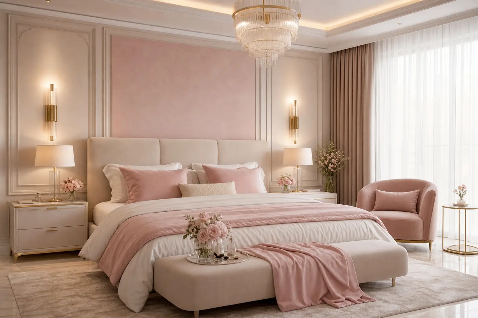
White, pastel pink, and beige all sit close together in overall lightness, which is part of what makes them feel calm and cohesive as a group. The luxury feeling comes less from contrast and more from the quality of materials and the layering of texture within that narrow tonal range. This is a more subtle approach than a high contrast room, and it relies on getting the details right rather than relying on bold color to do the work.
Think of white as your brightest, cleanest tone, beige as your warmer, grounding tone, and pastel pink as the accent that adds just enough personality to keep the room from feeling generic.
2. Use White as Your Base for Walls and Bedding
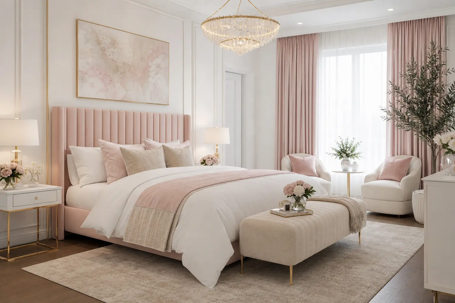
Crisp white or a very soft off white on the walls keeps the room feeling bright and spacious, which matters for a palette this light overall. White sheets or a white duvet cover as your base bedding layer also give you a clean foundation to build texture and color on top of, rather than starting from an already busy pattern.
Choosing the Right White
A pure, cool white can feel a little sterile paired with pastel pink and beige, both of which lean warm. A soft, warm white, sometimes labeled as “cloud white” or “linen white” on paint swatches, generally blends more naturally with the rest of this palette.
3. Add Pastel Pink Through Textiles, Not Just Walls
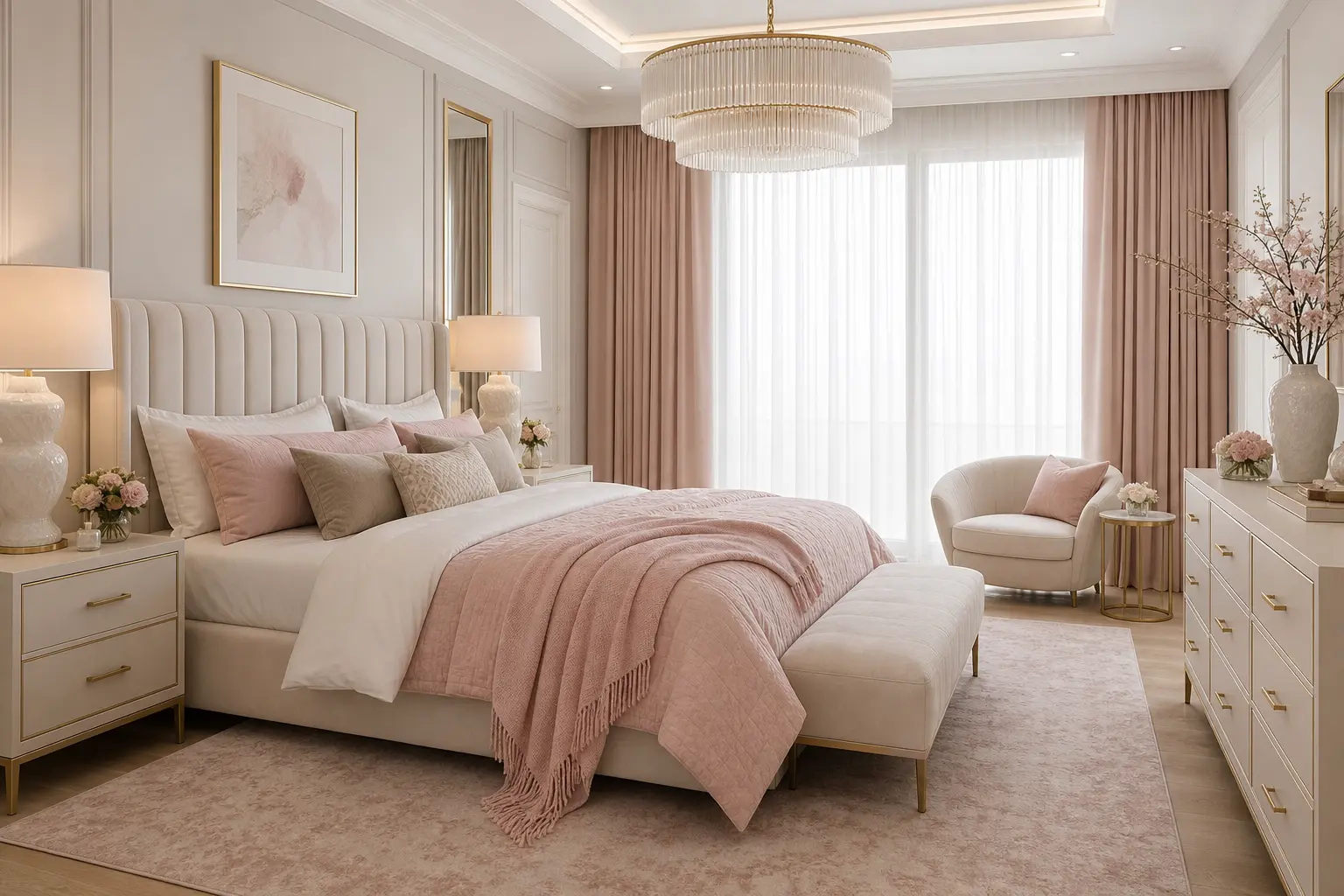
Rather than painting the entire room pastel pink, which can tip quickly into overly sweet territory, bring the color in through textiles instead. A pink throw blanket, a set of pink accent pillows, or pink curtains all introduce the color in a way that’s easy to adjust later if your taste shifts.
If you do want pink on the walls, consider it for just the headboard wall rather than all four, keeping the rest of the room in white and beige. This gives the pink a clear, contained role rather than letting it dominate the entire space.
4. Bring in Beige Through Furniture and Flooring
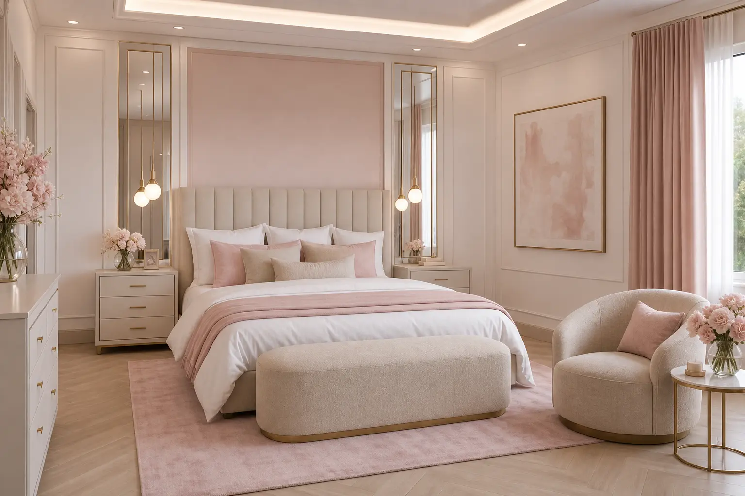
Beige works well as the grounding tone in this palette, most naturally through furniture pieces like a dresser, nightstands, or an upholstered bench at the foot of the bed. If your flooring is a warm toned wood or a beige carpet, you’re already partway there without adding anything new.
A beige area rug is another straightforward way to bring this tone in if your existing flooring doesn’t already lean warm. Look for a rug with subtle texture, like a looped wool or a slightly nubby weave, rather than something completely flat and smooth.
5. Choose Metal Finishes That Feel Elevated
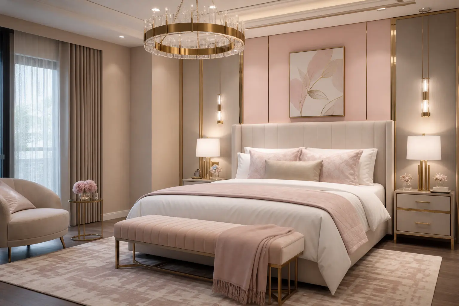
Metal finish matters as much here as it does in any other room built around a soft, neutral palette. Brass and warm gold both push this combination toward luxury and elegant. Chrome and cool silver can feel a little clinical against pastel pink specifically, pulling the room toward cold rather than soft and warm.
Apply your chosen metal finish consistently across lighting fixtures, drawer pulls, and any picture frames in the room. This kind of consistency reads as far more considered than several different finishes scattered throughout the space.
6. Layer Texture So the Palette Doesn’t Feel Flat
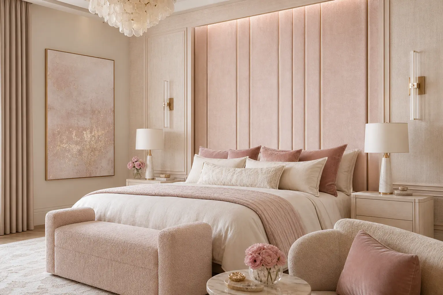
With three tones this close in lightness, texture has to do a lot of the visual work. A boucle accent chair, a linen duvet cover, a velvet throw pillow, and a woven rattan headboard all add different textures within the same soft color family. Without this variation, the room can start to look flat under most lighting.
Aim for at least three distinct textures somewhere in the room. This might be as simple as a smooth cotton sheet, a chunky knit throw, and a woven rattan or cane furniture piece, giving the eye enough variety to keep the space feeling rich rather than plain.
7. Pick a Statement Headboard to Anchor the Room
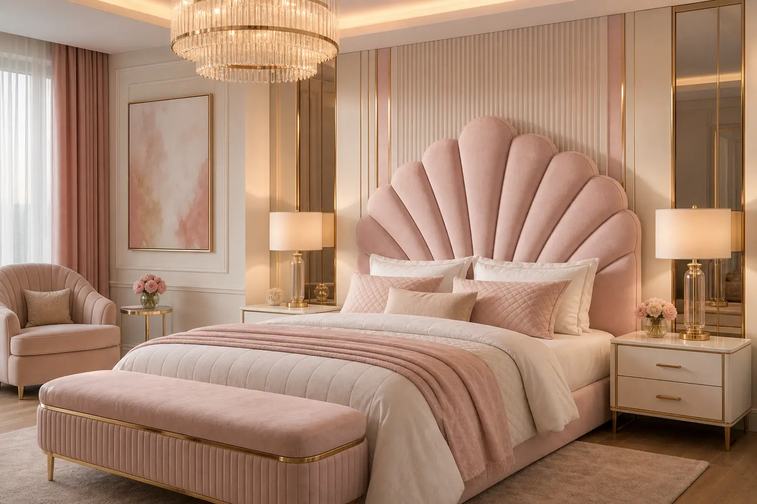
A headboard is one of the easiest ways to add both color and texture in a single piece. An upholstered headboard in pastel pink velvet or boucle, or a channel tufted headboard in a soft beige, both give the bed a clear focal point that the rest of the room can build around.
If your headboard is already neutral, a large piece of art or a pair of matching sconces above it can serve the same anchoring function, giving the eye a clear place to land when entering the room.
8. Use Art and Mirrors to Add Depth Without New Colors
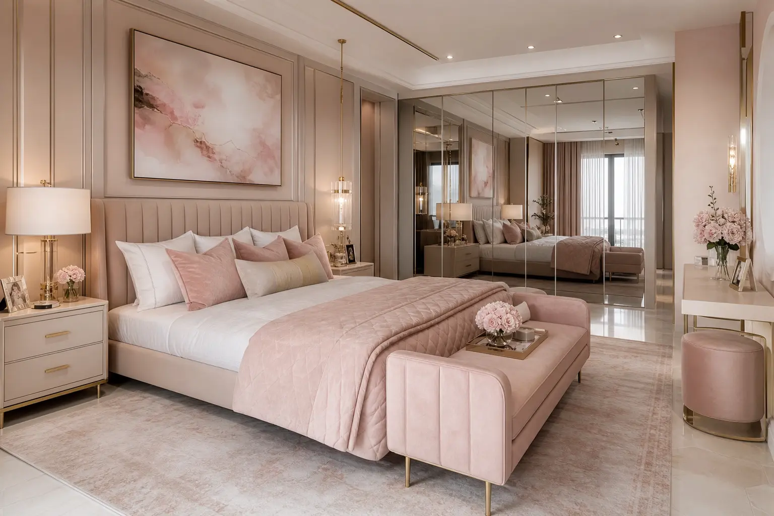
Simple line art, soft abstract paintings in muted tones, or black and white photography all add visual interest to the walls without introducing a fourth color that has to be balanced against the rest of the palette. A large mirror also works well here, adding depth and bouncing light around a room that often gets used in lower evening light.
Keep frame finishes consistent with whatever metal finish you’ve chosen elsewhere in the room. Brass frames against white walls with beige and pink accents tend to look more cohesive than a mix of black, silver, and gold frames on the same wall.
9. Add Warm Lighting for an Evening Glow
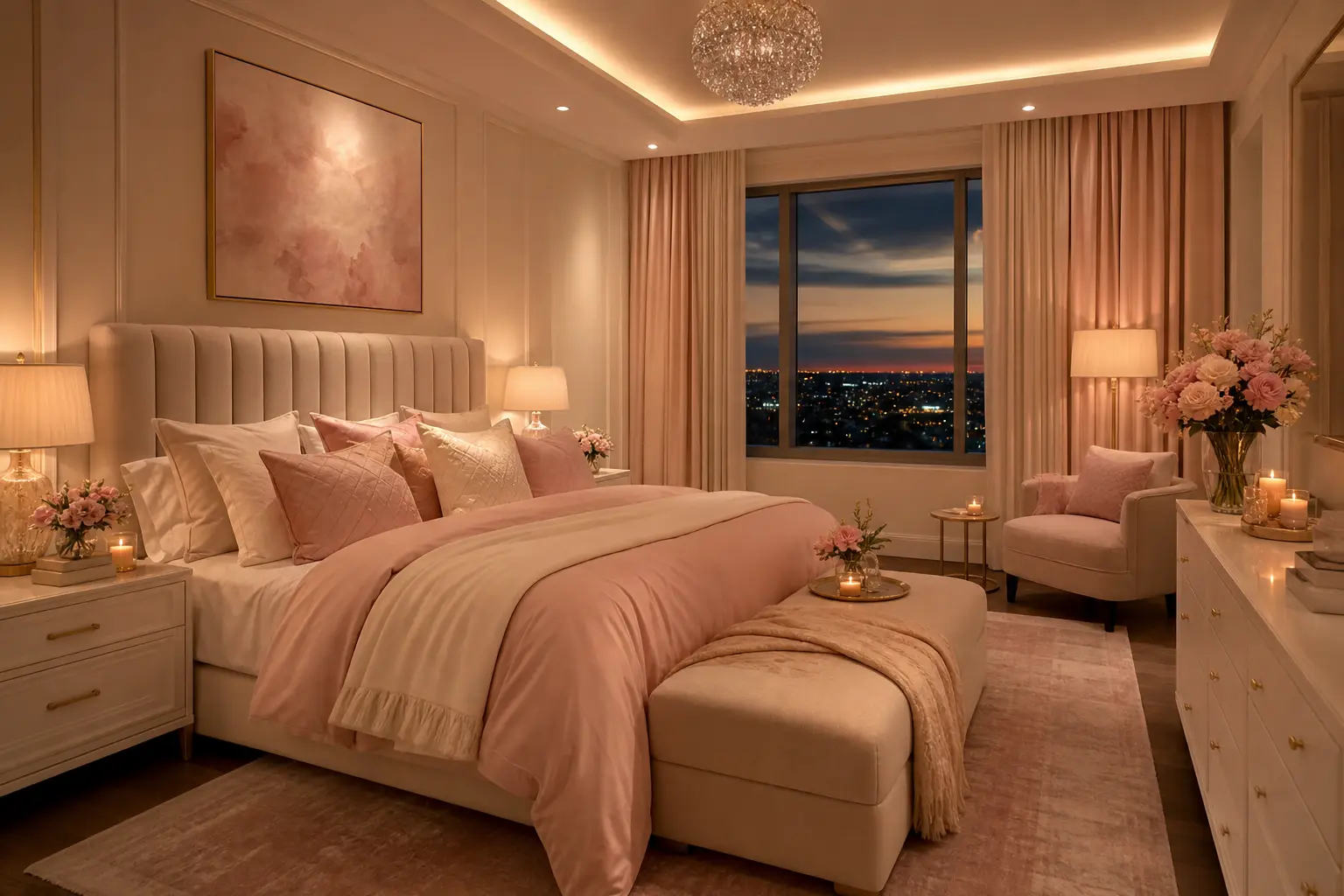
Overhead lighting alone rarely does justice to a soft, layered palette like this one. Add a pair of bedside lamps or wall sconces in warm brass, along with warm bulb lighting in the 2700 to 3000 Kelvin range, to give the room a softer, more flattering glow in the evening.
Dimmable lighting is worth the small extra cost here, since a bedroom built around a soft palette often benefits from being able to lower the light level significantly for winding down at night, rather than relying on one bright overhead setting.
10. Style the Bed With Layered Pastel Details
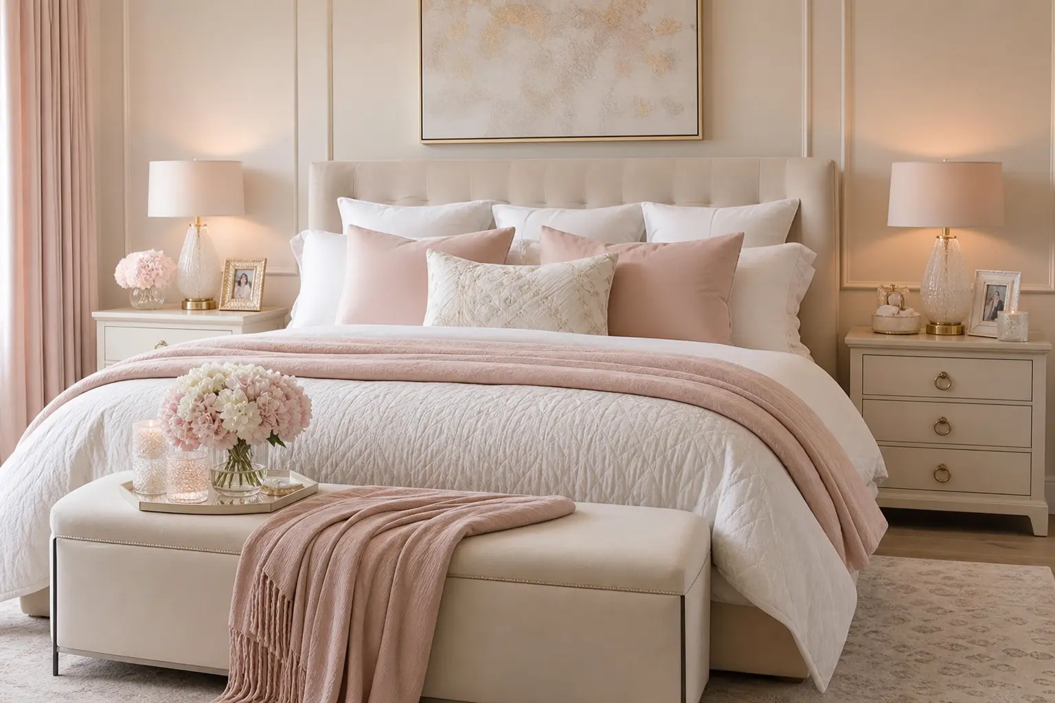
For the bed itself, build up layers rather than relying on a single flat comforter. A white base sheet and duvet, a beige textured throw folded at the foot of the bed, and two or three pastel pink accent pillows against plain white or beige sleeping pillows give the bed a styled, hotel like look without much daily effort once it’s set up.
Keep the pink pillows to a smaller ratio, maybe two or three out of six or seven total pillows on the bed, so the color reads as an accent rather than the dominant tone across the whole bedding arrangement.
Mistakes to Avoid
- Painting all four walls pastel pink, which can push the room toward sweet rather than elegant
- Pairing pastel pink with chrome or cool silver finishes, which can feel cold and clinical
- Skipping texture entirely, leaving a light, close toned palette feeling flat
- Using only bright, stark white without any warmth in the undertone
- Overloading the bed with pink pillows so the accent becomes the dominant color
- Choosing a headboard too small or plain to anchor a room this soft overall
Frequently Asked Questions
Is pastel pink too young or trendy for an adult bedroom? Used as an accent alongside white and beige, rather than the dominant wall color, pastel pink reads as sophisticated rather than juvenile. The metal finishes and texture choices you make around it matter more than the color itself for how grown up the room feels.
What metal finish works best with this palette? Brass and warm gold generally read as more elevated and cohesive against pastel pink, white, and beige than chrome or cool silver, which can feel colder against these warm, soft tones.
How do I keep an all light colored bedroom from feeling flat? Focus on texture rather than color contrast. Mixing boucle, linen, velvet, and woven materials within the same light palette keeps the room feeling layered and rich instead of one dimensional.
Should I paint the whole room pastel pink or just an accent wall? Many people find that a single accent wall, often behind the headboard, gives enough color impact without the room tipping into overly sweet territory. Keeping the remaining three walls white or beige also makes the space feel larger.
What bedding works best for this look? Layer a white or cream base sheet and duvet with a textured beige throw and a small number of pastel pink accent pillows. This layered approach looks more considered than a single flat colored comforter.
Conclusion
Pastel pink, white, and beige create a genuinely luxury feeling bedroom when each tone gets a clear role and texture does most of the heavy lifting. Keep pink mostly in textiles, let white and beige handle the larger surfaces, and layer in enough texture that the room never feels flat. Done this way, a soft palette reads as elegant and considered rather than plain or overly sweet.